UI/UX Engineering in Web Applications: Usability, Responsive Design, and Reliable Client Behavior

A comprehensive engineering note on usability, information architecture, accessibility, responsive design, measurable task performance, data tables, forms, reliable client behavior, visual-system engineering, touch ergonomics, multiple input modalities, and a Zen approach to critical work applications.
Approach: I do not use the word “Zen” here as a reduction of a historical or religious teaching into a design rule. In this text, Zen means reducing unnecessary decisions, keeping attention on the actual task, refusing to place form ahead of function, giving feedback quietly but visibly, and not disrupting behavior that already works merely because something newer looks more modern. This is not an aesthetic slogan. It should be treated as an engineering discipline tested against standards, measurement, error cost, and the context of the real task.
When working on a web interface, color, spacing, and icons are the most visible layer, yet production failures usually originate elsewhere. Information architecture, the user's mental model, accessibility, network latency, data integrity, input devices, authorization boundaries, and habits accumulated over years are all parts of the same interaction. If the interface ignores one of them, the result can look clean while remaining operationally fragile.
UI/UX engineering therefore belongs at the intersection of human-computer interaction and software engineering, not only within visual design. A screen is good first because it lets the user complete the job correctly, predictably, accessibly, and safely—not because it looks attractive. Speed and learnability matter as well, but speed obtained at the expense of correctness or data safety is not a real gain.
Four kinds of evidence are distinguished:
- Normative requirement: standards such as W3C WCAG/WAI-ARIA and HTTP.
- Research-based finding: usability research and peer-reviewed studies.
- Design system/pattern: recommendations from widely used systems such as GOV.UK, IBM Carbon, Apple HIG, and Material.
- Industry example: interaction patterns observed in Facebook, X, Amazon, Hepsiburada, Trendyol, Canvas, Moodle, and university information systems.
The fact that a large company or popular product uses a particular interface does not prove that the same decision is correct for every product. Large products are designed within their own user population, business model, experiments, technical debt, and backward-compatibility constraints. Examples should therefore be treated as decisions to examine, not templates to copy.
Unit 1: Foundations, Usability, and Information Architecture
UI, UX, and Usability
UI and UX are not the same concept
User Interface (UI) is the visual and interactive surface through which the user directly operates the system: buttons, menus, tables, forms, search fields, tabs, dialogs, colors, typography, spacing, icons, and state indicators.
User Experience (UX) is broader. It covers the complete experience of pursuing a goal: whether the user can find the required function, understand what to do, complete the task in reasonable time, avoid errors, recover from them, understand system feedback, tolerate waiting, maintain a sense of trust and control, use the product accessibly, and encounter consistent behavior across devices.
A visually impressive screen can produce poor UX. Conversely, a plain screen can be highly usable when its task flow is correct.
The engineering meaning of usability
It is useful to evaluate usability along several axes:
- Learnability: How easily can a new user learn the basic task?
- Efficiency: How little cognitive and physical effort does an experienced user need to complete the same task?
- Memorability: After time away from the system, must the user learn it again?
- Error rate and severity: How often do errors occur, and how serious are their consequences?
- Recoverability: Can an error be undone or corrected easily?
- Satisfaction: Does the user experience the system as a tool under control?
- Accessibility: Can the task still be completed despite visual, auditory, motor, or cognitive differences?
The user's mental model
A good interface does not force the user to learn the system's real technical architecture. The user should not need to think about which microservice is being called, which table is being updated, or which state machine is running.
The user should instead be able to answer:
- Where am I?
- What can I do here?
- What is the next step?
- Did the action I initiated actually happen?
- If I made a mistake, how do I return?
- Has my data been saved?
- Is the system currently working, waiting, or failing?
If these answers are not visible in the interface, the cognitive burden has been transferred to the user.
Nielsen's Usability Heuristics and the Modern Web
The Nielsen Norman Group's ten usability heuristics are not a formal standard. They are evaluation principles that remain useful across a broad range of problem classes.
1. Visibility of system status
The result of an action must be visible.
- Save → “Saving…” → “Saved”.
- A filter changes → a loading state is shown.
- A file is uploading → when actual progress is known, show a percentage or progress bar.
- A long query runs → the interface must not look frozen.
- The session has expired → the user should not continue entering data into a dead session without warning.
Silence is one of the worst forms of system-status feedback.
2. Match between the system and the real world
Technical terminology should be used only when the audience is genuinely technical. The language of the user's domain matters more than backend class names or database identifiers.
3. User control and freedom
Especially around mistakes, the product should provide safe exits such as Back, Cancel, Undo, Revert Changes, and Restore Defaults where appropriate.
4. Consistency and standards
Within one product, the same concept should use the same name, icon, positioning logic, shortcut, and state language. Established web behavior should be changed only when there is a clear benefit.
5. Error prevention
The best error message is often the design decision that prevented an avoidable error from occurring. Examples include disabling invalid dates, preventing impossible combinations, making the scope of a destructive action explicit, and preventing duplicate submission on both client and server.
6. Recognition rather than recall
Users should be able to recognize options instead of memorizing codes or commands. Recent items, autocomplete, visible filters, breadcrumbs, explicit tab titles, and shortcut hints reduce cognitive cost.
7. Flexibility and efficiency of use
A new user may follow visible controls while an experienced user reaches the same result faster through keyboard shortcuts, batch operations, saved filters, and quick search.
8. Aesthetic and minimalist design
Minimalism does not mean “few features.” It means removing noise that does not contribute to the task. If a dense operational screen genuinely requires thirty columns, reducing the table to five columns is not minimalism; it is information loss.
9. Help users recognize and recover from errors
“Operation failed” is usually insufficient. An error message should explain what happened, what the user can do next, and whether the user's data was preserved.
10. Help and documentation
A good product should explain itself as far as practical, but contextual help, field-level guidance, example values, shortcut lists, and process documentation remain valuable for complex tasks.
Established Web Conventions
Why conventions matter
Users do not arrive at a web application with an empty mind. They bring expectations learned elsewhere:
- the logo returns to the home page,
- a magnifying glass implies search,
- profile/avatar opens account-related actions,
- a gear suggests settings,
- a trash can suggests deletion,
- a left arrow suggests going back,
- tabs are different views of the same context,
- breadcrumbs show location in a hierarchy.
These expectations allow knowledge learned in one product to transfer to another.
A strong layout convention for LTR desktop web
┌─────────────────────────────────────────────────────────────────────────┐
│ Logo   Primary Navigation          Search        Help  Alerts   Profile │
└─────────────────────────────────────────────────────────────────────────┘
Not every position in this layout has the same evidential strength.
Logo/home in the upper-left: This is strongly supported by long-standing web convention and Nielsen Norman Group research. In LTR interfaces, upper-left placement is advantageous for brand recognition and returning home. In RTL interfaces, the logical leading side may reverse.
Profile/account in the upper-right: Many web applications place account utilities on the trailing side of the utility area. This is a strong industry convention, but it should not be treated as an experimental requirement as strong as the upper-left home/logo convention.
Search: If searching is central to the product's primary task, it should be visible and prominent. If it is secondary, a smaller position in the upper utility area can be sufficient.
A content site and an application do not need the same navigation
Content-heavy site:
Logo | Home | Articles | Resources | About | Search | ProfileDense work application:
┌───────────────────────────────────────────────┐
│ Top bar: title / global search / utilities    │
├──────────────┬────────────────────────────────┤
│ Left menu    │ Workspace                      │
│ Module A     │ Table / form / detail          │
│ Module B     │                                │
│ Module C     │                                │
└──────────────┴────────────────────────────────┘
NN/g identifies visible left navigation as a strong option for broad or growing information architectures on desktop. Making the hamburger menu the default on a spacious desktop can reduce discoverability.
Global, local, and utility navigation
- Global navigation: the product's primary sections.
- Local navigation: subareas inside the active section.
- Utility navigation: account, help, notifications, language, sign-out, and similar secondary but frequently accessed functions.
Giving all three layers the same visual weight blurs the information architecture.
When are breadcrumbs useful?
Breadcrumbs are particularly useful in deep hierarchies, large category systems, or when users can enter a middle-level page from an external link.
Home > Administration > Users > User DetailsThe “three-click rule” is not a rule
There is no general empirical rule saying that any task requiring more than three clicks automatically has poor UX. What matters is strong information scent, clear location, meaningful steps, and an easy path back from a wrong turn.
Visual Hierarchy, Layout, and Attention
A screen should make the following order understandable within the first few moments:
- What is this screen?
- What is the primary task?
- Which action is primary?
- Which information is secondary?
- Which actions are destructive or otherwise risky?
Hierarchy is created through size, weight, contrast, spacing, alignment, color, grouping, and position.
Spacing is not decoration; it is information architecture
Spacing groups related elements, separates different groups, and establishes visual priority. Giving every element equal space is not the same as good design.
The scale and relational meaning of space
Space is not limited to large page margins. Three levels work together in an interface:
- Macro space: distance between the major regions of a page or workspace,
- Micro space: distance within and immediately around controls, labels, icons, and cells,
- Textual space: vertical and horizontal rhythm between headings, paragraphs, lines, and list items.
The purpose of this distinction is not to create another vocabulary for its own sake. It is to ask what relationship the spacing communicates. If the paragraph under a heading sits close to that heading while the next section is farther away, users can perceive structure before reading the text in detail.
More negative space is not automatically better. In dense work applications, excessive spacing can increase scanning distance, separate values that need comparison, and reduce useful information per screen. Too little spacing creates the opposite problem by making separate tasks look like one block.
The useful question is therefore not:
How much space looks elegant?
but:
Which elements should be perceived as belonging together, and which should be separated?
Space can group content more quietly than borders and color. Before adding another dividing line, consider whether distance can express the same boundary.
A consistent spacing scale
Instead of arbitrary values, a scale can be used:
4, 8, 12, 16, 24, 32, 48These numbers are not universal laws. The valuable property is consistency through design tokens.
Alignment
Form labels, numeric table values, action buttons, card headings, and icon-text pairs should align to shared axes where practical.
Color must not carry meaning alone
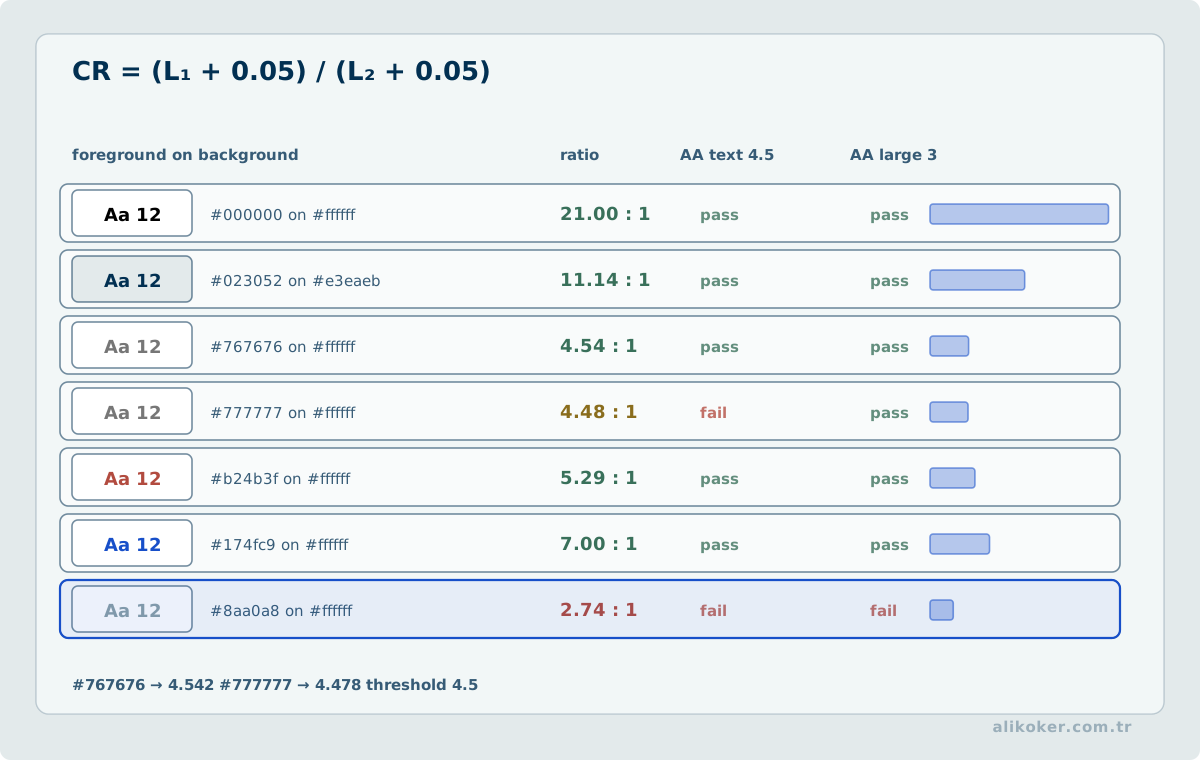
[!] Error: Record could not be saved
[✓] Saved
Color, iconography, and text should work together.
Icons
An icon can stand alone only when its meaning is broadly established. Search, close, back, play, and pause are comparatively safer; ambiguous actions should use an icon with a visible label.
The Golden Ratio — Design Principle or Design Myth?
The golden ratio is:
φ = (1 + √5) / 2 ≈ 1.618It can be approximated as a 61.8% / 38.2% distribution.
Where can it be useful?
It can be tested as a compositional hypothesis for a hero/text area, image cropping, heading scale, card proportions, or decorative composition.
Where should it not drive the decision?
It should not be the sole determinant of functional choices such as sidebar width, breakpoints, table columns, touch-target size, form columns, modal size, or accessible font size.
What does the research say?
In a web information-retrieval experiment with 98 participants by Paul van Schaik and Jonathan Ling, screen ratio affected task performance and subjective outcomes, yet the condition using the Golden Section produced the weakest screen-ratio result.
In an experiment with 91 participants by Tractinsky, David, and Krupnik, the golden-ratio hypothesis received support for mobile-device form factors but not for web-page designs.
Therefore:
The golden ratio is not a scientifically established universal optimum for web UX.
Golden ratio → sketch / aesthetic hypothesis
User task + content + accessibility + measurement → design decision
Information Architecture and Navigation
Menus should be grouped around user goals rather than the institution's internal organization.
Ambiguous:
Operations
Other
Services
More
More descriptive:
Leave Requests
Payment History
Access Permissions
Export
Mega menus
On very broad content sites, a mega menu can expose several category levels at once instead of relying on long chains of hover-driven submenus. In a dense work application, persistent left navigation plus section headings and tabs is often more stable.
What should a tab represent?
Tabs should represent closely related, mutually exclusive views of the same context.
User
├─ Profile
├─ Permissions
├─ History
└─ Sessions
Tabs should not be mixed with actions such as Save, Delete, and Export. Apple HIG likewise separates the role of tab bars as navigation from action controls.
Too many tabs
A large number of tabs leads to overflow, horizontal scrolling, truncated names, and loss of visibility of the active tab. Beyond a certain point, a sidebar, selector, or split view can be more appropriate.
Search, Discovery, Filtering, and Sorting
A mature search experience is more than a text box. It may include:
- a visible search affordance,
- search history,
- autocomplete,
- spelling correction,
- synonyms and related queries,
- filters,
- sorting,
- a summary of active filters,
- result counts,
- recovery suggestions for zero-result queries.
Amazon's search improvements explicitly use autocomplete, spelling correction, and related search. Hepsiburada's official 20-F disclosures describe product discovery through text search as well as categories, filters, barcodes, images, and speech-to-text.
Search does not repair poor information architecture
Search is especially effective when users know the item they want and must retrieve it from a very large set. When users do not yet know what choices exist, visible navigation and meaningful grouping may impose less initial cognitive effort than inventing the correct query.
Search therefore should not:
- replace well-labeled navigation,
- hide a poorly grouped collection of functions,
- prevent users from discovering what the product can do.
In a dense enterprise application, search becomes an accelerator after the information architecture is sound. Keeping nineteen opaque operation names and adding a search box does not remove complexity; it requires the user to know the system's internal vocabulary.
When a known record, person, document, or command must be selected from a very large set, search is natural. When the user is still deciding what task to perform, visible and understandable choices are usually more appropriate.
Search as the user types
Instead of calling the backend for every keystroke:
input
  ↓
debounce
  ↓
cancel previous request
  ↓
new request
  ↓
apply only the latest request result to the UI
Filters
Filters should make the selected value, active-filter count, individual removal, clear-all action, and result count visible. Baymard's e-commerce finding about keeping applied filters visible should be validated against the task context before being transferred to enterprise data grids.
Sorting
Sorting should clearly show direction and, where possible, use human language such as “Newest / Oldest.”
Unit 2: Data, Forms, Workflows, and Client State
A client workflow begins with the user's goal, its preconditions, and the state proving completion. Treat loading, partial data, validation errors, timeouts, and retries as distinct interface states. If repeating an action may duplicate an operation, combine interface safeguards with an appropriate server-side operation identifier. The interface must not claim success before completion and should preserve entered information where possible after failure.
Data Tables and Data-Grid Design
Nielsen Norman Group emphasizes four fundamental tasks around data tables:
- finding records that match criteria,
- comparing records,
- viewing, editing, or adding a single record,
- acting on records.
A table and a grid are not the same thing
For static or read-only data, semantic HTML <table> is often the right and accessible choice. If an interactive data grid adds application behaviors such as keyboard cell navigation, selection, editing, and virtualization, the WAI-ARIA grid pattern may become relevant.
A common work-table surface
Title                    [Search.............] [Filter] [⋯]
Active filters: [State: Active ×] [Date: Today ×] [Clear]

┌────┬──────────────┬─────────────┬──────────┬────────────┐
│ □  │ Record       │ Date ↕      │ State    │ Actions    │
├────┼──────────────┼─────────────┼──────────┼────────────┤
│ □  │ ...          │ ...         │ ...      │ ⋯          │
└────┴──────────────┴─────────────┴──────────┴────────────┘

1–50 / 12,480                       [‹] [1] [2] [3] [›]
Depending on the task, the table may include search, filters, sorting, pagination, page size, row selection, multi-select, batch actions, column visibility, resizing, sticky headers, detail panels, export, copy, and explicit empty/loading/error states. Adding every capability to every table is not good design.
In IBM Carbon's data-table approach, the toolbar provides a common area for search, filtering, and global actions. Batch actions can appear contextually when rows are selected.
Mobile tables
Responsive behavior does not require every table to become a stack of cards. Hiding low-priority columns, using a detail panel, controlled horizontal scrolling, sticky key columns, or a task-specific card view may all be valid. In dense engineering and administration tables, horizontal scrolling is often preferable to discarding important information.
Pagination or infinite scroll?
Infinite scroll works well for exploration and homogeneous social feeds. Pagination is often stronger for returning to a known record, comparison, administration, and reporting. NN/g likewise notes weaknesses of infinite scrolling for goal-directed tasks such as locating a specific item.
Virtualization
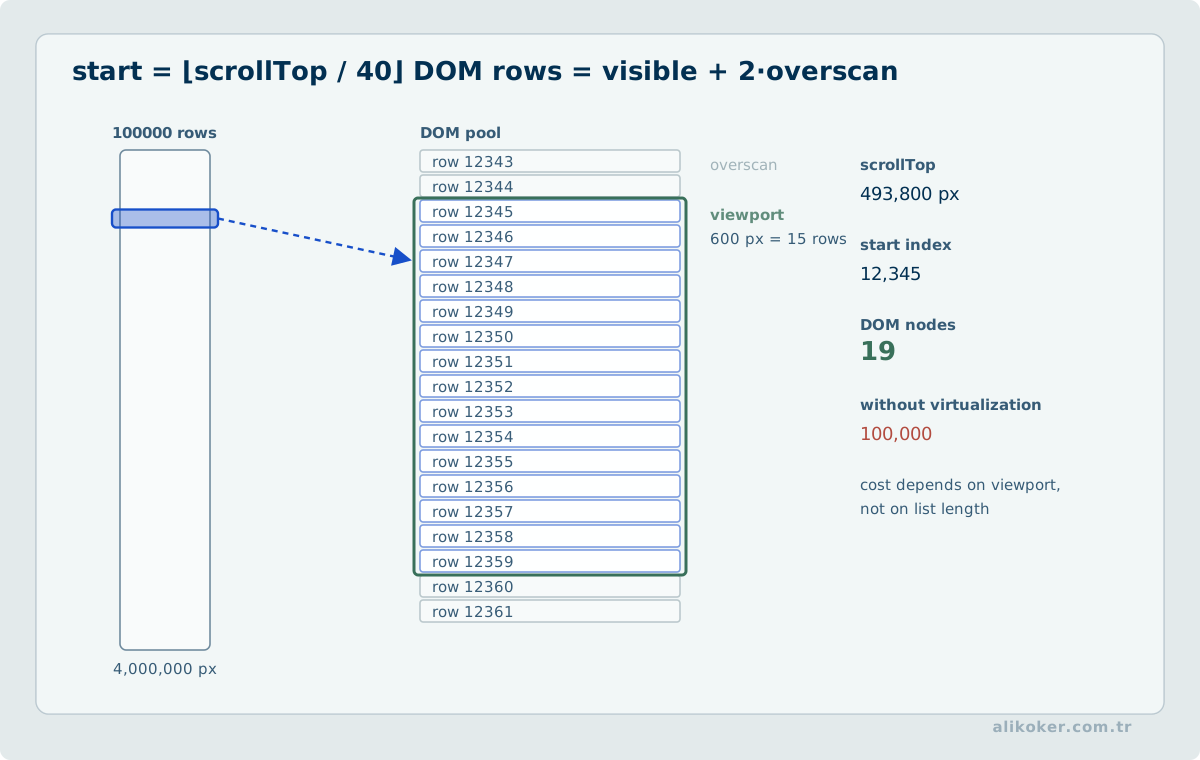
Placing 100,000 rows in the DOM is not responsive design. Virtual scrolling reduces rendering cost, but screen-reader semantics, browser find behavior, row counts, keyboard navigation, and scroll-position stability must be handled deliberately.
Form Design
The user's goal is not to fill in a form; it is to obtain the result behind that form. For every field, ask: “Is this information really required now?”
Eliminate → Automate → Simplify
- remove fields that do not contribute to the task,
- do not ask again for data the system already knows,
- derive or prefill what can be obtained reliably,
- simplify what remains.
Baymard's checkout research likewise shows that the burden of fields presented to the user can matter more than the raw number of steps.
Labels
Prefer:
Email address
[________________________]
A placeholder should not replace a label because it disappears when the user starts typing.
Required and optional fields
In long forms, required fields should be unambiguous. A red * without an explanation is weak communication.
Input semantics
<input type="email" autocomplete="email">
<input type="tel" inputmode="tel">
<input type="date">
These semantics support appropriate virtual keyboards and browser behavior.
Validation
Client-side validation exists for fast feedback; server-side validation remains the authority for security and data integrity. Client validation is not a security boundary.
A reasonable timing model is often:
- untouched field → remain quiet,
- after blur/touch → validate,
- submit → validate the complete form.
Remove the source of the error before designing the error message
Validation is not only about detecting invalid input. It is also worth asking why the interface allowed the user to create that invalid state.
If a system can provide records only for the last twelve periods, showing those available periods can be simpler than asking for unrestricted start and end dates. Likewise, if the current query already defines the date range, asking for those dates again inside an analysis workflow adds a decision and creates an opportunity for contradictory state.
A useful order is:
make invalid states impossible where practical
↓
show remaining errors early and in context
↓
validate again on the server
↓
keep a clear recovery path
Confirmation dialogs are not a universal prevention mechanism. They interrupt correct users as well as mistaken ones. For low-risk, reversible actions, good defaults, visible state, and undo often impose less cognitive cost.
Error summary
The form could not be submitted. Correct 3 fields:
- Start date
- Email
- Department
For a long form, a summary near the top plus field-level detail is useful.
Form state
The browser Back button should not erase fifteen minutes of form work. History state, drafts, or suitable storage can be considered; client-side persistence of sensitive data requires a separate security analysis.
Wizards, Steppers, Task Lists, and Progressive Disclosure
A wizard can be useful when the process is naturally sequential, later steps depend on earlier answers, new users struggle with too many simultaneous choices, or high-risk decisions need staged verification.
1. Basic Information
      ↓
2. Scope
      ↓
3. Permissions
      ↓
4. Review
      ↓
5. Confirmation
When is a wizard the wrong choice?
If users perform the same task very frequently, need to compare fields simultaneously, or move back and forth between steps, a wizard may slow experienced users down.
Properties of a good wizard
- the current step is visible,
- total progress is understandable,
- the previous step remains reachable,
- data is preserved when moving back,
- locked steps do not look accidentally active,
- each step focuses on one logical subject,
- the final step provides a review.
Review answers
GOV.UK notes that in small and medium-sized transactions, a review screen immediately before confirmation can increase confidence and help users correct errors.
Review

Name            Ali Koker      [Change]
Unit            ...            [Change]
Permission      ...            [Change]

[Confirm and Save]
Task lists
For a long process completed across multiple sessions, a task list may be more suitable than a linear wizard:
Application

[✓] Identity information
[✓] Contact details
[ ] Documents
[ ] Preferences
[-] Final review
GOV.UK uses this pattern for long, multipart transactions, while also recommending that the process first be challenged to see whether it can be simplified at all.
Progressive disclosure
Basic Settings
...
[ Show advanced options ]
Hiding advanced options can be useful, but hiding a frequently used critical function under the label “advanced” is poor information architecture.
Facebook Privacy Checkup
Meta's Privacy Checkup turns privacy and security settings into a topic-oriented guided flow. It is a useful example of managing complex settings through a guided review/wizard rather than a single oversized form.
Dialogs, Side Panels, Popovers, and Modal Dialogs
A modal is an expensive interaction
A modal dialog:
- interrupts the primary flow,
- moves focus into itself,
- temporarily makes the background unavailable,
- forces the user to make a decision.
It should therefore be reserved for genuinely temporary work that requires focused attention.
Accessibility in modal dialogs
In the WAI-ARIA modal dialog pattern:
- focus moves into the dialog when it opens,
Tabcycles within the dialog,Escapecloses it where appropriate,- after closing, focus returns to a meaningful triggering element,
- a visible close or cancel mechanism is available.
A visually centered <div> is not, by itself, an accessible modal. Focus management is part of the behavior.
Confirmation dialogs
Asking:
Are you sure?
for every action eventually teaches users to confirm reflexively. Confirmation is most valuable for actions that are:
- irreversible,
- high impact,
- infrequent,
- easy to trigger accidentally.
Where practical, a reversible action followed by Undo can produce a better experience.
Side panels
A side or detail panel is useful when:
- the user needs details without losing list context,
- a quick edit is required,
- filters need a dedicated surface,
- a record must be inspected briefly.
Deep, multi-section, validation-heavy forms should not be forced into a narrow side panel merely to avoid navigation.
Popovers
Popovers work for short contextual choices such as:
- row actions,
- quick filters,
- small option lists,
- secondary explanations.
A critical function must not be reachable only through hover; touch and keyboard users must have an equivalent path.
System Feedback, Loading States, and Perceived Performance
Actual speed and perceived speed
To the user:
Click → nothing → screen changes 1.5 s laterand:
Click → immediate pressed/loading state → result 1.5 s laterare different experiences even when backend time is identical.
web.dev's INP documentation explicitly discusses how delayed visual feedback can cause users to activate the same control repeatedly.
Choose the loading indicator according to the work
Skeleton
- when the page structure is already known,
- while content is being loaded.
Spinner
- for a short operation,
- when duration is unknown.
Progress bar
- when actual progress can be measured.
Determinate progress
- when a percentage or remaining work can be reported reliably.
Fabricating a percentage to make an operation look measurable damages trust.
Optimistic UI
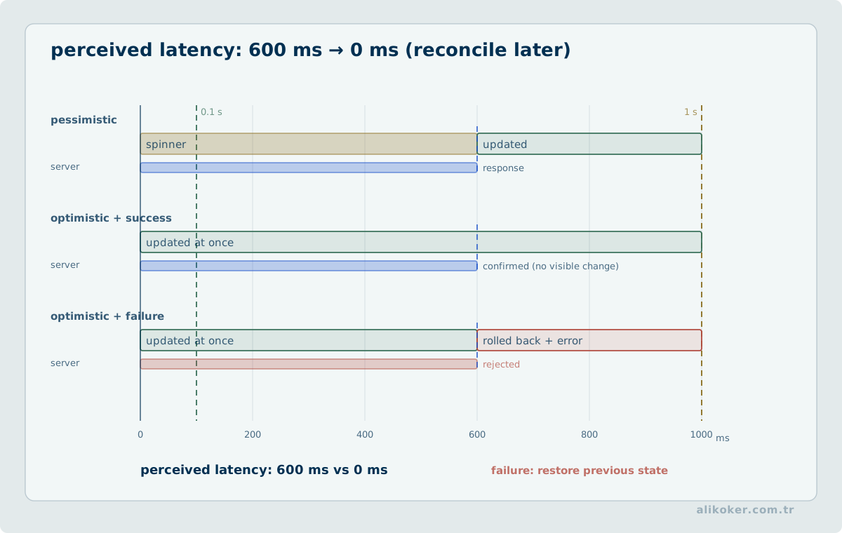
For an action such as a “like” that is:
- low risk,
- easy to reverse,
the UI can update immediately and reconcile with the backend afterward.
The same approach is inappropriate for:
- money transfers,
- permission changes,
- critical deletion,
- creation of an official record,
- security settings.
For such actions, the interface must not report success before the server has established success.
Toasts
A toast is appropriate for a state that is:
- temporary,
- low importance,
- not requiring further user action.
A critical error should not disappear in a toast after a few seconds.
Empty states
Instead of a generic empty table:
No recordsdistinguish the reason:
No record has been created yet. [New record]or:
No records match these filters. [Clear filters]The result set is empty in both cases, but the user's next task is different.
Preventing Duplicate Requests and Race Conditions
This is where UI/UX directly meets data integrity. In high-traffic production systems, a double-click or a late search response is more than a cosmetic defect. It can become a duplicate record, stale data overwriting a newer result, or an operator acting on the wrong record.
Problem 1: Double-click / repeated submission
A user can press Save twice:
POST /save
POST /save
Temporarily locking the action on the client is useful:
if (saving) return;
saving = true;

try {
    await save();
} finally {
    saving = false;
}
But this is not a data-integrity guarantee. The same logical action can be repeated:
- from two tabs,
- from another device,
- by a retrying proxy or client.
Problem 2: Search request storms
Calling the backend on every character can produce:
a    → request 1
al   → request 2
ali  → request 3
alik → request 4
and waste network, CPU, and database capacity.
Debounce
let timer;

function scheduleSearch(value) {
    clearTimeout(timer);
    timer = setTimeout(() => search(value), 250);
}
250 ms is only an example. The delay should be selected from the real task and actual measurement.
Problem 3: An older request overwrites a newer result
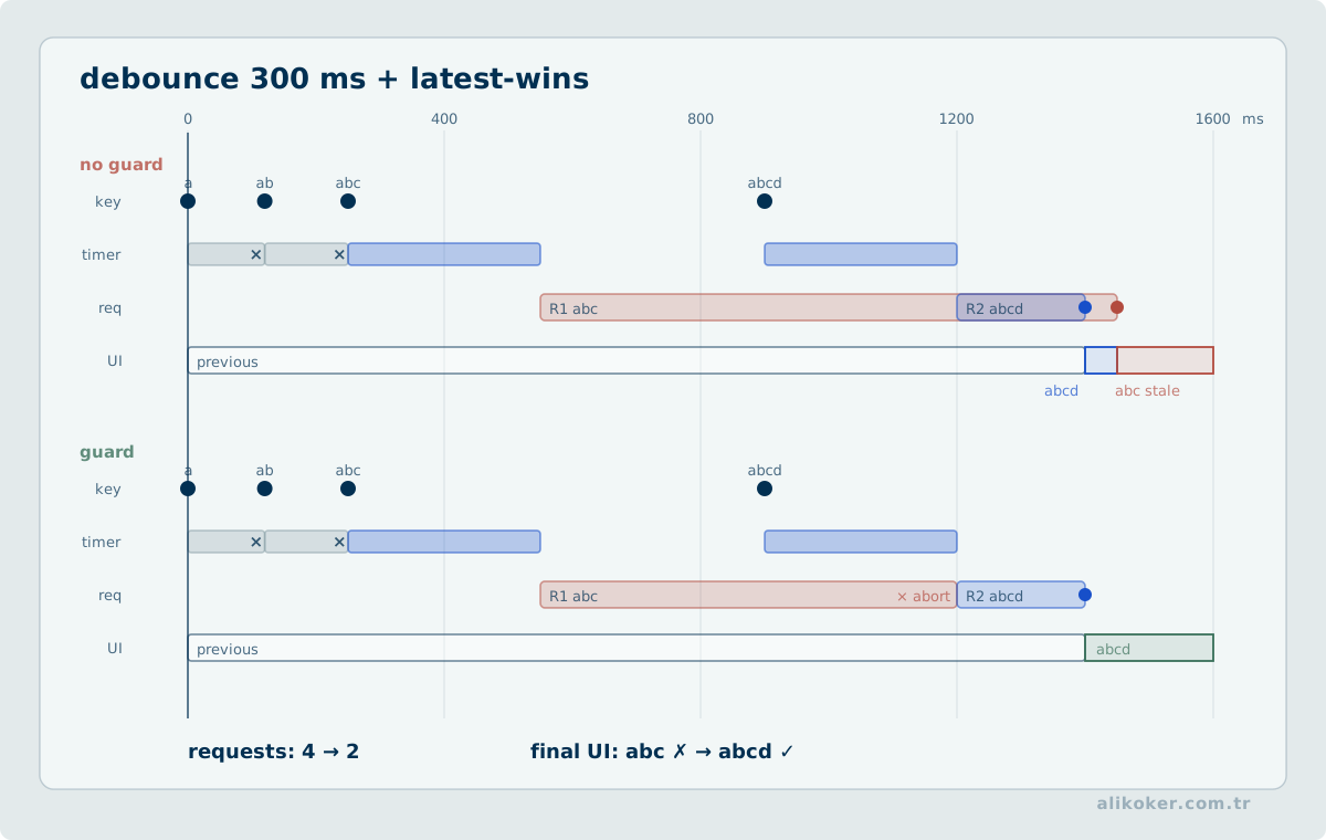
request("a")      slow
request("alik")   fast

result for "alik" arrives
result for "a" arrives later
UI incorrectly returns to the stale result
Protection can use two layers:
- cancel the previous request with
AbortController, - also guard the result with a generation/sequence number.
let controller;
let generation = 0;

async function search(value) {
    controller?.abort();
    controller = new AbortController();
    const current = ++generation;

    const response = await fetch(`/search?q=${encodeURIComponent(value)}`, {
        signal: controller.signal
    });

    const data = await response.json();
    if (current !== generation) return;

    render(data);
}
This does more than reduce load: it ensures that the most recent user intent remains dominant in the UI.
Problem 4: Retrying mutations
Under HTTP semantics, GET, HEAD, OPTIONS, and TRACE are safe methods; safe methods plus PUT and DELETE have idempotent semantics. POST is not generally assumed to be idempotent.
That makes this sequence important:
POST sent
connection lost
did the operation happen on the server?
Idempotency keys
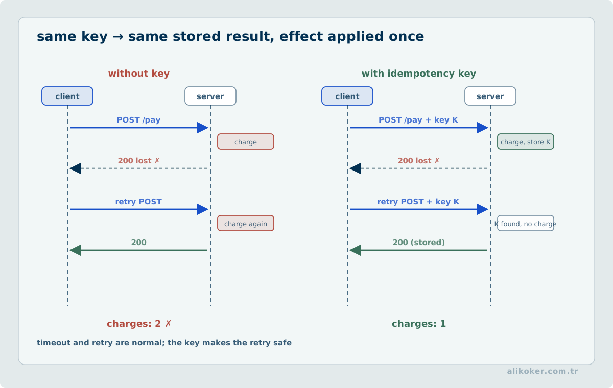
A common approach, especially in payment and ordering APIs, is:
POST /orders
Idempotency-Key: 550e8400-e29b-41d4-a716-446655440000
The server should not create the same logical operation twice when the same key is retried. Stripe's API is a well-known example of this model.
The protection layers belong at different levels
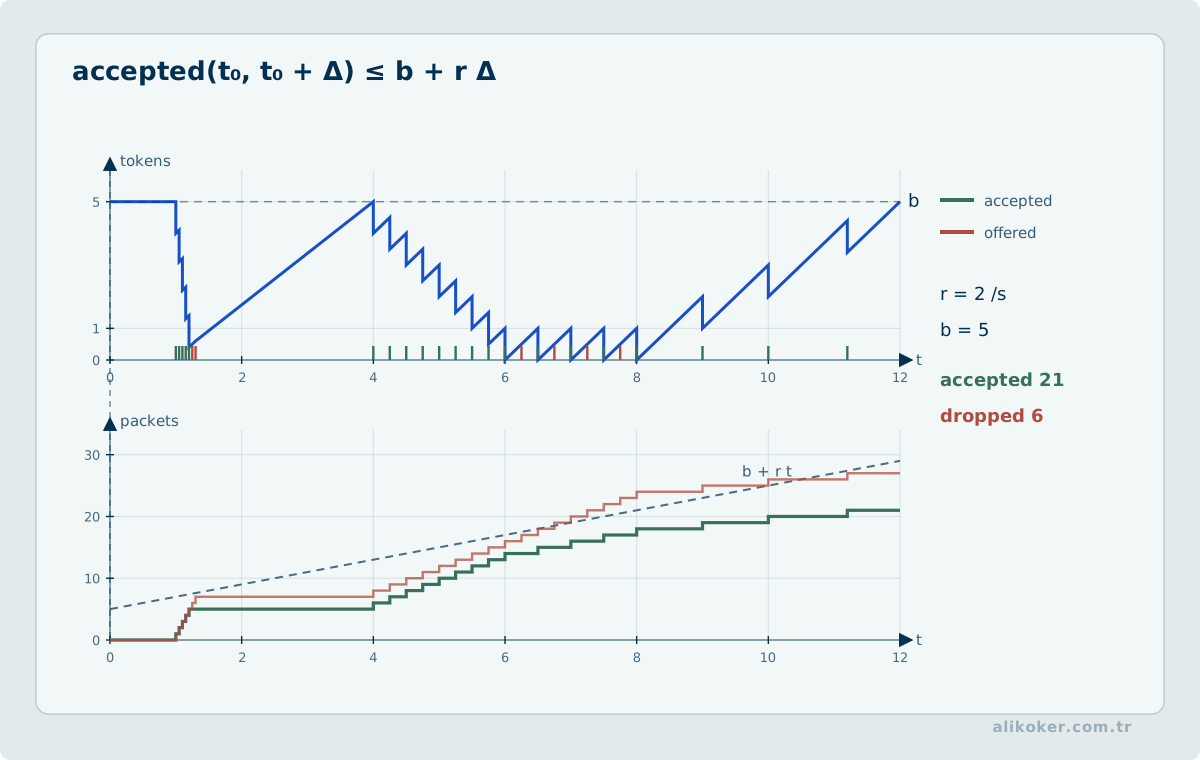
UI in-flight guard
        ↓
debounce / cancel
        ↓
idempotency key
        ↓
business invariant / transaction
        ↓
optimistic concurrency or unique constraint, when available
Disabling a button alone is not data safety.
Retry
Retry is safer when the operation is:
- safe or idempotent,
- failing transiently,
- retried only a bounded number of times,
- using exponential backoff,
- using jitter.
Blindly retrying a non-idempotent POST without understanding its semantics can create duplicate data. RFC 9110 makes this distinction explicit.
URL State, Navigation, and Browser History
Not every visible state in a web application has the same lifetime. Temporary search text, an expanded panel, a selected record, pagination, filters, a user draft, and domain data persisted on the server should not automatically share one storage or navigation mechanism.
A useful distinction is:
ephemeral view state
    -> current interaction only

navigation state
    -> meaningful restoration through URL / session history

session state
    -> working context for a tab or session

persistent domain state
    -> server-validated business data
This distinction has direct UX consequences. If a user is on page three of search results with a filter active and has opened a record detail, pressing the browser Back button should normally return to the previous meaningful navigation state rather than an unrelated default screen.
The URL is a contract for shareable state
State is a good candidate for the URL when it usually:
- retains meaning after reload,
- can be bookmarked,
- can be opened in another tab,
- can reconstruct useful context when shared,
- does not expose secret or sensitive data.
For example:
/search?q=oracle&status=open&page=3can represent meaningful navigation state. Passwords, access tokens, personal data, and large transient objects should not be encoded into the URL.
Every UI change should not create a new history entry either. pushState-like behavior is appropriate when the user has moved to a semantically new step; replaceState-like behavior is more appropriate when the current navigation entry is being corrected or normalized. The decision starts with the user's mental model rather than the API name:
new meaningful step      -> new history entry
correction of same step  -> update current entry
The WHATWG HTML session-history model defines Back/Forward traversal and classic History API state as part of browser behavior. Client-side routing should cooperate with that contract rather than replace it with a private navigation model.
Reload, deep links, and direct entry
A route or selection that exists only in client memory is fragile if a reload destroys the user's task. When an important view is addressable by URL, the server and client should both be able to interpret that address safely.
same URL
  |
  +--> normal navigation
  +--> open in new tab
  +--> reload
  +--> bookmark
  +--> direct address-bar entry
These paths do not have to reproduce every pixel of transient state, but they should reconstruct the same user task safely.
Scroll restoration and focus restoration are different concerns
Browsers provide scroll restoration as part of session history. When an application takes manual control, two questions must remain separate:
- which content position should be restored?
- which meaningful element should receive keyboard or assistive-technology focus?
Persisting only scrollTop does not create accessible navigation. A newly opened view may need focus on a meaningful heading or content start, while returning to a previous view should avoid resetting the user's context unnecessarily.
The URL is not the entire interface state
Encoding everything in the URL is also a mistake. An open tooltip, hover state, a few unsaved characters, or a transient drag position does not need to become part of the navigation contract. The objective is to keep navigation context that users may need to reconstruct addressable.
Distributed Client State, Data Freshness, and Offline Behavior
"The data on screen" is not a single state in a modern web application. Several layers may coexist:
server-validated state
        |
        +--> client cache
        |       |
        |       +--> version currently rendered
        |
        +--> newer version arriving in background

user's unsaved draft

mutation in flight / outcome unknown
If these layers are collapsed, users can mistake stale data for current data, unsent changes for saved changes, or failed synchronization for success.
Freshness is a UX property
On decision-sensitive screens, "the response arrived" may not be enough. When it can change a decision, the interface may need to expose:
- what time the data represents,
- when it was last refreshed successfully,
- whether a background refresh is running,
- whether the view is complete or partial,
- whether the user is currently seeing a stale cached version.
The goal is not to fill every row with timestamps. The goal is to make freshness differences that can change a decision visible.
Offline, slow, and disconnected are not the same state
"No network" is not one error class:
connected and current
connected but slow
disconnected with local data
disconnected without required data
reconnected, synchronization pending
synchronization conflict
Web-platform mechanisms such as Service Workers and the Cache API can support offline-capable applications, but caching alone does not create correct UX. Users still need to understand which data is available offline and which action has not reached the server.
If a mutation can be queued safely while offline, the UI should avoid claiming final success prematurely. A semantically accurate state might be:
Saved locally · will be sent when connection returnsFinal persistence can be shown after server acknowledgement. If an operation cannot be queued safely, saying so explicitly is preferable to presenting false success.
Reconnection is not permission to overwrite silently
A user may edit a draft while offline while the same record changes elsewhere. Sending the local version later and overwriting server state merely because it arrived last is not a reliable synchronization strategy.
A safer model is:
local base version
      +
local changes
      +
current server version
      |
      v
compare / merge / expose conflict to the user
Automatic merge is appropriate only when field independence and domain rules genuinely make it safe.
Multi-Tab and Multi-User State
The same person can open the application in two tabs, and two people can edit the same record concurrently. These look related but operate at different layers.
sessionStorage and localStorage do not provide the same semantics
The WHATWG HTML standard describes sessionStorage for state associated with a top-level browsing context and localStorage for more persistent state shared across windows under the same origin. Sharing through localStorage does not imply transactional locking or atomic read-modify-write semantics.
Values that require integrity—such as:
- unique counters,
- sequence allocation,
- locks,
- financial or workflow state,
- authorization decisions
should not depend on a browser-storage read-modify-write sequence for correctness.
For UI coordination across tabs under the same origin, the storage event or, where appropriate, BroadcastChannel can communicate events. A common example is logout: if one tab ends the session, other open tabs should not keep presenting an authorized interface as though nothing changed.
Server-side concurrency must have a UI contract
Two clients can edit the same record in this order:
A reads version 7
B reads version 7
A writes -> version 8
B writes from stale version 7
If B's mutation is accepted blindly, A's update may be lost. RFC 9110 explicitly describes conditional requests such as If-Match as a mechanism that can prevent the lost update problem for state-changing requests.
The UX concern is not the header itself but the correct representation of conflict. When the server rejects a stale mutation, a message such as:
Save failed.is usually insufficient. When the application can support it, a better recovery path is:
This record changed while you were editing it.
[Review server version]
[Compare my changes]
[Cancel]
The user's draft should not be destroyed merely because a conflict occurred. Last-write-wins can be acceptable for some low-risk preferences, but it should not become the implicit default where the cost of lost data is high.
Notification and Attention Architecture
Notification design is not the choice of one toast component. Severity, lifetime, whether action is required, and whether the message remains meaningful outside its local context should drive the surface.
field error          -> next to the field
form-level summary   -> persistent within form context
success information  -> brief and low interruption
system warning       -> visible and persistent when required
background event     -> elevated only if it changes the user's decision
Repeated events should not automatically create a notification storm. Aggregation, counters, or a persistent status surface may be more appropriate. A critical message that the user can miss before it disappears should not rely on an auto-closing transient surface.
More notifications do not automatically create a more transparent system. Attention is also a bounded resource. The interface should translate technical events into user-relevant state changes at the correct level of interruption.
Using Semantic Platform Primitives and Built-In Behavior
A UI engineering problem does not always require a new JavaScript component. The HTML platform already provides strong starting points for links, form controls, buttons, disclosure widgets, and dialogs, including keyboard behavior, focus semantics, roles, and assistive-technology integration. The first design question should therefore be not only “how should this look?” but also “does the platform already have a semantic primitive for this behavior?”
This has three practical advantages:
- essential interaction can remain more resilient when JavaScript is unavailable or an enhancement fails;
- much of the keyboard and assistive-technology contract exists before custom component code is added;
- client code can focus on product-specific behavior instead of re-implementing platform semantics.
For example, attaching a click handler to a div purely for visual convenience creates the burden of rebuilding the focus, keyboard, and disabled semantics already provided by a real button. Likewise, details/summary can serve disclosure, dialog can serve genuine modal interaction when appropriate, and correct input types and autocomplete semantics can reduce the amount of custom code required.
The rule is not “native is always better.” Product behavior, accessibility testing, or support constraints may justify a custom component. The important point is that a custom implementation should be a deliberate deviation, not an accidental reimplementation of semantics the platform already supplies.
Input type is a UX decision
Choosing the correct form type is not only validation. Appropriate type, autocomplete, required, min, max, step, and related semantics can influence software keyboards, browser assistance, autofill, and error feedback. Form semantics and client-side validation should therefore be designed together.
A useful sequence for each field is:
- What is the actual data type?
- Does the platform provide a suitable native control?
- Which input conveniences can the user receive?
- Which rules must the server enforce authoritatively?
- If native behavior is insufficient, which part should be enhanced progressively?
This sequence reduces the risk of forms that look highly customized but are semantically weak.
Preventing stale network responses from overriding the latest selection. A user opens record A, then immediately record B. Network latency may cause response A to arrive after response B. Rendering responses in arrival order can then display stale record A even though the latest selection is B. Assign an increasing request generation to each selection and apply a response to visible state only if its generation is still current. For example, request A receives generation 7 and B receives 8; B may render first, and late response A must not change the screen. Cancelling the old request can save resources, but cancellation completion must not be assumed to eliminate races. Loading indicators and errors require the same generation check. This preserves the user's last intent despite nondeterministic response ordering.
Unit 3: Responsive Design, Accessibility, Performance, and Security
Responsive-interface verification goes beyond inspecting a few viewport sizes. Define variable conditions such as expanding content, long translations, keyboard navigation, zoom, and focus order. Test components under constrained layouts for overflow, hidden controls, and lost focus. Performance assessment should distinguish responsiveness to interaction from the time to first render.
Responsive and Adaptive Design
The goal of responsive design
Responsive design does not mean:
shrink the same desktop screen.
The goal is:
preserve the same user task across different viewports and input capabilities.
Viewport
A basic mobile-web declaration is:
<meta name="viewport" content="width=device-width, initial-scale=1">A breakpoint is not a device name
Weak thinking:
iPhone breakpoint
iPad breakpoint
Laptop breakpoint
A better question is:
At what width does the content stop working well?
The content should determine the breakpoint.
Mobile-first and desktop
Mobile-first CSS is a useful engineering technique, but it should not turn desktop into an oversized phone. A wide screen can exploit:
- comparison space,
- multi-column data,
- persistent navigation,
- simultaneous detail panels.
NN/g likewise warns that mechanically scaling mobile patterns up to desktop can create unnecessary whitespace and fragmented information density.
Container queries
The viewport is not always the right signal for a component.
The same card may be:
800 pxwide on a full page,300 pxwide inside a sidebar.
.card-container {
    container-type: inline-size;
}

@container (min-width: 40rem) {
    .card {
        grid-template-columns: 1fr 1fr;
    }
}
The component can then respond to its own available space rather than the device width.
clamp()
Fluid typography or spacing can be expressed as:
h1 {
    font-size: clamp(1.75rem, 1rem + 2vw, 3rem);
}
Using only vw can create extreme values on very small or very large screens. Minimum and maximum bounds matter.
Input capability
Screen width alone is insufficient:
@media (pointer: coarse) { ... }
@media (hover: none) { ... }
@media (prefers-reduced-motion: reduce) { ... }
A touch laptop, stylus, trackpad, and phone do not expose the same interaction capabilities.
Screen size is not an input method
Viewport width is a useful layout signal, but it does not reliably describe the user's input hardware. A wide-screen device may be touch-enabled; a small device may have a physical keyboard or stylus; the same system may accept touch, mouse, trackpad, and keyboard input at the same time.
The following mappings should therefore not be treated as design rules:
narrow screen = touch
large screen  = mouse
desktop       = precise pointer
mobile        = finger only
Layout and input capability answer different questions:
Layout question: How much space is available?
Input question:  How can the user interact with this surface?
Task question:   Which method lets the task remain safe and efficient?
A breakpoint should determine how space is reorganized. A change in interaction behavior requires a separate assessment of input capability.
Multiple input modalities
Assuming one “correct” input method per device is increasingly fragile. On a hybrid computer, a user may change methods within one task:
search with the keyboard
→ change a tab by touch
→ choose a detail with the trackpad
→ continue editing with the keyboard
The interface should not expose this as a mode switch that the user has to manage. The same core task should remain achievable through:
- the keyboard,
- a precise pointer,
- a coarse pointer,
- a stylus where supported.
CSS input-capability queries are useful signals, but they are not definitive profiles of user behavior. It is more robust to query the capability required by an interaction than to classify the entire interface as a “touch device” or “desktop device.”
Hover is an enhancement, not the primary path
hover can provide previews, explanations, and accelerators. If a function is discoverable only on hover, however, it can disappear from touch, keyboard, and some assistive-technology paths.
A safer model is:
Primary function    → reachable by activation/touch and keyboard
Additional shortcut → may appear on hover when available
Hover should accelerate an existing accessible path, not replace it.
The physical boundary of responsive design
A CSS pixel is a powerful abstraction for layout, but physical contact does not occur in pixels. Display density, viewing distance, whether the device is handheld or fixed, and spacing between adjacent controls can all change the practical usability of the same numerical size.
Instead of treating one historical pixel value as a universal physical law for every touchscreen, preserve two layers:
- Satisfy current normative accessibility requirements such as WCAG.
- Measure mistaps, reach, occlusion, and error cost in the real device and task context.
A standard defines a minimum acceptance boundary; field validation confirms the context.
Reflow
WCAG 2.2 Reflow aims, subject to defined exceptions, for content and functionality to remain available at the equivalent of 320 CSS px without requiring two-dimensional scrolling.
Content whose meaning genuinely requires a two-dimensional layout—such as some data tables, maps, and complex diagrams—must be evaluated separately.
Responsive prioritization
Desktop:
[Title] [Search................] [Filter] [Export] [New]Mobile:
[Title]                          [⋯]
[Search............................]
[Filter 3]
The function remains; its placement and priority change.
A practical resolution test matrix
The following are test cases, not universal breakpoints:
- Class: Very narrow phone; Example CSS viewport: 320 × 568
- Class: Phone; Example CSS viewport: 360 × 800
- Class: Modern phone; Example CSS viewport: 390 × 844
- Class: Large phone; Example CSS viewport: 412 × 915
- Class: Small tablet; Example CSS viewport: 768 × 1024
- Class: Tablet / landscape; Example CSS viewport: 1024 × 768
- Class: Small laptop; Example CSS viewport: 1366 × 768
- Class: Laptop; Example CSS viewport: 1440 × 900
- Class: Desktop; Example CSS viewport: 1920 × 1080
- Class: Wide display; Example CSS viewport: 2560 × 1440
Also test:
- 200% browser zoom,
- larger system fonts,
- landscape orientation,
- touch input,
- keyboard-only operation,
- dark mode,
- reduced motion.
4K displays
A 4K monitor does not require content to span the entire screen.
Long-form text can remain inside a controlled readable measure:
readable text columnA data grid, timeline, or graphical workspace can use the additional width when the task benefits from it.
Responsive design is not equivalent to setting every component to width: 100%.
Mobile Navigation and Screen Space
Bottom navigation
Material 3 NavigationBar is designed for three to five primary destinations on small screens. Apple similarly positions the tab bar as navigation among top-level areas of an application.
Appropriate:
[Home] [Search] [Tasks] [Notifications] [Profile]Not appropriate:
[Save] [Delete] [Export] [Refresh]The second group contains actions, not destinations.
Less visible does not mean less functional
A useful priority is:
- keep the primary task visible,
- place secondary tasks in overflow,
- place infrequent advanced settings in an appropriate panel or sheet.
Sidebar to compact navigation
A wide layout may use a sidebar; a narrow layout can move to a compact top or bottom navigation model.
Desktop: persistent left navigation rail
Tablet: collapsible rail
Phone: 3–5 primary destinations in bottom navigation + More
If the information architecture has more than five equally important top-level areas, forcing all of them into bottom navigation is usually the wrong solution.
Accessibility — WCAG 2.2 and Keyboard Operation
WCAG target
W3C recommends WCAG 2.2 for new work. For enterprise web applications, WCAG 2.2 AA is a strong baseline target.
Keyboard access
Every important function should, where its interaction model requires it, be operable with:
Tab,Shift+Tab,Enter,Space,- arrow keys,
Escape.
Focus must remain visible
:focus-visible {
    outline: 2px solid currentColor;
    outline-offset: 2px;
}
Removing focus indication only for aesthetic reasons is a serious usability defect.
WCAG 2.2 also addresses cases where a focused component becomes entirely hidden by sticky or fixed layers.
Target size
Under WCAG 2.2 Target Size (Minimum) at AA level, targets generally need to be at least 24 × 24 CSS px or satisfy one of the criterion's spacing or exception conditions.
That is an accessibility floor. On mobile, larger operational targets are often safer.
Tab pattern
In the WAI-ARIA tabs pattern:
Tabenters thetablist,Left/Right Arrowcan move between tabs,- automatic activation is suitable only when changing panels is effectively latency-free,
- otherwise manual activation with
Enter/Spacecan be better.
This is a direct point of contact between performance and accessibility.
Grid keyboard model
When an ARIA grid is genuinely required, application-level keyboard behavior may include:
- Arrow keys between cells,
- Home/End within a row,
- Ctrl+Home/Ctrl+End across the grid.
Turning a semantic HTML table into an ARIA grid without need creates additional obligations.
Reduced motion
@media (prefers-reduced-motion: reduce) {
    *, *::before, *::after {
        animation-duration: 0.01ms;
        animation-iteration-count: 1;
        transition-duration: 0.01ms;
    }
}
A real product can apply this more selectively.
X also exposes accessibility preferences such as:
- reduced motion,
- autoplay control,
- font size,
- high contrast,
- dark/dim themes,
- keyboard shortcuts.
Screen readers and accessible names
Poor:
<button><i class="fa fa-trash"></i></button>Better:
<button aria-label="Delete record">
    <i aria-hidden="true" class="fa fa-trash"></i>
</button>
Live announcements
Dynamic status:
<div role="status" aria-live="polite">
    Saved
</div>
Critical error:
<div role="alert">
    The record could not be saved.
</div>
Unnecessary use of aria-live, however, can make a screen-reader experience noisy.
Performance Is a UX Property
Core Web Vitals
Google's current Core Web Vitals thresholds classify performance as “good” at the 75th percentile when:
- LCP ≤ 2.5 s
- INP ≤ 200 ms
- CLS ≤ 0.1
These are field-metric targets primarily for general web experiences; they do not replace an end-to-end SLA for a critical internal application.
INP and repeated activation
Poor responsiveness can produce:
Click
(no feedback)
Click
Click
...
event queue catches up
This is more than a feeling of slowness. Multiple activations of the same event can become a functional defect.
CLS
If a banner appears above existing content after load and shifts the page downward:
- the user may activate the wrong control,
- reading position can be lost.
Space should be reserved in advance or the layout should remain predictable.
Lazy loading
Lazy loading can help for:
- heavy off-screen images,
- distant tabs,
- large modules.
But over-splitting JavaScript required for the primary interaction can lengthen time to the first useful task. The objective is more than “fewer initial bytes”; it is to make the critical user path usable earlier.
Security, Privacy, and Data Integrity Are Part of UX
Hiding UI is not authorization
if (!admin) hideDeleteButton();is only a presentation decision.
The backend must still:
authenticate
    ↓
authorize action
    ↓
authorize resource scope
    ↓
validate invariant
    ↓
mutate
    ↓
audit
Sending unauthorized data and hiding it on the client is wrong
Poor:
Server → all records
Client → hide unauthorized records with CSS
Correct:
Server → authorized records onlyDestructive actions
A deletion control should make clear:
- the object name,
- the scope,
- whether recovery is possible.
“August 2026 Report” will be permanently deleted.
This action cannot be undone.

[Cancel] [Delete Report]
Dirty forms
When the user has made unsaved changes, the risk must be managed during:
- closing a tab,
- switching records,
- navigating away.
Prompting on every navigation is also exhausting. The warning should appear only when a real dirty state exists.
Autosave
When autosave is appropriate, state should be visible:
Changed → Saving → Saved 09:41In multi-user editing, autosave without:
- revisioning,
- optimistic concurrency,
- conflict handling
can cause data loss.
Session timeout
Losing an entire long form at the end because “session expired” is both a UX and data-loss problem.
Without weakening the security policy, consider:
- warning before timeout,
- reauthentication,
- preserving non-sensitive drafts.
Capability, Not Device: Media, Container, and Input Features
A mature responsive strategy moves away from guessing device models. Labels such as “tablet,” “phone,” or “desktop” are not reliable design inputs by themselves; the same physical device can operate at different window widths and with different pointer and input combinations.
Three questions should be separated:
- How much space does the viewport provide? This matters for overall page composition.
- How much space does the component have inside its own container? This describes the actual operating context of a reusable component.
- Which interaction capabilities are available? Fine or coarse pointers, hover capability, keyboard, and pen input can affect target sizing and interaction design.
Media queries can answer the first question and several preference/capability questions. Container queries allow a component to react to the space in which it is actually placed rather than to the entire screen. This matters when the same component is wide in the main workspace but narrow inside a side panel.
pointer versus any-pointer, hover versus any-hover
A system can expose touch, trackpad, mouse, and pen input at the same time. The characteristics of the primary pointing device are therefore not the same as the characteristics of any available pointing device. Ignoring touch merely because pointer: fine matches, or inferring hover from width alone, is brittle.
A practical separation is:
viewport/container -> composition
pointer/hover       -> interaction ergonomics
user preferences    -> presentation behavior such as motion or color
These dimensions should not substitute for one another.
Container-relative units
Container queries are more than narrow/wide component thresholds. Units such as cqi, cqw, cqb, cqh, cqmin, and cqmax can relate measurements to the component's available container rather than the viewport. They do not remove the need for ergonomic floors. A button or text area should not shrink without bound just because its container becomes narrower.
A bounded-fluid value should therefore follow this idea:
ergonomic floor
      <=
adaptive value
      <=
reasonable ceilingmin(), max(), and clamp() can express those bounds, but the chosen values still need testing with real content, zoom, language, and input methods.
Responsive Images Are More Than CSS Resizing
Using max-width: 100% prevents an image from overflowing, but it solves only one part of responsive delivery. Sending a source file far larger than necessary still imposes network, memory, and decode cost even when CSS displays it at a smaller size.
Two problems should be distinguished:
- Resolution switching: selecting an appropriately sized source for the same visual.
- Art direction: using a genuinely different crop or composition when the presentation context requires it.
srcset, sizes, and, where needed, picture give the browser tools for these cases. Image-format choice is also part of performance, but it should be planned with fallback and the production pipeline rather than treated as an isolated optimization.
The UX principle is simple: optimize visual quality and delivery cost together. Sending the highest-resolution asset to every user is not a quality guarantee; it is often unnecessary work.
Unit 4: Product Patterns, Design Systems, and UX Measurement
What Can Be Learned from Large-Scale Products
When examining large products, it is more useful to ask which problem is being solved by a behavior than to copy its pixel layout. The same interface choice can fail under a different user population, revenue model, or critical internal workflow. The following examples are therefore design decisions to test, not ready-made recipes.
Facebook / Meta
When Meta reorganized Facebook settings, it described broader category grouping, closer placement of related options, improved settings search, and more visible access to Privacy Checkup. What matters here is not the exact menu shape but the refusal to make one navigation technique carry all complexity. Information architecture, search, and topic-oriented guided review can work together so that users do not need to memorize a deep settings tree.
Privacy Checkup provides another useful idea: high-impact privacy and security decisions are not simply stacked in one large form; they are divided into meaningful review topics. A similar approach can be considered for critical enterprise settings, provided that measurement shows which steps genuinely need guidance.
X
X publishes accessibility options including keyboard shortcuts, high contrast, reduced motion, autoplay control, font sizing, dark/dim themes, alternative text, and captions. The important lesson is that responsive design is not only a response to screen width. Motion, visual presentation, input capability, and content-consumption preferences are also variables to which the interface can adapt.
Amazon
Amazon's 2024 homepage work highlights personalized continuation points, related product groups, horizontal exploration, shortcuts for recurring tasks such as “Buy Again,” and measured iterative rollout of design variants. Its search experience similarly combines autocomplete, spelling correction, related queries, and image-plus-text discovery.
A more general principle is that users should not have to reconstruct the same context from zero in every session. “Recent,” “do again,” and “continue where you left off” paths can save substantial time when applied to the right tasks. I see the same effect in dense work applications: preserving context that operators repeatedly rebuild is often more valuable than adding another feature.
Hepsiburada
Hepsiburada's SEC annual reports describe several product-discovery paths working together: category and subcategory navigation, text search, detailed category search, barcode, image, and speech-to-text. Its 2025 report also states that roughly %90 of traffic came from mobile channels.
That figure belongs to Hepsiburada's own platform and should not be generalized to every Turkish web application. It still provides a concrete reminder of how risky it can be to treat mobile as a reduced secondary version of the desktop experience in consumer products.
Trendyol
A Trendyol Tech article on homepage architecture describes a page assembled from different component types that can be personalized, assigned to user groups, used in A/B tests, and fall back to default content. The architectural idea is to model a large homepage as independently measurable and orderable content units rather than one monolithic page.
That model should not be copied directly into a transactional enterprise interface. Dynamically moving a control that an operator expects in the same place every day damages spatial and muscle memory. Personalizing a dashboard and preserving placement stability in a high-frequency transaction UI are different problems.
Canvas and Moodle
The Canvas Student mobile application keeps destinations such as Dashboard, Calendar, To Do, Notifications, and Inbox in bottom navigation. Moodle 5.2 brings Course overview, Timeline, and Calendar together on a customizable dashboard.
Read together, these examples suggest a useful criterion for educational systems: the home screen should answer “What do I need to do now?” before it explains the institution to the user. The course list matters, but upcoming tasks, calendar, notifications, and communication often have equal operational value.
Istanbul University AKSIS and Sakarya University SABIS
Istanbul University's official AKSIS guide presents document requests through a task-oriented path such as Document Requests → New Request, followed by a table for existing requests. The useful point is not its current visual styling, but the clear separation between reviewing existing work and starting a new operation.
Sakarya University's official SABIS guides show a hub for student information, mail, educational information, library services, and other institutional applications. Inside the student-information domain, tasks such as courses, transcripts, and applications are separated through local navigation. For large multi-module systems, first choosing the work domain and then the task within that domain can produce a comprehensible two-layer structure.
These university guides should be used as field examples of real institutional task decomposition, not as contemporary UX standards.
Dashboard Design
A dashboard is not a report dump
A dashboard should answer:
- What matters now?
- What is waiting?
- What changed?
- What should I do?
- Where is the risk?
Numbers need meaning and action
Poor:
[ 125 ]
[ 98 ]
[ 72 ]
[ 41 ]
The numbers have neither context nor action.
Better:
Pending Applications      125
+18 since yesterday
Oldest: 3 days
[Review]
A card should carry one coherent thought
A card is not merely a rounded rectangle. It is useful when it bounds an independent content or task unit, remains understandable on its own, and usually has one dominant action.
Cards can make sense when:
- independent items belong to the same collection,
- items need to reflow across different screen widths,
- each item has a compact summary and a clear action.
By contrast, splitting tightly related values that must be compared simultaneously into separate cards increases eye movement and spacing cost. A table, aligned list, or single dense information surface may be more appropriate.
As the number of cards grows, their borders can stop carrying structure and become visual noise. Prefer “one meaningful unit per surface” over “one value per card.”
Dashboard personalization
Platforms such as Moodle allow users to rearrange dashboard blocks.
In an enterprise system, personalization may help according to:
- user role,
- task frequency,
- available screen space.
However, critical warnings that must be visible for safety or compliance should not be completely removable by the user.
Keyboard-First and High-Intensity Work Applications
A consumer website and an operator application do not have the same UX objective. For an experienced user who spends hours in the same record flow, a few hundred milliseconds of latency, focus that moves after every record, or a lost selection may look small in isolation yet accumulate into real productivity loss and error cost over a shift.
In systems used continuously by experienced users, the following matter:
- mouse travel,
- context switching,
- repeatedly opening and closing modal dialogs,
- tab order,
- selection preservation,
- scroll position.
Shortcuts
A good shortcut should be:
- related to the task,
- free of harmful conflicts,
- discoverable,
- reversible where relevant,
- protected from accidental activation while typing into input fields.
Example:
Enter       → primary action on selected record
Esc         → close contextual panel
Ctrl+S      → save
F1 / ?      → shortcut help
Browser and operating-system shortcuts should not be captured without a strong reason.
Roving tabindex and composite widgets
In dense composite widgets such as tables, tablists, and toolbars, making every child control a separate Tab stop can create hundreds of stops.
Where the WAI-ARIA pattern calls for it, a better model can be:
Tabonce into the composite widget,- Arrow keys within the widget.
Preserve selection
If a user is working on row 700, saving a detail, opening a side panel, or performing a short refresh should not throw the user back to row one.
State worth preserving may include:
- selected record,
- scroll position,
- active tab,
- filters,
- sort order,
- column widths.
Designing Responsive Forms and Tables Together
Desktop form
Name              [____________________]
Surname           [____________________]
Email             [____________________]

                         [Cancel] [Save]
When should two columns be used?
Prefer two columns for short, closely related fields:
Start [____]   End [____]
City  [____]   District [____]
Splitting a long form into two columns merely to fill empty space can make visual scanning harder.
Mobile
Name
[____________________]

Surname
[____________________]

Email
[____________________]

[Save]
Sticky action bar
On a long mobile form, the primary action may be pinned near the bottom.
Make sure that it:
- does not cover content,
- does not collide with the virtual keyboard,
- does not obscure focused controls,
- respects safe-area insets.
Design Anti-Patterns
1. Hiding everything behind a hamburger menu
On desktop, hiding primary navigation despite ample space can reduce discoverability.
2. Placeholder-only forms
The label disappears as soon as the user types.
3. Ambiguous icon-only actions
The user is forced to guess the meaning.
4. Critical functionality available only on hover
Touch and keyboard users may not be able to discover or reach it.
5. Color-only state
Meaning can disappear under color-vision differences, low contrast, or display conditions.
6. Making everything a modal
The user's context is interrupted continuously.
7. Infinite scrolling in administrative screens
Position, comparison, and returning to a known record become difficult.
8. Turning every screen into cards
Dense comparison data becomes visually inflated.
9. Disabled submit button with no explanation
The control is unavailable, but the user cannot tell why.
10. Solving duplicate submission only by disabling the button
The server can still receive duplicate logical operations.
11. Applying a filter without making it visible
The user may believe data is missing.
12. Skeleton forever
A backend failure remains hidden behind a perpetual loading state.
13. Resetting scroll position continuously
This causes serious productivity loss in dense work applications.
14. Treating desktop as an enlarged mobile screen
Wide screens can end up with excessive whitespace and unnecessary scrolling.
15. “Golden ratio = correct UX”
Research does not support this as a universal rule.
16. “Three clicks is the limit”
This is not a general empirical law.
17. Blindly copying a successful company
As NN/g emphasizes, a very large product may tolerate some design defects because of brand strength, habit, traffic, or other advantages. The same pattern can cause substantial loss in a smaller product or one with different tasks.
UI State Models
A data component does not have only “data” and “no data.”
A minimal state machine is:
IDLE
  ↓
LOADING
  ├── SUCCESS + DATA
  ├── SUCCESS + EMPTY
  └── ERROR
For a mutation:
CLEAN
  ↓ edit
DIRTY
  ↓ save
SAVING
  ├── SAVED
  ├── CONFLICT
  └── ERROR
Each of these states needs a deliberate UI representation.
Why does this matter?
Without an explicit model:
- empty data and failure can look identical,
- users cannot tell whether loading finished,
- users may leave with unsaved changes,
- a conflict may be displayed as an ordinary error,
- duplicate submission may be triggered.
Versioned analytical results and stale context
In analytical interfaces, stale state is not limited to an old cached row. A finding, selection, or contextual action can belong to a specific data snapshot. Once the underlying scope changes, the same ordinal position or visually similar card may represent a different object.
Structured results can therefore be bound to a data version:
result
├─ data version
├─ scope
├─ findings
└─ selections
When a new version arrives, an older result does not have to disappear; it may remain visible for comparison or user orientation. But an action bound to that old result should not silently execute against the current data. The interface can mark the older scope and require a fresh selection from the current result.
The same rule applies to clarifications and contextual follow-ups. Phrases such as "open the second one", "show that", or "expand this" are safe only while the referenced finding still belongs to the active data version.
This is more than a state-management detail. Versioned results and stale-reference guards are UX safety mechanisms that prevent high-density analytical interfaces from acting on the wrong object.
A Reliable Pattern for Form and Transaction State
An example record-edit flow:
GET entity + revision
        ↓
render
        ↓
user edits
        ↓
DIRTY
        ↓
Save clicked
        ↓
prevent duplicate submission
        ↓
PUT/PATCH + expected revision
        ↓
server validates authentication + scope + revision
        ├─ OK        → SAVED
        ├─ conflict  → CONFLICT UI
        └─ error     → ERROR + preserve entered data
The UI is more than responsible for issuing a request; it must represent server-side state truthfully.
Design Systems
A design system is not just a component library
A mature design system includes:
- design tokens,
- components,
- patterns,
- content guidance,
- accessibility behavior,
- interaction states,
- responsive behavior,
- code standards.
Tokens
:root {
    --space-xs: .25rem;
    --space-sm: .5rem;
    --space-md: 1rem;
    --space-lg: 1.5rem;

    --radius-sm: .25rem;
    --radius-md: .5rem;
}
Tokens allow visual changes to be applied consistently and controllably across a product.
Component states
A button has more than a default state:
default
hover
focus
active
disabled
loading
An input may be:
empty
filled
focused
invalid
disabled
read-only
Every state belongs to the component's design contract.
Pattern level
A “form” is not one component; it is a pattern.
Structures such as a user picker, bulk editing, filter bar, wizard, or command palette coordinate behavioral contracts across multiple components.
User Habits and Muscle Memory
In a heavily used application, users do not only see the interface; they learn movement sequences. Keyboard flows that remain stable in production for a long time can become an almost automatic work rhythm.
For example:
Enter → open record
Right → next record
Ctrl+S → save
can become muscle memory after sustained use.
Why can a small change have a large effect?
Moving a button from:
bottom-right → upper-leftis technically simple but can affect hundreds of daily actions.
Therefore, in a dense production system with established behavior:
adding a new feature and changing an existing behavior do not belong to the same risk class.
UX regression testing
Screenshot tests alone are not sufficient.
End-to-end task scenarios should also be verified, for example:
1. Search
2. Select record 17
3. Move forward three records using the keyboard
4. Change a detail
5. Save
6. Return to the previous list position
Role- and User-Profile-Aware UX
Within the same system, the following users do not have identical needs:
- a new user,
- an expert operator,
- an administrator,
- a read-only user,
- a mobile user.
Progressive expertise
A new user may use:
[New Record — with visible guidance]while an expert reaches the same function with:
Ctrl+NHow should expert-user feedback be interpreted?
Expert users provide valuable information, but expert behavior is not automatically representative of every user. Experts know the product vocabulary, develop shortcuts, and may place greater value on infrequently used precision controls.
This distinction should not lead to either of two mistakes:
- “An expert requested it, so put it on everyone's primary screen.”
- “A mainstream user may struggle with it, so remove the expert capability.”
If the target population is genuinely composed of expert operators, their needs for speed, keyboard control, bulk operations, and high information density are primary requirements. In mixed-audience products, the primary path can remain visible and learnable while precision controls, advanced filters, and shortcuts live in a secondary layer.
The goal is to keep the entry cost low without penalizing expertise.
Role-aware interfaces
An action the user cannot perform may, depending on product requirements:
- be hidden,
- remain disabled with an explanation.
But server-side authorization remains mandatory.
Risky administrator actions
Administrative screens may contain many actions. Destructive actions should:
- be visually distinct,
- not be placed accidentally adjacent to the primary action,
- make their scope explicit.
UX Principles for Educational Platforms
In an LMS or student information system, users usually want to complete time-bound tasks rather than simply “explore content.”
Core questions include:
- What do I need to do today?
- Which class do I have?
- What is the deadline?
- Has my grade been published?
- Which application is still pending?
- Is my document ready?
Dashboard
A useful academic dashboard might show:
Today
- 10:00 Class
- 16:00 Assignment deadline

Upcoming
- Friday exam
- Application deadline

My Courses
- ...

Notifications
- ...
Academic information density
Some student-information screens are naturally dense:
- transcripts,
- course registration,
- examination schedules,
- curricula.
Instead of expanding them into large cards, the following may be more efficient:
- tables,
- group headings,
- sticky columns,
- totals,
- descriptive states.
Transaction history
For processes such as applications and documents, a traceable table can create confidence:
Request Date
Document Type
State
Last Action
Download / Details
Measuring UI/UX
“This design looks good” is not a measurement.
Turning ease of use into a measurable requirement
“Easy to use” can express a design intention, but by itself it is not a verifiable requirement. Treating usability as an engineering concern requires at least five explicit elements:
- user group: who performs the task,
- task: what outcome must be completed,
- context of use: device, environment, authorization, data density, and similar conditions,
- measure: what will be observed,
- decision threshold: what result will count as acceptable.
The usability framework used across the ISO 9241 family evaluates whether specified users can achieve specified goals in a specified context with effectiveness, efficiency, and satisfaction. These dimensions are not interchangeable:
- Effectiveness concerns whether the goal is completed accurately and completely.
- Efficiency relates resources such as time and effort to the result achieved.
- Satisfaction concerns the user's perception and evaluation of the interaction.
This separation prevents one-dimensional conclusions such as “it is usable because it is fast” or “there is no problem because users liked it.” A user may complete a task successfully but take unnecessarily long; another flow may be fast while carrying an unacceptable risk of critical error.
A measurable acceptance definition can be structured as follows:
User group      : defined role / experience level
Task            : explicit start and completion condition
Effectiveness   : success, completeness, critical error
Efficiency      : task time, unnecessary action, need for help
Satisfaction    : preselected subjective measure
Decision target : threshold defined before the test according to product risk
The thresholds are not universal constants. A critical work application and a low-risk content site should not be expected to tolerate the same error profile. The important point is to define the target before observing the result rather than moving it afterward.
Separate formative evaluation from summative evaluation
The purpose of a usability study should determine its measurement strategy. Formative evaluation focuses on finding and correcting problems in the interface. Problem type, frequency, severity, task context, and user impact can all be analyzed together with quantitative observations.
Summative evaluation is closer to the question, “Did the design reach the intended level of usability?” Two common structures are:
- reference-based evaluation: compare one version with predefined targets,
- comparative evaluation: compare two designs, versions, or methods on the same tasks.
A comparison in which the same participants try all designs and one in which separate participant groups are used are different experimental structures. In either case, order effects, learning effects, and participant profile need to be considered when interpreting the result.
Sample size and representativeness are also different concepts. A large sample drawn from the wrong user population does not automatically provide better evidence than a smaller study that reflects the intended users. Sample size affects uncertainty; representativeness concerns which user population the sample can reasonably describe.
Separate behavioral measures from perceived usability
What users do and what they think about the experience can both matter, but they should not be substituted for one another.
Behavior
- did the user complete the task?
- how long did it take?
- how many errors occurred?
- was help required?

Perception
- how easy did the interface feel?
- how much control did the user feel?
- how satisfied was the user with the interaction?
Standardized questionnaires such as the System Usability Scale (SUS) can be useful for perceived usability. A questionnaire score, however, does not prove task success or error safety. When possible, the score should also be interpreted against a relevant reference distribution, a previous version, or a predefined target rather than as an isolated number.
Read the scope of a standard correctly
ISO 9241-940:2017 is not a general web-interface standard. It focuses on evaluation of tactile and haptic interaction and excludes some standard input devices, including conventional keyboard/mouse interaction, from its own scope. Device-specific haptic requirements therefore should not be transferred to web screens as if they were general normative rules.
Its evaluation structure still provides a useful methodological lesson: representative users and tasks, expert inspection, performance data, user-reported data, effectiveness, efficiency, and satisfaction are different parts of an evaluation plan. ISO 9241-940 is used only for its device-specific methodological framing; general web-usability claims should not be derived from requirements outside its scope.
Task metrics
- task-completion rate,
- time on task,
- error rate,
- recovery time,
- abandonment rate.
Interaction metrics
- search success,
- zero-result queries,
- filter usage,
- repeated clicks,
- rage clicks,
- backtracking,
- validation errors,
- use of undo.
Performance
- LCP,
- INP,
- CLS,
- API latency,
- render latency.
Additional metrics for expert applications
- keyboard-only completion,
- mouse clicks per transaction,
- time per record,
- rate of acting on the wrong record,
- number of context switches.
Make uncertainty visible
An observed usability value is not the user population itself; it is an estimate obtained from a sample. A task-completion rate can be expressed as:
observed success = successful tasks / total attemptsbut reporting should not stop at that point estimate. Especially with small samples, the same observed proportion can correspond to a wide range of plausible population values. Completion rates should therefore be interpreted with an appropriate binomial confidence interval, while continuous measures such as task time should be summarized with methods that fit their distribution.
Task-time data can contain outliers and right-skew. Looking only at the arithmetic mean can therefore be misleading; the median, the distribution, and the assumptions of the selected statistical method also matter. The goal of measurement is not false precision but visibility into the uncertainty carried by a decision.
single number             -> incomplete context
point estimate + interval -> value + uncertainty
Model the task path with GOMS
The GOMS approach developed by Card, Moran, and Newell makes it possible to examine a skilled user's routine task as a goal-and-method structure, not merely as a sequence of screens. GOMS is organized around four elements:
- Goals: the outcomes the user is trying to achieve,
- Operators: elementary physical or cognitive actions used by a method,
- Methods: procedures that can achieve the same goal,
- Selection Rules: conditions that determine which method is chosen when alternatives exist.
For example, a dense record-management screen might support two paths to the same goal:
Goal: find and open a specific record

Method A
Ctrl+K -> type identifier -> Enter

Method B
open filter panel -> choose field -> type value -> apply -> open row

Selection rule
identifier known     -> A
identifier not known -> B
This is more informative than asking only how many clicks are required. It exposes when users choose alternative paths, how a task decomposes into subgoals, and where optimization should be applied.
The limits of GOMS matter as much as its strengths. The classical model is best suited to learned, routine, largely error-free skilled behavior. Exploration by novices, complex problem solving after serious errors, unexpected interruptions, and difficult recovery behavior are not described with the same fidelity. GOMS should therefore sit between task analysis and user testing rather than replace user testing.
Estimate interaction cost with the Keystroke-Level Model
The Keystroke-Level Model (KLM) is a lower-level member of the GOMS family intended to estimate how long a skilled user takes to execute a well-learned method. For web applications, its useful operation types can be represented as:
K: keystroke or button activation,P: pointing to a target,H: moving the hand between keyboard, mouse, or another input device,M: mental preparation for the next physical action,R: waiting for system response,D: drawing or continuous pointer movement when relevant.
A symbolic total can be written as:
T_estimate = nK*tK + nP*tP + nH*tH + nM*tM + sum(tR) + sum(tD)The engineering value is not in copying historical timing constants blindly into a modern system. If the user population, input devices, or application latency differ, the operator times should be measured or calibrated with local data.
This decomposition prevents two common design mistakes.
First, click count is not task cost. A path with fewer clicks can still be slower if it requires more pointing, mental preparation, or switching between input devices.
Second, system latency is part of the task through R. A two-step path that requires a slow server round trip at each step can cost more than a four-action path that remains local. Client interaction and backend latency therefore share the same user-task budget.
Two alternative paths can be compared even before assigning numeric constants:
Flow A = M + P + K + R + M + P + K
Flow B = M + K + K + R
For an actual decision, the relevant operation times are measured and the estimate is then checked with user testing. The model is useful for eliminating weak alternatives before production or explaining where time is spent; it is not a substitute for observed user data.
Usability testing
A test with a small number of users does not prove behavior for the entire population, but small tests can still expose severe defects early.
A stronger evaluation loop is:
heuristic review
      ↓
prototype test
      ↓
task-based usability test
      ↓
production telemetry
      ↓
field feedback
      ↓
iteration
Unit 5: Acceptance Criteria, Checklists, and Simplicity
Responsive Design and Accessibility Acceptance Matrix
A screen should not be declared “responsive” merely because it looks acceptable in a phone preset inside Chrome DevTools.
Visual
- Can the primary task be completed at 320 CSS px?
- Is any content lost at 200% zoom?
- Is text clipped?
- Does the toolbar overlap itself?
- Does a sticky header cover focused elements?
- Does landscape orientation work?
Keyboard
- Is the tab order logical?
- Is focus visible?
- Is focus trapping inside a modal correct?
- Does Escape work as intended?
- Is arrow-key navigation inside a tablist correct?
Touch
- Are targets large enough?
- Is any function available only on hover?
- Is the risk of accidental activation high?
- is spacing between neighboring targets safe, not only the size of each target?
- when a finger occludes the target, is activation still perceptible?
- are frequent actions reachable across supported grips and orientations?
- are critical or hard-to-reverse actions sufficiently separated from likely mistaps?
- does the selected state remain visible after contact ends?
- is long press, drag, or multitouch the only path to a core function?
- can the same task also be completed with mouse/trackpad and keyboard input?
- do application gestures conflict with operating-system or browser edge gestures?
- when orientation changes, do target order and meaning remain stable?
- is a fixed stand/kiosk incorrectly being treated as if it had handheld-tablet ergonomics?
Screen reader
- Is the heading structure correct?
- Are form labels associated correctly?
- Are table/header relationships correct?
- Are state changes announced when necessary?
Performance and network
- Under simulated high latency, is there a visible loading state?
- Are requests repeated unnecessarily?
- Can an old request overwrite a newer result?
- Can repeated submission create duplicate mutations?
A Baseline Layout for a Web Application
Dense desktop work application
┌──────────────────────────────────────────────────────────────────────┐
│ Logo / Product       Global Search           ?   🔔   User ▾       │
├───────────────┬──────────────────────────────────────────────────────┤
│ Primary nav   │ Breadcrumb / Location                                │
│               │ Page Title                       Primary Action      │
│ Dashboard     │                                                        │
│ Records       │ Search / Filter / Toolbar                              │
│ Reports       │                                                        │
│ Administration│ Main workspace                                         │
│               │                                                        │
│               │                                                        │
└───────────────┴──────────────────────────────────────────────────────┘
Mobile
┌───────────────────────────┐
│ ←  Page Title         ⋯   │
├───────────────────────────┤
│ [ Search................] │
│ [Filter 2]                │
│                           │
│ Main content              │
│                           │
├───────────────────────────┤
│ Home Records Tasks Profile│
└───────────────────────────┘
This is not a product requirement. It is only a starting point derived from established conventions.
Data-Table Checklist
Structure
- [ ] The table title explains the task.
- [ ] Total/result scope is visible.
- [ ] Search is visible when needed.
- [ ] Active filters are visible.
- [ ] Sort direction is visible.
- [ ] Column names are unambiguous.
- [ ] Numeric values are aligned for comparison.
- [ ] Date formatting is consistent.
- [ ] State is not communicated by color alone.
- [ ] Empty, loading, and error states are distinct.
Interaction
- [ ] Row selection is visible.
- [ ] Multi-select has a clear scope.
- [ ] Batch actions are visible/active only when selection exists.
- [ ] Destructive actions are separated.
- [ ] Pagination/scrolling matches the task.
- [ ] Refresh does not unnecessarily reset selection.
- [ ] Keyboard behavior is defined.
Responsive behavior
- [ ] The most important columns remain available on narrow screens.
- [ ] Horizontal scrolling, when used, is discoverable.
- [ ] Row actions remain accessible.
- [ ] Sticky toolbar/first-column behavior does not overlap.
- [ ] 200% zoom has been tested.
Form Checklist
- [ ] Every field is genuinely necessary.
- [ ] Known data is not requested again.
- [ ] Labels remain visible.
- [ ] Placeholder text is used only for examples or hints.
- [ ] Required/optional state is understandable.
- [ ] Field order is natural.
- [ ] Input type is appropriate.
- [ ] Autocomplete has been considered.
- [ ] Help text is available before an error occurs.
- [ ] Client- and server-side validation are separated.
- [ ] Error messages explain what to correct and how.
- [ ] Entered data survives validation errors.
- [ ] Submission is protected from accidental repetition.
- [ ] Server-side mutations are protected from duplicate logical requests.
- [ ] Success is visible.
- [ ] Dirty-state loss has been considered.
- [ ] Keyboard-only use works.
- [ ] The mobile keyboard does not hide required content.
Wizard Checklist
- [ ] The task is genuinely multi-step.
- [ ] A single form would not be better.
- [ ] Step titles are meaningful.
- [ ] Progress is visible.
- [ ] Back does not lose data.
- [ ] Skip exists only for truly optional steps.
- [ ] Users understand why a locked step is locked.
- [ ] A final review is available.
- [ ] It is clear when the mutation actually occurs.
- [ ] Resume/draft behavior has been considered for long processes.
- [ ] Expert users are not slowed down without need.
Application Top-Bar Checklist
- [ ] In an LTR web interface, brand/home is on the logical leading side and returns home.
- [ ] Primary navigation is visible or available in a task-appropriate sidebar.
- [ ] Utility actions are not confused with primary navigation.
- [ ] Account/profile placement is consistent in the trailing utility area.
- [ ] Search is visible when it is central to the product.
- [ ] Help is accessible.
- [ ] Notification badges are reserved for meaningful events.
- [ ] Critical destinations do not disappear on mobile.
- [ ] The top bar does not consume an excessive portion of the screen.
- [ ] Focus is not hidden under a sticky header.
An Evidence Hierarchy for Design Decisions
A useful order for evaluating a design decision is:
1. Data integrity / security
2. Normative accessibility
3. Task correctness
4. Real user research
5. Product telemetry
6. Established platform convention
7. Design system
8. Aesthetic preference
9. Trend
For example:
“The golden ratio looks better.”
and:
“The operation cannot be completed at 320 CSS px reflow.”
are not claims of equal weight.
Likewise:
“This toolbar looks more modern.”
cannot invalidate the finding:
“An experienced user now needs 11 interactions instead of 4 to complete the same task.”
The Real Lessons to Take from Large-Scale Systems
The value of Facebook, X, Amazon, Trendyol, Hepsiburada, Canvas, or Moodle is not a particular pixel arrangement.
The recurring principles are more useful:
- Build information architecture around user tasks.
- Shorten high-frequency paths.
- Let users continue from where they left off.
- Treat search as a real discovery system.
- Support the same task on desktop and mobile with layouts appropriate to each environment.
- Make system state visible.
- Do not treat accessibility as a layer added after component design.
- For irreversible operations, place security and data integrity ahead of cosmetic convenience.
- Preserve expert users' muscle memory.
- Do not adopt a new pattern merely because it is fashionable; validate it with task testing or measurement.
- Do not confuse hiding functionality with simplifying it.
- Measure real use.
The Zen Approach — Simplicity Is Not Emptiness, but the Absence of Unnecessary Burden
The first mistake in applying a Zen perspective to web interfaces is equating simplicity with white space and a small number of components. A complex work application may contain hundreds of genuine business rules, record types, and actions. Removing them visually does not make the system simple; it merely hides complexity from the user and often moves it to the wrong place.
Simple and Usable, Designing Interfaces, The Design of Everyday Things, and Don't Make Me Think approach the same principle from different directions: the purpose of an interface is not to display itself, but to help the user achieve a goal.
From a Zen perspective, a good interface repeatedly asks:
What is the user actually trying to accomplish, and what unnecessary burden does this screen place in front of that work?
That burden is not only visual. It includes:
- unnecessary decisions,
- data entered repeatedly,
- meaningless confirmations,
- lost selection,
- filters that must be rebuilt every time,
- no feedback while waiting,
- codes the user is forced to memorize,
- controls whose positions keep changing,
- performing the same task differently on two screens,
- unnecessary network requests,
- misleading error messages,
- small actions that cannot be undone,
- menus that merely expose the system's internal architecture.
Simplicity and subtraction are not the same thing
Four classes of simplification can be useful:
- Remove: eliminate a function or information that contributes nothing to the real task.
- Organize: group necessary complexity into understandable structures.
- Hide: move infrequent but necessary capabilities to a second layer with the right cues.
- Displace: move work to a more suitable device, time, layer, or automation mechanism.
Simple and Usable distinguishes these strategies explicitly. The important point is not to confuse “hide” with “remove.”
Simplicity is not an aesthetic; it is management of complexity
Several design traditions converge on a similar point. Dieter Rams's principles emphasize usefulness, understandability, restraint, honesty, longevity, and attention to detail. These are not accessibility standards or experimental laws; they are historical criteria for questioning design decisions.
John Maeda does not reduce simplicity to feature removal. Reduction matters, but so do organization, time, learning, context, and accepting that some things cannot be made simple. This is why “fewer elements = better interface” is an inadequate rule.
Giles Colborne's remove, organize, hide, and displace strategies turn that perspective into practical interface decisions. Norman's conceptual-model and system-image ideas define an important boundary: if hiding complexity also removes the cues required to understand system behavior, the surface may look simpler while the experience becomes harder.
A useful engineering classification is:
- Unnecessary complexity: contributes nothing to the real task; remove it.
- Presentational complexity: the information is necessary but need not be visible all at once; organize it or reveal it when needed.
- Technical complexity: it is not the user's task; let the system absorb it at the appropriate layer.
- Domain complexity: it is intrinsic to the work; represent it faithfully with a clear conceptual model rather than pretending it does not exist.
For example, asking a user to choose a database retry strategy moves technical complexity into the wrong layer. Conversely, collapsing conflicting timestamps from multiple forensic sources into one value may erase domain complexity that the user actually needs to understand.
Minimalism is therefore not the production of empty screens. It is the discipline of keeping complexity in the right place.
The quiet interface
A quiet interface is not silent. It speaks only as much as the task requires.
For example:
Saving…
Saved
is often enough, while:
SUCCESS!
YOUR OPERATION HAS BEEN COMPLETED SUCCESSFULLY!!!
[OK]
wastes attention.
On the other hand, if a critical record truly failed to save, hiding that fact in a small disappearing toast is an equally harmful form of excessive quietness.
Few components ≠ simple system
Few decisions + clear context + stable behavior + low error cost = simple experience
Unit 6: Human Factors, Cognitive Load, and Interaction Psychology
The User's Goal — The Interface Is a Tool, Not the Goal
Designing Interfaces treats the reason a user opens an interface as the starting point for design. Users do not really want to press buttons, look at tables, or fill forms. They want to:
- find a record,
- complete work,
- compare something,
- produce a result,
- verify a condition,
- finish an application or transaction.
Keep asking “Why?”
A feature request may arrive as:
Add a quick filter here.
The underlying need may be:
Why a quick filter?
→ Because every morning the user selects the same three scopes.

Why every morning?
→ Because the screen does not preserve the previous work context.

Actual problem:
→ Not a missing filter, but repeated loss of context.
Understanding the root task before implementing the first requested control can lead to a simpler solution.
User research is not marketing research
Simply asking:
Would you like this feature?
is not enough.
More useful questions include:
- How do you perform this task today?
- Where do you most often get stuck?
- Which information do you copy from elsewhere?
- Which step are you afraid of skipping?
- Which action do you repeat continuously?
- On which screen do you most often need to go back?
- Which error causes the most rework?
Direct observation
Especially in expert-operator systems, observed behavior can differ from reported behavior.
A user may say:
I use the mouse.
while observation reveals a learned sequence such as:
Enter → Right → Right → Ctrl+S → DownIf that behavior has formed over years in production, changing it merely to make the product look “modern” can create a serious UX regression.
The center of design is the task, not the screen. A component has value only to the extent that it advances the task.
Do not freeze the problem definition too early
In human-centered design, the first feature request is not necessarily the real problem definition. Users may not notice the exact source of friction, or they may describe a solution in terms of their current workflow.
An early design cycle can therefore be:
- observe the task,
- locate the actual friction,
- try several small alternatives,
- observe behavior,
- revise the problem definition when necessary.
This does not assume that users “do not know what they want.” Users know their domain and goals; the design team's job is to distinguish the stated solution from the underlying task.
In long-lived production systems, small, reversible, measurable changes are often safer than an immediate wholesale redesign. The first solution that looks more modern is not necessarily the solution that improves the task.
Safe Exploration — Users Should Not Be Afraid to Try
The Safe Exploration pattern in Designing Interfaces emphasizes that the cost of experimentation should be low enough for users to learn the interface.
Users should be able to:
- open the wrong tab,
- try a filter,
- change a view,
- make a temporary selection,
- undo an action when that is realistically possible,
without losing data in most of these cases.
Preconditions for safe exploration
- System state is visible.
- A path back exists.
- Destructive actions are separated from ordinary navigation.
- Temporary selection and persistent mutation are clearly distinct.
- Form data is not discarded unnecessarily.
- When undo is impossible, the consequence is stated in advance.
Preview
For a high-impact operation, preview can precede mutation:
Select scope
   ↓
Preview
   ↓
37 records will be affected
   ↓
Confirm
   ↓
Mutation
This does not mean adding confirmation to every minor action. Seeing scope in advance, especially for batch operations, aligns the user's mental model with the system's actual effect.
Undo versus confirmation
Confirmation asks the user to predict a future result.
Undo lets the user see the result and then reverse it.
For a reversible, low-risk operation:
Archived. [Undo]is often more fluid than:
Are you sure you want to archive this?Safe exploration and security
For permissions, money, official data, permanent deletion, or forensic records, freedom to experiment cannot outrank data safety. In those domains, safe exploration may mean making scope unmistakable and preventing the wrong action before it starts, not merely making the action easy to undo.
Give users room to move, but do not draw an invisible path along the edge of a cliff.
Satisficing, Expertise, and the “Good Enough” Path
People usually do not search for the theoretically optimal route through an interface. They find the first route that completes the job adequately and reuse it. This behavior is commonly described as satisficing.
Consequence
A function may be:
- shorter,
- faster,
- more powerful,
and still remain undiscovered.
The existing route may be perceived as:
works
learned
low risk
New and expert users are different
A new user may benefit from:
- explicit labels,
- explanation,
- guidance,
- a wizard,
- a visible primary action.
An expert may value:
- keyboard shortcuts,
- batch operations,
- quick filters,
- recent items,
- saved views,
- direct navigation.
The same product can support both:
New user:
[Visible Save button]

Expert:
Ctrl+S
Progressive expertise
The interface can remain learnable at first while allowing users to discover faster paths over time.
“Easy” and “fast” do not have to be opposing goals.
Satisficing and change risk
If users have followed this path for years:
A → B → Cand a redesign changes it to:
A → X → Cthe new path may save one click and still damage learned behavior.
Step count alone is not enough without measuring the actual gain.
Do not force users to learn the shortest route. Keep the known route safe and make the better route discoverable.
Deferred Choices and Progressive Disclosure
Users do not need to make every decision at the beginning. The Deferred Choices and Progressive Disclosure patterns in Designing Interfaces support postponing decisions that are not yet necessary.
The cost of early decisions
A poor starting screen might be:
Output format
Encoding
Advanced option
Compression
Cache
Sort
View
Theme
Detail level
...
[Start]
The user is being asked to resolve technical options before even seeing the primary task.
A better start may be:
What do you want to do?
[Open File]
and only later, when needed:
[Advanced options]Three conditions for progressive disclosure
Before hiding a feature, verify that:
- it is used infrequently,
- it does not block the primary task,
- users can still find it when needed.
Without discoverability, progressive disclosure becomes feature loss.
Progressive disclosure across stages
A wizard can reveal information only at the relevant step:
1. Scope
2. Parameters
3. Review
4. Confirmation
The user does not need to process all choices simultaneously.
The danger of “advanced” settings
Moving a setting used every day under:
Advanced > Other > More > Optionsis not simplification.
Frequency and task importance must be evaluated together.
Show as much information as the task needs, at the time it needs it—neither too early nor too late.
Habit, Spatial Memory, and Stable Layout
Designing Interfaces treats habit formation and spatial memory as important interaction patterns.
Over time, users learn not only what an icon means but where it lives. In an operational screen that already works, a few pixels of cosmetic adjustment and a spatial change that alters the work flow should not be treated as the same risk class.
For example:
Upper-left → primary navigation
Upper-right → account / utilities
Rightmost table column → row actions
Bottom-right → primary form action
can create strong spatial memory.
The hidden cost of moving things
Moving a button for purely visual reasons can affect:
- mouse travel time,
- visual scanning,
- error rate,
- disruption of learned habits.
Dynamic layout risk
If new content appears just as the user is about to click and moves the target, this is not only a CLS problem; it is also a motor-memory problem.
Continuity in record selection
In a dense grid application:
row 812 selected
→ open detail
→ save
→ grid refreshes
→ return to row 1
destroys working context.
Where possible, preserve:
- selected key,
- scroll position,
- active tab,
- focus,
- filters,
- sorting.
Continuity while changing course
The Changes in Midstream idea accepts that users may change their mind or context during a task.
The interface should tolerate:
- going back,
- changing a field,
- revising a filter,
- looking at another record and returning.
Stability is an invisible usability property. Once the user has learned something, changing it requires a real reason.
Attention, Working Memory, and Cognitive Budget
100 Things Every Designer Needs to Know About People, Design for How People Think, and Laws of UX all emphasize that interfaces are used through limited attention and memory resources.
Users do not see everything
Being present on the screen does not guarantee being noticed.
Items especially likely to be missed include:
- a right column that resembles advertising,
- a small icon inside a dense toolbar,
- status color that blends into the background,
- critical information below the fold.
Externalize working memory
Instead of asking users to:
remember the code from the previous page
→ enter it on this page
keep the context visible:
Selected record: 10428 — ...Grouping
Long sequences of information should be divided into meaningful groups.
Poor:
30 fields in one undifferentiated formBetter:
Identity
Contact
Permissions
Validity
Simply putting visual cards around fields is not meaningful grouping. The groups should match the user's understanding of the domain.
Hick's principle
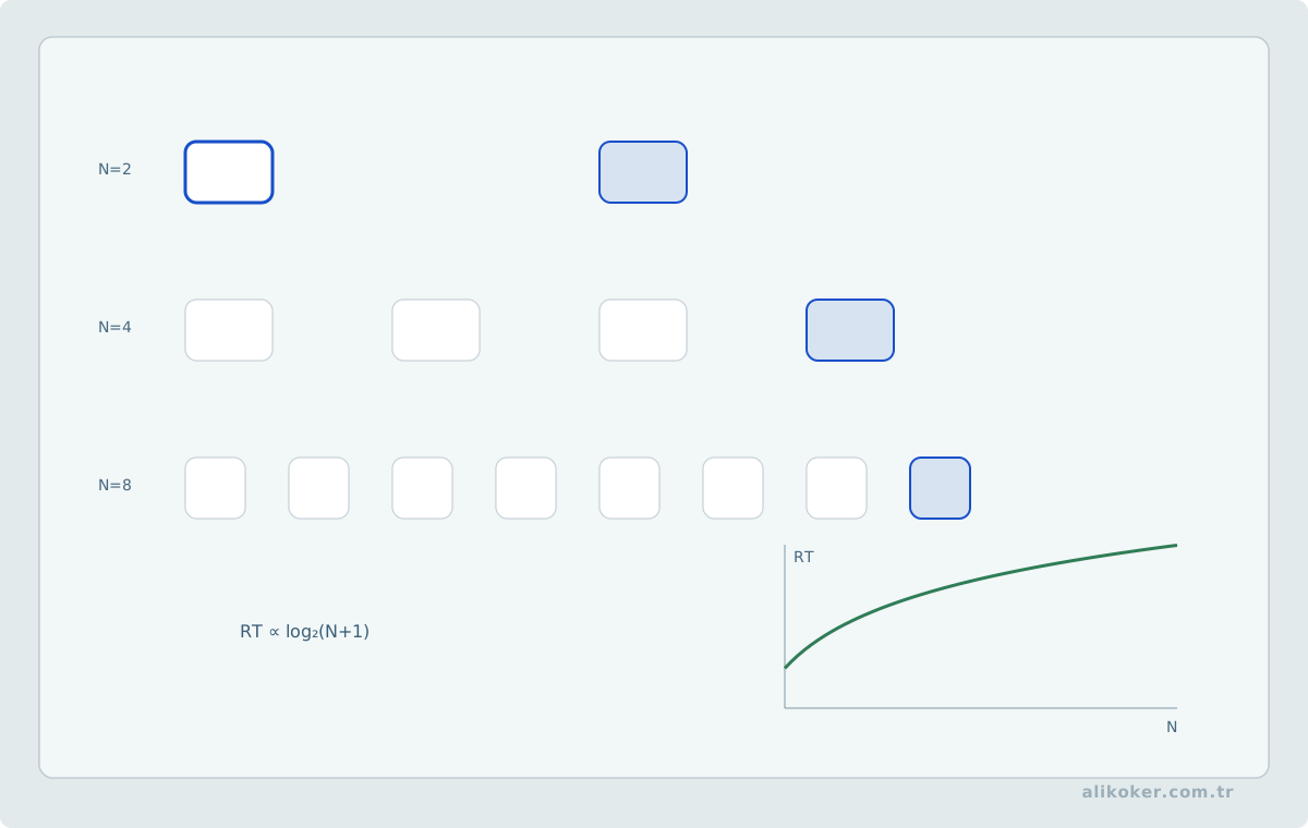
As the number and complexity of choices increases, decision time can also increase. This matters for:
- menus,
- categories,
- filters,
- initial actions.
The solution is not always to reduce the number of options. Good grouping and search can make a large choice space manageable.
Do not misuse Miller's number
The claim “people remember only 7 ± 2 items, therefore a menu may contain at most seven choices” is not a reliable UI rule.
Menu use involves:
- recognition,
- categorization,
- visual scanning,
which differs from a working-memory recall task.
Do not use the user's memory as a database or their attention as an unlimited processor.
Affordance, Signifier, Mapping, Constraint, and Conceptual Model
Don Norman's design approach considers not only whether a control exists, but whether the user can understand how it should be used.
Affordance
An affordance is an interaction that an object makes possible.
Signifier
A signifier communicates that the interaction is possible.
On the web, signifiers can include:
- borders,
- underlines,
- button shape,
- hover/focus state,
- labels,
- icons.
Invisible clickability
Text may technically have a click handler while looking like an ordinary paragraph. The interaction exists, but the signifier is insufficient.
Mapping
The relationship between a control and its effect should be natural.
For an audio example:
Left-channel control → left channel
Right-channel control → right channel
If the mapping is reversed, the user must perform a mental transformation every time.
Constraints
It is often safer to narrow the available action space than to accept an invalid action and explain it afterward.
For example, if:
End date < Start dateis invalid, the design can consider preventing impossible selections rather than waiting until submission to report the error.
Conceptual model
The user's mental model does not need to match the real architecture exactly, but it must be sufficient to predict behavior.
For example, “Draft” should support a clear model such as:
Draft → temporary work visible only to me
Publish → others can see it
Good design embeds as much of the operating manual as possible into the behavior of the object itself.
The system image
Users cannot directly see the architecture in the designer's head. They form their model of the system from controls, labels, visible state, feedback, help, previous experience, and the behavior they observe. This combined surface can be treated as the system image.
If the system image contradicts actual behavior, the implementation may be technically correct while the user forms the wrong expectation. For example, after pressing:
[Save]if no state change is visible and closing the page leaves the user unsure whether data persisted, the interface is not helping the user build a reliable conceptual model.
Using different names for the same concept, applying a change immediately on one screen but requiring an extra Save action on another, or allowing visible state to diverge from server state all weaken the system image.
A good system image does not require exposing internal architecture. It must expose the correct result, scope, and state required to predict the task.
Knowledge in the head and knowledge in the world
Users should not have to remember everything. Some knowledge can remain in the interface:
- active filters,
- current scope,
- current date range,
- the open record,
- whether a change has been saved,
- available shortcuts,
- the next plausible action.
Externalizing this context reduces working-memory demand and is especially valuable in interrupted workflows.
For example:
query criteria
→ result set
→ analysis
If the analysis already inherits the query's date range, asking for the same dates again is not gathering new information; it makes the user repeat information the system already knows.
Keeping known context visible and stable allows the interface to explain itself without adding more help text.
Touch Ergonomics and Physical Interaction
A touch interface is a physical control surface as well as a visual one. A mouse pointer occupies only a small visual area, while a finger occludes part of the target and its surroundings; the hand, arm, and device weight also contribute to interaction cost. Touch design is therefore not merely a problem of making buttons larger.
Grip and posture are not fixed properties
How a device is held depends on more than the device model. The same person may use it:
- while standing,
- while seated,
- on a desk,
- one-handed,
- two-handed,
- while bracing it against a surface.
Orientation can change, and the supporting hand and operating hand can switch. A single fixed “thumb zone” should therefore not be treated as a universal truth across all users and sessions.
A more robust question is:
Can the frequent controls for this task be used across a reasonable set of supported postures without unnecessary physical strain?
Layout should follow task frequency, form factor, orientation, and observed use rather than one ergonomic diagram.
Contact patch and occlusion
A finger does not contact the screen as one mathematical point. The sensor derives a position from a contact area. For interface design, the more important consequence is often occlusion: while touching a target, the user may temporarily lose sight of the target itself and of nearby feedback.
This has three direct consequences:
- A control should not depend only on a small color change underneath the finger.
- A label or critical state cue should not disappear entirely under the contact area.
- The result of selection should remain understandable after contact ends.
Instead of relying on a subtle icon-only state change, selection can be reinforced at the row, border, text, or persistent-state level. Feedback must exist where and when the user can actually perceive it.
Touch accuracy is not only target size
The practical usability of a control is a combination of:
target size
+ spacing to neighboring targets
+ position on the surface
+ frequency of use
+ occlusion during contact
+ user motor capability
+ cost of a wrong activation
“All buttons should use one size” is therefore not a complete rule. Two individually adequate targets can still produce errors when packed too tightly. Conversely, a spacious surface can justify larger targets for frequent or high-impact actions to increase error tolerance.
Normative accessibility criteria define a minimum acceptance boundary. Ergonomic evaluation determines the additional safety margin required by the real task.
Physical cost and action frequency
Moving a mouse across a large display and repeatedly moving an arm across a large touchscreen do not have the same motor cost. On larger touch surfaces, widely scattered frequent controls can increase physical load even when the number of interactions is unchanged.
For high-frequency work it is therefore useful to:
- avoid distributing repeated actions across unnecessary distances,
- keep related actions in stable regions,
- reduce avoidable touch count,
- preserve keyboard and precise-pointer accelerators for expert users.
The objective is not to move everything into one corner. It is to evaluate motor cost together with task importance.
Risky actions must balance reachability against accidental activation
A frequent primary action should be easy to reach. Permanent deletion, irreversible submission, or broad-scope modification should not, however, be placed next to high-traffic controls merely for speed.
Three mechanisms can work together:
spatial separation
+ explicit action wording
+ undo / confirmation / preview appropriate to the consequence
A confirmation dialog is not a substitute for poor target placement. Reduce the probability of accidental activation first.
Touch and visibility must be designed together
Users can act safely only on controls they can both reach and understand. Iconography, labels, contrast, target geometry, and feedback are therefore not independent quality dimensions on a touchscreen.
A control may be:
- easy to touch but undiscoverable because it looks decorative;
- visually obvious but error-prone because its target is crowded;
- correctly sized but ambiguous because feedback disappears beneath the finger.
Affordance, signifier, and feedback become three layers of the same physical event.
A fixed touchscreen is not a handheld tablet
Mounting a tablet on a stand may leave its resolution unchanged while changing its ergonomics completely. The user can no longer reposition the device; the arm has to travel to the surface. Repeated reach to upper regions of a large or vertical display can create shoulder and arm fatigue.
A kiosk, control panel, or fixed tablet therefore requires separate consideration of:
- sustained arm movement,
- reachable height,
- user stature and mobility,
- display angle,
- environmental reflection,
- privacy from the next user in line.
The same HTML and the same resolution do not imply the same human-factors problem.
Interaction as Conversation — Feedforward and Feedback
Designing Interfaces frames interaction as a conversation between the user and the system. Strategic Writing for UX treats the words in that conversation as a systematic design problem.
Feedforward
Before an action, answer:
What will happen if I do this?
[Export 24 records]provides more useful feedforward than:
[OK]Feedback
After the action, answer:
What happened?
24 records exported.Better action labels
Instead of a generic:
[Submit]use a label that reflects the result when possible:
[Submit Application]
[Generate Report]
[Save Changes]
The rhythm of system communication
Opening a modal for every small state change is like constantly interrupting the other person in a conversation.
A more natural rhythm is:
- minor status → inline/state area,
- important but transient → notification,
- action required from the user → persistent visible message,
- critical decision → modal or dedicated step.
The interface should speak sparingly, but never ambiguously when it does speak.
Designing for Human Error — Slips, Mistakes, and Recovery
Don Norman treats human error not as an isolated defect in the user, but as part of the design problem between people and systems.
Slip
The goal is correct but execution is wrong.
Examples:
- clicking Delete on the wrong row,
- touching the adjacent menu item,
- pressing
Enterinstead ofCtrl+Enter.
Mistake
The user's mental model or decision is wrong.
Examples:
- interpreting “Archive” as “Delete,”
- misunderstanding the scope of a date filter,
- assuming inactive records will not be visible.
Different error, different remedy
For slips, useful protections include:
- larger targets,
- separating destructive actions,
- undo,
- correct focus behavior,
- stable layout.
For mistakes, the solution may require:
- better labels,
- clearer scope,
- preview,
- a better conceptual model,
- help.
Mode errors and visible state
When the same action has different effects in different modes, the user must continuously know which mode is active. As unnecessary modes accumulate, the chance of applying the right action in the wrong context increases.
If a mode is unavoidable:
- the active mode should be conspicuous,
- mode changes should not happen silently,
- the meaning of the same control should not change unexpectedly,
- risky modes should be distinguishable from ordinary work.
For example, if the Delete key only clears a selection in one view but permanently deletes a record in another, weak context signaling creates unnecessary risk.
“Pay more attention” is not a design control
Experienced users naturally perform many actions without consciously reconsidering every step. Safety should therefore not depend on the assumption that users will maintain full attention for every repeated action.
Separating similar controls, placing destructive actions away from frequent actions, showing scope before execution, and providing clear feedback afterward are more reliable defenses.
Plausibility and boundary checks
A system can evaluate not only whether input is syntactically valid, but also whether it is unusual in context.
Examples include:
- a monetary amount several orders of magnitude above normal,
- a date completely outside the selected query range,
- a bulk deletion affecting thousands of records,
- a selection outside the user's authorization scope.
Such checks do not always need to reject the operation. Depending on risk, the system may restate the scope, require stronger confirmation, or block the action on the server.
The goal is not to warn constantly; it is to avoid silently accepting implausible state.
Forcing functions
Some critical operations should make an invalid sequence impossible.
For example:
The mutation API cannot execute until permission scope has been validated.Hiding a button in the UI is not a forcing function for security; the rule must exist as a server-side invariant.
Confirmation fatigue
If every action triggers confirmation, users learn to confirm without reading.
Confirmation is meaningful mainly when there is:
- high impact,
- low frequency,
- irreversibility,
- unclear scope.
“Do not make mistakes” is not design. Narrow the path to error, make errors visible, and make the resulting harm reversible whenever possible.
How to Use the “Laws” of UX Psychology
Laws of UX makes psychological findings accessible under memorable headings. These are not context-free laws of physics.
Jakob's Law
Users spend most of their time in other products, so established conventions shape expectations in a new one.
Result:
Breaking standard behavior requires a measurable reason.Fitts's Law
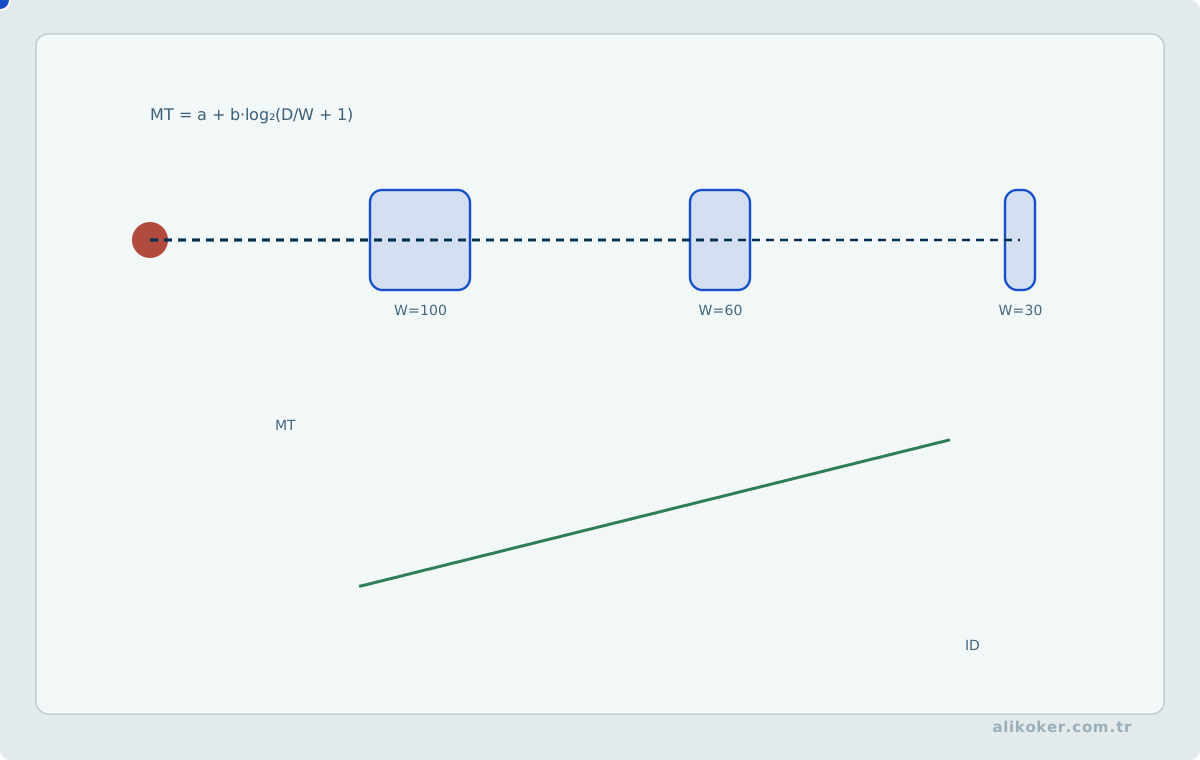
Time to reach a target is related to its:
- distance,
- size.
A frequent action should not be tiny and far away.
Hick's Law
As the decision space grows more complex, selection time can increase.
Possible responses include:
- grouping,
- defaults,
- search,
- progressive disclosure.
Postel-style tolerance
Tolerance in parsing user input can be useful, but unlimited tolerance in security or data semantics can produce incorrect results.
These phone representations may normalize to the same semantic value:
(555) 123-45-67
5551234567
555 123 45 67
But:
invalid date
unauthorized scope
must not be accepted in the name of tolerance.
Peak–End Rule
People's evaluation of an experience can be disproportionately affected by intense moments and the ending, not only by the average moment.
That makes the following especially important:
- final confirmation,
- success screen,
- recovery from error,
- transaction closure.
Aesthetic–Usability Effect
An attractive interface may initially feel easier to use. That does not remove real usability defects.
Von Restorff Effect
An element that differs from its surroundings attracts attention.
Reserve strong differentiation for genuinely primary or critical elements. If everything is emphasized, nothing is emphasized.
Tesler's Law / conservation of complexity
Some business complexity cannot be eliminated; it can only be shifted among:
- the user,
- the UI,
- the backend,
- the process.
The system should absorb complexity where it can do so correctly. If correctness cannot be guaranteed, fake automation is not simplification.
Doherty Threshold
Fast feedback helps preserve flow. The important implication is:
- a heavy operation may not be able to finish immediately,
- but initial feedback should still be fast.
Use psychological principles as design hypotheses, not decorative “laws”; validate them against the real task.
Four Strategies for Simplification — Remove, Organize, Hide, Displace
One of the most practical frameworks in Simple and Usable treats complexity through four different strategies.
1. Remove
Candidates include:
- unused functionality,
- duplicate controls,
- meaningless explanations,
- fields that ask for data the system already knows,
- dashboard metrics that support no decision.
Critical information must not be removed merely to make the screen look sparse.
2. Organize
When complexity is real, organization matters:
- chunking,
- sections,
- hierarchy,
- prioritizing frequent work,
- ordering around user behavior,
- consistent grids.
3. Hide
An infrequent but necessary feature may move under:
AdvancedBut discoverability must remain through:
- signifiers,
- hints,
- search,
- correct labels.
4. Displace
Complexity can move to another layer.
For example:
Do not ask the user to select a date format every time
→ apply locale/system preference.
or:
Use mobile for a short task and desktop for detailed administration.“Leave the decision to the user” is also a form of displacement, and sometimes a poor one. If the system can make a safe, reliable default, it should not force an unnecessary decision.
Smart defaults
A good default should be:
- likely,
- safe,
- reversible,
- context-appropriate.
A dangerous default cannot be:
Delete all recordsSimplicity is not a sequence of cutting first and hiding later. Understand the task first; then determine which complexity genuinely needs to exist.
Unit 7: Forms, Content, Prototyping, and Trust
A Form Is Not a List of Questions; It Is a Controlled Conversation
Designing UX: Forms treats form experience not merely as label placement, but as a chain in which the user understands the question, finds the answer, judges whether the answer is appropriate, and physically enters it.
Every question has a cost
Adding a field creates costs in:
- reading,
- understanding,
- remembering,
- deciding,
- entering data,
- validation.
Therefore:
“This field exists on the backend” is not sufficient reason to put it in the form.
Language of the question
Ask for the real-world meaning, not the institution's internal data model.
Poor:
STAT_CDBetter:
Record statusDo not ask again for an answer the system already knows
If the system reliably knows:
- user identity,
- role,
- previous preference,
- context,
it should not ask again without a reason.
Smart prefill
Prefilling is useful when:
- the value is very likely to be correct,
- the user can correct it,
- privacy constraints permit it.
A wrong prefilled value can be more dangerous than an empty field because users may submit it without noticing.
Format tolerance
Data that people naturally write in different valid forms can be normalized where possible.
Normalization must not destroy meaning.
Review
For a critical form, a final sequence such as:
Input → Review → Confirmcan reduce errors, especially in multi-field mutations.
Every question is a small debt collected from the user. Do not ask unnecessary questions.
Complex Data and Actions — Separate “Show” from “Do”
Designing Interfaces describes different pattern families for lists, complex data, actions, and commands. That separation is important in dense web applications.
Data-viewing tasks
The user:
- finds,
- compares,
- sorts,
- filters,
- opens details.
Action tasks
The user:
- changes,
- saves,
- performs batch operations,
- undoes,
- exports.
When these two task families are mixed indiscriminately in the same toolbar, operational risk increases.
Selection model
A table must be consistent about whether:
click row = select onlyor:
click row = open detailsLegacy desktop behaviors such as double-click should be used carefully on the web and on touch interfaces.
Cancelability
If a long operation can truly be cancelled:
Generating report...
[Cancel]
user control increases.
But if Cancel merely hides the loading indicator while server-side work continues, the control is semantically dishonest.
Command history and undo
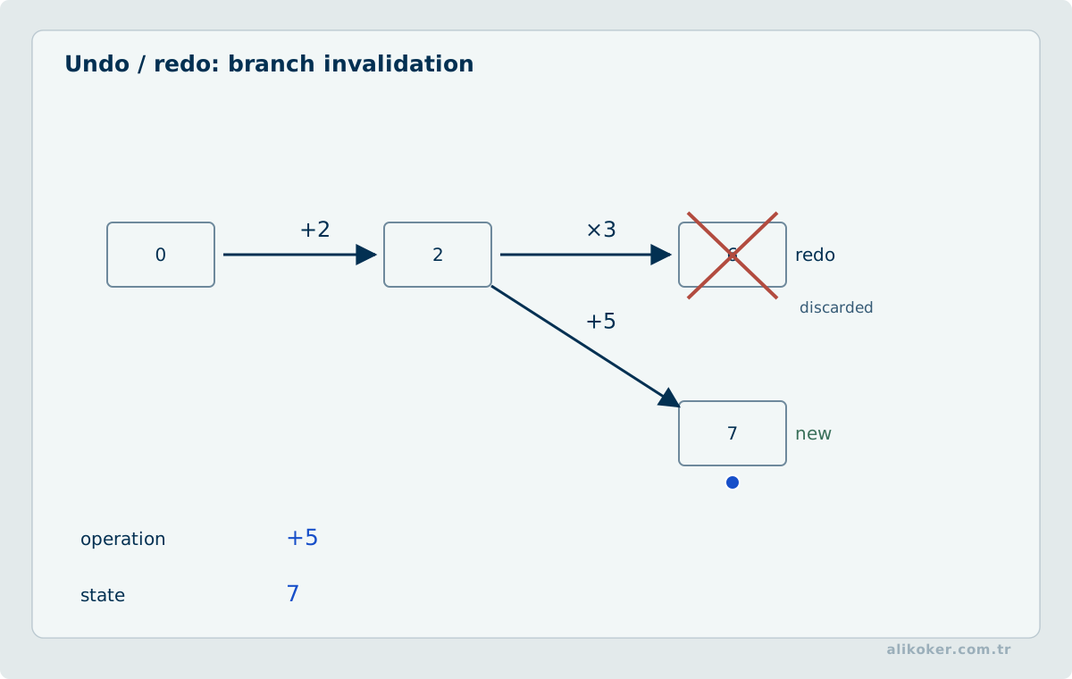
In expert tools, making past actions visible can improve:
- auditability,
- recovery,
- learnability.
Viewing data and mutating data should not carry the same visual weight.
UI Text Design — Words Are Components Too
Strategic Writing for UX treats interface text not as an empty field filled at the end, but as a functional part of the experience.
Headings
A heading tells the user location and task.
Ambiguous:
OperationsBetter:
User PermissionsButtons
Button text should describe the result.
Instead of:
[OK]prefer, where appropriate:
[Save Changes]Empty states
An empty state should explain not only that data is absent, but also what the user can do.
No records yet.
[Create new record]
or:
No records match these filters.
[Clear filters]
Errors
A good error message answers, where possible:
- What happened?
- What can the user do?
- Was any data lost?
Notifications
A notification should explain:
- what happened,
- why it matters,
- the next action if one is required.
Voice and tone
The same product does not need the same emotional tone for:
- success,
- critical failure,
- first-time guidance,
- security warnings.
A critical error should not sound like:
“Oops! Something went wrong :)”
Brevity
The goal is not the shortest possible text. The goal is the shortest sufficient text that communicates the result clearly.
Remove words that do not clear the user's path; do not withhold the words needed at a decision point.
Advanced Data Entry: Dates, Time, Files, and Bulk Input
Form engineering is not limited to text fields, selects, and a Save button. Date/time, file, paste, and bulk-data workflows make it easy for validation semantics and the user's mental model to diverge.
Date, local time, instant, and time zone are different concepts
These values are not equivalent:
2026-09-28               -> calendar date
14:30                    -> local time
2026-09-28T14:30+03:00   -> instant with offset
Europe/Istanbul          -> time-zone rule set
A form that needs a calendar date should not collect unnecessary time information. A system that needs an unambiguous instant usually cannot rely on 28.09.2026 14:30 without knowing how that value is anchored to a time zone.
Structured controls can reduce invalid input when they fit the domain rule, but the control must fit the task, not merely the data type. For example, forcing a user to navigate a calendar month-by-month for a known historical birth date can be worse than direct entry.
Localized display and server-side storage representation should remain separate concerns. The user may see 28.09.2026 while the data layer uses a different precise representation. Treating the display format as the storage contract creates internationalization and validation defects.
File upload is a state machine
File selection is more than rendering <input type="file">. From the user's perspective the workflow includes:
not selected
 -> selected
 -> client pre-check
 -> uploading
 -> server validation
 -> completed
plus failure branches.
Size limits, accepted file types, multiple-file behavior, and what happens after upload should be understandable before the user commits to the action. If transfer takes time and measurable progress exists, show real progress. If cancellation is offered, it should stop the client request and, as far as the architecture allows, the server-side work that the user reasonably understands as cancelled.
A file extension or client-provided MIME type is not a security guarantee. Client checks improve early feedback; the server must still validate actual content and domain rules.
Paste and bulk entry are distinct interaction paths
Expert users may prefer pasting hundreds of values or importing a file rather than entering records one at a time. That workflow should not be treated as merely a larger textarea.
A reliable bulk-input flow makes these stages visible:
received row
 -> parsed
 -> validated
 -> accepted
 -> rejected / needs correction
"3 errors" is less useful than showing which rows failed and why. A pre-import preview can prevent hundreds of incorrect records caused by delimiter, encoding, or column-mapping mistakes.
Clipboard input should not be assumed trustworthy or structurally clean. Invisible characters, locale-specific number formats, line-ending differences, and unexpected columns can all affect parsing.
Do not ask again for data the process already knows
WCAG 2.2 Redundant Entry aims to reduce unnecessary re-entry of information already supplied within the same process. This is also sound form architecture beyond accessibility compliance.
system already knows it
      |
      +--> populate safely
      +--> let the user select it
      +--> ask again only if it is no longer valid
Security-driven reauthentication is a different requirement; usability should not be used as a reason to remove a necessary security control.
Terminology Governance and Content Consistency
Interface writing is not only about writing each sentence well. In long-lived applications, naming the same concept differently across modules creates cognitive cost.
same concept
 -> "Record"
 -> "Item"
 -> "Object"
 -> "Result"
If those words do not represent genuinely different domain concepts, users are forced to reclassify the interface whenever they change screens.
A product vocabulary can therefore stabilize at least:
- domain terms,
- action verbs,
- state names,
- error and success language,
- authorization and privacy terminology,
- date, duration, and unit conventions.
Consistency is not mechanical uniformity. If the same verb produces materially different outcomes in different contexts, more specific language may be necessary. But unnecessary synonym variation for the same function is terminology debt, not design richness.
Prototyping — Make Behavior Visible Before Debating Design
Designing UX: Prototyping and Figma-oriented material treat prototypes not simply as visual mockups, but as tools for testing hypotheses.
Fidelity should match the question
Low fidelity:
- information architecture,
- task flow,
- comparing ideas.
High fidelity:
- real navigation,
- micro-interactions,
- responsive behavior,
- usability testing.
When is a coded prototype necessary?
A static design tool may not represent reality when the important variables include:
- actual keyboard behavior,
- scrolling,
- virtualized grids,
- audio/video,
- performance,
- API states,
- touch input.
A prototype is not production
A prototype that works with:
fake data + one user + zero latencyis not equivalent to production with:
high latency + authorization + concurrency + duplicate data + failureTest scenarios
Instead of asking:
Do you like this design?
give a task such as:
Find an incomplete application from the last three months and open its details.
Move design discussion away from a contest of opinions and toward observation of behavior.
Emotional Design, Trust, and Perceived Quality
Don Norman's Emotional Design considers emotional response alongside functional correctness.
Three simplified levels
- initial perception: appearance, composition, feel,
- use: control, performance, comprehensibility,
- reflection: meaning and trust over the longer term.
Aesthetics must not hide failure
A visually pleasing interface can improve:
- initial trust,
- willingness to use,
- perceived ease.
But aesthetics cannot compensate for:
- data loss,
- unauthorized visibility,
- slow operations,
- ambiguous state.
Designing trust
In an enterprise system, trust grows from:
- consistent behavior,
- correct results,
- a clear audit trail,
- visible record timestamps,
- recoverability,
- predictable failure behavior.
Calmness is more than a color palette. A system that keeps its promises is the strongest source of calm.
Tragic Design — Sometimes the Cost of Bad UX Is More Than Annoyance
Tragic Design centers cases where design failure produces not only conversion loss or dissatisfaction, but serious real-world harm.
High-risk products
In domains such as:
- healthcare,
- public safety,
- finance,
- transportation,
- industrial control,
- authorization,
- critical infrastructure,
a UX decision can also be a safety decision.
Dangerous simplification
Hiding critical status to create a “clean interface” can exchange aesthetic gain for operational risk.
Dark patterns
Patterns that steer users toward:
- accidental consent,
- inability to unsubscribe,
- difficulty finding privacy controls,
- unnecessary sharing,
are manipulation, not usability.
Error budget
The acceptable probability of user error in a high-risk operation is not the same as for a social-media Like button.
Human factors
In a critical system, “the user should have paid attention” is a weak defense. An operator performing the same task at high frequency will never have zero probability of error. The interface should systematically reduce both probability and consequence by:
- reducing wrong selection,
- making state visible,
- explaining critical outcomes clearly,
- providing a second safety layer where appropriate.
Do not hide reality in the name of simplicity. Critical information may be quiet; it must not be invisible.
Unit 8: Visual Systems Engineering and Consistency
Design Systems — Infrastructure for Consistency
A common lesson across Designing Interfaces, Figma resources, and works such as Practical UI Patterns for Design Systems is that a design system is more than a component repository.
Four layers
Token
  ↓
Primitive
  ↓
Component
  ↓
Pattern
For example:
space-md
  ↓
button padding
  ↓
Button
  ↓
Save Form pattern
Behavioral contract
A component is more than CSS.
A Button also needs defined behavior for:
- focus,
- loading,
- disabled state,
- keyboard operation,
- accessible name,
- duplicate-submission guard.
Pattern contract
A modal dialog standardizes behavior such as:
- focus entry,
- focus trap,
- Escape,
- close button,
- return focus,
- backdrop behavior.
Consistency and product speed
A standardized component can reduce:
- repeated decisions on every screen,
- accessibility defects,
- small behavioral inconsistencies.
A design system is not dogma
A real business problem should not be forced into an existing component when it does not fit.
When a new pattern is necessary, a traceable process can be:
problem → evidence → pattern → documentationSolving the same problem again on every screen is noise. A good system quietly removes repeated decisions.
Visual System Engineering — Turning Aesthetic Decisions into Repeatable Rules
An interface does not feel like part of the same product merely because it uses the same logo or brand color. Consistency emerges when color, typography, spacing, control height, corner radius, borders, surfaces, icons, motion, and state behavior are derived from the same decision system.
It is therefore misleading to frame visual design as either:
free aesthetic preference
or
rigid pixel standard
A mature approach lies between the two:
raw value
   ↓
design token
   ↓
semantic role
   ↓
component
   ↓
pattern
   ↓
page template
For example, #d32f2f is only a color. color-danger-foreground expresses intent. The same semantic role can map to different raw colors in light and dark themes while component code remains unchanged.
Separate universal requirements from design-system choices
There is no single industry standard for UI dimensions. Mature systems use different scales. Fluent 2 uses a spacing scale based on 4 px, Atlassian uses an 8 px base, USWDS uses an 8 px-based system while also supporting smaller intermediate values, and GOV.UK defines its own spacing scale.
The conclusion is not “which one is correct?” The useful question is:
Within the same product, are we using a constrained scale that satisfies task and accessibility needs without inventing arbitrary values?
Normative requirements are different. WCAG defines testable accessibility conditions in areas such as contrast, reflow, target size, and text spacing. These do not have the same evidential status as a brand or design-system preference.
Primitive, semantic, and component tokens
Three layers are useful:
Primitive:   blue-600, space-4, radius-2
Semantic:    action-primary, surface-muted, gap-form
Component:   button-primary-bg, dialog-padding
Primitive tokens form the raw vocabulary. Semantic tokens describe roles. Component tokens make it possible to tune one component when necessary without breaking the broader system.
It is also wrong to turn every CSS value into a token. A genuine one-off exception should be distinguished from a systemic decision. But if the same 13px, 17px, #737373, or border-radius: 7px appears across several screens, the product already has a design decision; it is simply undocumented.
Page templates are part of the design system
A design system is not only a collection of buttons and inputs. Large applications can also standardize recurring page anatomies:
List page
Title → global actions → search/filter → data surface → pagination/status

Detail page
Title → identity/status → primary actions → content sections → history

Form page
Title → context → field groups → error summary → actions

Wizard
Progress → step title → step content → back/next → state preservation
These templates do more than make modules look similar. They reduce the cost of deciding where to begin on an unfamiliar screen.
Color Systems — From Palette to Semantics
Color carries state, hierarchy, and interaction meaning in addition to brand identity. A “pleasant color palette” and a “working UI color system” are therefore not the same thing.
Three different jobs for color
Within a product, it is useful to distinguish at least three classes:
- neutral colors: for surfaces, text, borders, and separation,
- brand/action colors: for primary actions and product identity,
- status colors: for semantic states such as success, warning, error, and information.
When these roles are mixed, meaning becomes ambiguous. If red is simultaneously the primary brand color, selected tab color, error color, and a chart-series color, users must infer what red means from context every time.
Semantic color instead of raw color
red-600                → raw color
error-foreground       → semantic role
error-surface          → semantic role
error-border           → semantic role
An error state cannot be solved by one red value. Text, background, icon, border, and interaction states have separate contrast relationships.
Color harmony and UI
In graphic design, complementary, analogous, triadic, and similar color relationships can help build a composition. In an operational interface, however, color harmony should not override functional semantics.
A brand palette can be broad while the product surface works more consistently with a narrower functional palette. Neutrals can establish the working surface, while saturated colors are reserved for the small number of places that require attention.
Ratios such as “60/30/10” appear as compositional guidance in some design systems; they are not accessibility requirements or universal laws of UI.
Contrast is not only a text problem
Under WCAG 2.2, the general threshold is 4.5:1 for normal text and 3:1 for large text. Relevant contrast requirements also apply to meaningful UI component boundaries and graphical objects.
Contrast should not be reduced to a ratio alone. The following also matter:
- thin font weights,
- poor-quality displays,
- bright environments,
- halation in dark themes,
- color-vision differences,
- forced-colors / high-contrast modes,
- small icons and boundaries.
Status color is not a single channel
Instead of:
red areause a multi-channel signal such as:
[!] The record could not be savedColor, icon, text, and structure should work together when necessary.
Dark mode is not color inversion
Mapping #fff ↔ #000 can destroy surface hierarchy and contrast. In dark themes:
- surface layers should use deliberate neutral steps,
- elevation may need to be expressed through surface color because shadows are weaker,
- highly saturated colors should be controlled to avoid glare,
- status colors should be validated separately,
- icons and images should be tested in the theme.
When light, dark, and high-contrast themes share the same semantic token layer, components do not need to reinvent theme logic locally.
Separate data colors from UI status colors
Categorical chart colors and success/warning/error colors are not the same vocabulary. If a bar happens to use the product's error red simply because it is the third series, users may confuse data encoding with status semantics.
Data-visualization palettes should be separated by purpose:
- categorical,
- sequential,
- diverging,
- status-based.
Typography — Readability, Scale, and Rhythm
Typography is more than selecting a font family. Font size, weight, line height, line length, letter spacing, paragraph spacing, and numeric presentation form one reading system.
There is no single “standard font size”
16 px is a common starting point on the web, but it is not a mandatory size for every piece of UI text. Mature design systems use different body and label sizes for different contexts. What matters is that:
- text remains readable in its real context,
- the layout survives browser zoom,
- hierarchy comes from a constrained and consistent scale,
- small text is used carefully for secondary information.
Relative units such as rem can integrate better with root font-size preferences. Merely changing the unit, however, does not guarantee accessible typography.
Typographic roles
An example semantic scale:
display
heading-xl
heading-lg
heading-md
body-lg
body
body-sm
label
caption
code
These names are more meaningful than raw values such as 18px or 20px. A heading role can map to a different physical value on another platform or viewport when needed.
Line height
Line height should not be selected independently from font size. Long-form text generally needs more leading than a compact UI label.
WCAG's Text Spacing criterion requires content and functionality to survive when users override spacing up to specified values. Those values are not mandatory default styling; they are a resilience requirement against user-controlled text spacing.
Line length
Stretching a paragraph across a 4K display is not a good use of available space. Long lines can make it harder for the eye to find the beginning of the next line.
Content sites can use a controlled max-width and a ch-based reading measure. GOV.UK deliberately constrains long lines in content layouts. A data grid or timeline does not need to follow the same width limit.
Weight and emphasis
Hierarchy does not need to rely on font size alone. It can combine:
- weight,
- color,
- spacing,
- position.
If every heading is large, bold, and colored, the interface does not have hierarchy; everything is shouting at once.
Uppercase text
Long text or many control labels in all caps can reduce readability. Where uppercase data is required, Turkish locale rules must be respected; the i/İ and ı/I transformations cannot safely be delegated to ordinary English casing logic.
Typography for numerical data
In tables and counters, varying digit widths can make columns visually jitter. If the font supports them, tabular numerals can make comparison easier.
Monospace type can be useful for code, personnel numbers, hashes, or technical identifiers. This does not imply that the whole interface should use monospace.
Font loading behavior
Web-font selection is also a performance and layout-stability problem. Metric differences between fallback and target fonts can contribute to CLS. In a critical application, waiting for a brand font should not delay the primary task.
A system font stack can be the better choice in products where performance and platform fit matter more than distinctive typography. If a brand font is required, file size, subsetting, preload strategy, and fallback metrics should be considered together.
Spacing, Grid, Density, and Sizing
Spacing is not a “make it look nicer” setting. It is a language for relationships and separation. Random values such as 11px, 13px, 17px, and 23px gradually create visual drift.
Margin, padding, and gap are not the same
paddingdescribes the distance between a component boundary and its content,margindescribes the relationship outside the component,gapdescribes the relationship between sibling items in a layout.
In Flexbox and Grid, gap is often more predictable for sibling spacing than distributing directional margins across individual items.
Micro and macro spacing
The same spacing scale serves different levels:
micro:      icon ↔ label
component:  input internal padding
pattern:    distance between form fields
page:       distance between sections and panels
Nearby elements are perceived as related; larger gaps signal a new group. This is a direct UI application of the Gestalt principle of proximity.
Grid systems
A grid is not a set of lines that must be visibly drawn on the screen. It is scaffolding that constrains alignment decisions. Distinct concepts include:
- columns,
- gutters,
- outer margins,
- content containers,
- nested grids,
- component-level grids.
A 12-column grid is common, but it is not a standard. Forms, dashboards, and media layouts may use different structures.
CSS Grid and Flexbox
Flexbox is usually more natural for one-dimensional distribution, while CSS Grid is often stronger for two-dimensional layout. This is not an absolute law, but the primitive should fit the relationship instead of forcing a layout into the wrong model.
Tools such as minmax(), auto-fit, auto-fill, min-content, max-content, fit-content, and subgrid can reduce dependence on fixed pixel widths.
Content containers and work surfaces
One global max-width should not be applied to every page.
- long-form text → controlled reading width,
- form → enough space for the task without unnecessary expansion,
- data grid → work surface that can use available width,
- chart/timeline → area that can expand when the added width carries meaning.
A design system can therefore define more than one page-container role.
UI density
“More spacious” is not always “more usable.” For an experienced operator processing hundreds of records a day, excessive spacing means more scrolling, visual travel, and pointer movement.
Density can be modeled in profiles such as:
compact
comfortable
spacious / touch-oriented
Density is more than a smaller row height. Target size, text readability, row selection, keyboard navigation, and misclick risk must be evaluated together.
Control height
Equivalent buttons, inputs, and selects with arbitrary heights disrupt alignment and rhythm. A control-size scale can be defined:
small
medium
large
Raw values depend on the design system. On touch interfaces, the visible control can be smaller than its effective hit area as long as the interaction target remains adequate.
Corner radius and borders
Radius is part of visual identity, but every component does not need its own value. A constrained scale is usually enough:
radius-sm
radius-md
radius-lg
radius-pill
pill can be reserved for specific semantics or component families. Excessively rounding every card, input, and panel does not create information hierarchy.
Borders can likewise use semantic roles such as subtle / default / strong instead of arbitrary gray values.
Surfaces, Elevation, Iconography, and Motion
A product's shared design language extends beyond color and spacing. Layering, iconography, and motion also need a common vocabulary.
Surfaces and elevation
Turning every panel into a card with a shadow does not create hierarchy. Surfaces can be separated through:
- background tone,
- border,
- spacing,
- elevation/shadow.
Elevation is especially useful for temporary or overlapping layers:
base
raised
sticky
popover/dropdown
modal
notification
These visual roles do not mean that elevation and CSS z-index are the same concept.
Z-index systems
z-index: 99999 is a short-term fix and long-term stacking-context debt. Layers should use a constrained token set. A modal appearing below a tooltip or a dropdown being clipped by a sticky header often comes from an unplanned layer model.
Elevation in dark themes
Shadows can become hard to perceive on dark backgrounds. Systems such as Atlassian therefore also use surface tone as an elevation signal in dark themes. Simply inverting a shadow is not enough.
Icon families
Mixing icons from unrelated sets with different stroke widths, fills, perspectives, and optical weights produces a small but persistent inconsistency.
An icon system can define:
- a shared grid,
- a constrained size scale,
- a consistent stroke/fill language,
- baseline relationships,
- accessible naming,
- icon-to-text spacing.
Icon-only controls are safest when their meaning is truly conventional. Institution-specific actions are usually stronger with a text label.
Geometric and optical alignment
A triangular play icon can look left-shifted even when it is mathematically centered in its box. Circular shapes, chevrons, and asymmetric glyphs may require optical correction.
This is not an excuse for arbitrary pixel nudging. If an exception is needed, it should be documented and repeatable at component level.
Motion systems
Animation duration and easing can also be tokenized. The more important question, however, is not “which easing looks modern?” but:
Which state transition does this motion explain?
Useful motion can:
- explain source-to-destination transformation,
- show where a layer came from,
- make state transitions visible,
- direct attention to the relevant region.
Unnecessary motion produces perceived delay and distraction.
prefers-reduced-motion should not always be interpreted as “remove every animation.” Meaningful feedback can remain while motion intensity is reduced.
Visual and Behavioral Consistency Across Modules
One of the most common forms of design debt in large applications is that each module gradually develops its own small design system.
If one module has:
Save = blue, bottom-right, Ctrl+Sand another has:
Save = green, top toolbar, no shortcutthe problem is more than aesthetic. Users have to relearn the same concept in each module.
Layers of consistency
Across the same product family, at least the following layers should be reviewed independently:
- terminology,
- color and typography,
- spacing and component anatomy,
- action hierarchy,
- error/loading/success feedback,
- keyboard behavior,
- modal/side-panel patterns,
- responsive transformation,
- empty/read/loading states.
Two components that look identical but behave differently can be more dangerous than two components that look different but behave the same, because the first case creates a false expectation.
Component anatomy
A standard form field is more than an <input>:
label
optional/required state
control
helper text
validation message
loading/read-only/disabled state
If every module rebuilds this anatomy, validation presentation and spacing will drift over time.
Action hierarchy
Primary, secondary, tertiary, and destructive actions should use the same visual language and similar positional logic throughout the application.
If every screen contains three “primary” buttons, the concept of primary action has lost meaning.
A destructive action is not just a red button. Label, scope, position, and confirmation/undo behavior all contribute to its semantics.
Design drift
Typical signals include:
- five padding variants of the same button,
- four radius values for the same kind of panel,
- three different reds for similar errors,
- different heights for equivalent toolbars,
- different spinner patterns for the same loading state.
Each difference looks small in isolation. Together they increase both learning cost and maintenance cost.
Consistency is not dogma
If a genuinely different task requires a different component, it should not be forced into an existing pattern. But the justification should not be “another team built this screen.”
A useful process for a new variant is:
existing pattern is insufficient
      ↓
define the task difference
      ↓
define accessibility/behavior boundaries
      ↓
create the variant
      ↓
document and share it
Implementing Design Tokens with CSS Custom Properties
Design tokens should not remain an abstract design-system concept. In web applications, CSS custom properties provide a natural way to turn semantic decisions into a runtime styling contract.
A layered model is useful:
primitive value
    ↓
semantic token
    ↓
component token
    ↓
contextual override
Instead of repeating values such as 12px, 14px, or 36px directly across components, spacing, control height, surface, border, and typography decisions can be expressed through semantic variables. Dark/light themes, comfortable/compact density, coarse/fine pointers, and narrow/wide containers can then adapt those decisions without duplicating component code.
Tokenization is not a goal by itself. Creating a variable for every isolated pixel value can make the system harder to read. A token is most useful when the value has multiple consumers or carries system-level meaning.
Bounded fluidity with calc(), min(), max(), and clamp()
Fluid values are useful in responsive design, but unbounded scaling can damage ergonomics. Controls becoming smaller on a larger display, or text becoming unreadable on a constrained display, is not evidence of good responsiveness.
Typography, spacing, and control sizing should instead follow this model:
minimum readable/usable floor
        +
context-aware fluidity
        +
maximum visual-balance ceiling
This is especially important in long-lived operational applications: as screens grow, the main benefit should be more useful workspace, not smaller controls.
Font Loading, Layout Stability, and Variable Fonts
Typography is more than font family and nominal size. A late-loading web font can change text metrics, move layout, and expose the user to blank or suddenly reflowed text. Font choice is therefore also a performance and layout-stability decision.
font-display, an appropriate fallback stack, tools such as font-size-adjust/size-adjust when justified, and avoiding unnecessary font variants can improve perceived quality. Variable fonts can expose multiple weights or axes in one resource, but file size, actually used axes, and product needs still need to be evaluated together.
For tables and numeric dashboards, features such as font-variant-numeric are not merely decorative. Tabular figures can make changing values easier to scan and keep columns visually stable.
Modern Color and SVG: Resilience Before Novelty
OKLab/OKLCH, wide-gamut color, color-mix(), and relative-color capabilities can improve systematic theme and tonal generation. Essential tasks and contrast requirements should not, however, depend exclusively on a new color feature. Modern color capabilities are better treated as enhancement layers over valid fallback colors.
The same principle applies to SVG. SVG is powerful for sharp scalable icons, theme-aware graphics, and reusable symbols, but accessible naming, title/description requirements, hiding decorative graphics from assistive technology, and dependable loading remain separate concerns from visual quality. An optimized SVG is not only a smaller file; it can also be a cleaner and more maintainable icon primitive.
Unit 9: Advanced Workflows, Data Visualization, and Cross-Device Continuity
Advanced Wizard Design — From Flow to State Machine
The earlier wizard unit discussed when linear guidance is useful. In a complex application, a wizard is no longer merely a sequence of screens; it becomes a state machine.
Wizard and stepper are not the same thing
Wizard  = workflow and transition rules
Stepper = visual representation of progress
A wizard can exist without a stepper. A stepper can also be informational and provide no direct navigation.
The USWDS step indicator guidance recommends that forward/back navigation be provided separately and that every step have its own explicit heading.
State model
A single active=true/false is often insufficient. More realistic states include:
not-started
current
valid
complete
error
skipped
locked
stale
Not every product needs all of them, but the states that do exist should be explicitly defined.
What happens when an earlier step changes?
Consider:
1. Department selected
2. Permissions selected
3. Review prepared
If the user returns to step 1 and changes the department, data from steps 2 and 3 may no longer be valid.
The system can then:
- invalidate dependent steps,
- revalidate affected fields,
- explain what was reset.
Silently carrying old permissions into the new department is a data-integrity defect.
Linear and non-linear flows
Linear wizard:
1 → 2 → 3 → 4Non-linear process:
complete tasks A, B, and C in any orderA task list can be more appropriate in the second case. Processes with dynamic steps, arbitrary completion order, or multi-day progress should not be forced into a linear wizard because the progress indicator can become misleading.
Branching
Some answers can change later steps:
A selected → 2, 3, 5
B selected → 2, 4, 5
Showing “5 steps” at the beginning can be wrong in such a flow. Progress copy should remain consistent with the real workflow model.
Save and continue
Long processes can store a server-side draft. This improves resilience against:
- session timeout,
- browser closure,
- device changes.
Draft storage still requires access control, sensitive-data analysis, and versioning. Storing the entire form in local storage is not automatically the right solution.
Step validation
At the end of each step, server-side business rules relevant to that step can be validated in addition to client-side checks. Performing all validation for the first time on the final page can send users from the end of the process back to the beginning.
Conversely, rerunning expensive validation on every small input change can create unnecessary latency if the result has no effect on the next step.
Accessible progress
Progress should not exist only as a visual line or numbered circles. The current step and total should be understandable as text, and the page title and main heading should also reinforce location.
If completed steps are clickable, their link semantics must also be available to keyboard and screen-reader users.
Mobile wizard
A long horizontal stepper should not be compressed into a narrow viewport. Alternatives include:
Step 3 of 7
Permissions
or a short vertical/summary progress representation.
The workflow remains the same; only the density of its progress representation changes with the environment.
Real Scale in Responsive Design — More Than Width
The previous responsive-design unit covered viewport, container queries, and reflow. Production acceptance should also include height, zoom, system scaling, locale, and input method.
CSS pixels and physical pixels are not the same
A 1920 × 1080 display can expose a very different CSS viewport depending on operating-system scaling and browser zoom. A test matrix therefore cannot be based only on physical resolution.
Windows display scaling at %125, %150, or %200, combined with browser zoom, can produce unexpectedly narrow CSS viewports.
Height breakpoints
Responsive design is usually discussed in terms of width. Yet on a 1366 × 768 laptop, the combination of:
- persistent app bar,
- secondary toolbar,
- breadcrumbs,
- fixed bottom actions
can consume a large fraction of vertical working space.
Modals and wizard screens should therefore also be tested against short viewport heights.
Ultrawide and 4K
Wide screens provide two different opportunities:
- make content physically larger,
- show more related context at once.
For work applications, the second is often more valuable. A split view such as:
list | detail | related contextcan be useful.
However, controls placed at opposite edges of an ultrawide display can increase pointer travel and visual scanning. Extra space should be used without detaching actions from their context.
Content reflow vs functional rearrangement
On a narrow screen, it is not enough to let columns stack. Component anatomy can change:
desktop toolbar → primary action + overflow
persistent sidebar → drawer / compact navigation
multi-column form → single column
detail panel → separate screen
long tab list → controlled scroll / alternative selector
Functionality must not disappear during this transformation.
Logical properties
Where appropriate, physical-direction CSS such as margin-left and padding-right can be replaced with logical properties:
margin-inline-start
padding-inline-end
inset-block-start
This makes LTR/RTL adaptation easier.
Language expansion
Turkish and English do not produce labels of equal length. German or other languages may expand further. Fixed-width buttons and tabs can therefore break under localization.
If truncation is used, users must still be able to access the full text. A critical form label should not become meaningless merely because it does not fit.
Safe areas and PWA surfaces
Full-screen mobile/PWA layouts may need to account for notches, system gesture areas, and browser chrome. Variables such as env(safe-area-inset-*) can be used where necessary.
Scroll architecture
Three nested scrolling regions on one page can create focus and interaction problems for keyboard, mouse-wheel, and touch users. A single primary scroll surface is generally more predictable.
When nested scrolling is genuinely required, test:
- focus behavior,
- scroll boundaries,
- sticky headers,
- horizontal scrolling,
- scroll-position restoration.
Data Visualization and Graphic Design in Dashboards
A chart is not decoration; it is a quantitative claim. A misleading axis or inappropriate color can create a more serious misunderstanding than a purely aesthetic defect.
Data relationships should determine chart type
General mappings include:
category comparison      → bar
change over time         → line
part-to-whole            → pie/donut only for limited categories when appropriate
two numeric variables    → scatter
ordered intensity        → suitable matrix views such as heatmaps
Turning every dataset into a donut chart may create visual variety while reducing comparison accuracy.
Axes and baselines
Because bar length encodes quantity, a truncated baseline can exaggerate differences. A line chart does not always need to start at zero; the scale and interpretation should be explicit.
Dual-axis charts can make two series appear related even when that impression is largely a consequence of scale selection. They should therefore be used carefully.
Data-ink and noise
Grid lines, shadows, 3D effects, heavy gradients, and decorative frames should be reduced when they do not help users interpret the data.
The Zen question becomes:
Does this pixel help the user understand the data?
Choosing colors
Categorical palettes distinguish categories; sequential palettes communicate magnitude; diverging palettes show movement around a meaningful center.
Relying only on red vs green can fail for users with color-vision differences. Shape, pattern, labels, or direct values can provide additional channels when needed.
Tooltip is not the only information channel
Hover-only tooltips are insufficient for:
- touch devices,
- keyboard use,
- screen readers,
- print/export.
Critical values should not exist only inside hover interactions.
Chart accessibility
Charts can provide a concise textual explanation, data summary, or table alternative where appropriate. Making a screen reader traverse hundreds of SVG paths is not, by itself, an accessible visualization.
Number cards in dashboards
A KPI card should not merely show a large number. Context may be needed:
Pending records: 125
Change since yesterday: +18
Oldest record: 3 days
If there is no trend, target, or risk context, a very large number can become empty visual weight.
Visual Quality Assurance and Design Debt
For a working UI to remain coherent over time, design principles cannot live only in documentation. Some decisions can be verified automatically or semi-automatically.
Visual regression
A component can be compared across a matrix such as:
viewport
× theme
× state
× locale
× density
Pixel-perfect screenshot diff is not a complete quality metric. Font rasterization and platform differences can create false positives. It is nevertheless valuable for detecting unexpected layout shifts, overflow, and missing elements.
Component state matrix
At minimum, core components can be reviewed in states such as:
default
hover
active
focus-visible
disabled
read-only
loading
error
selected
If the design system does not define component states, product teams are more likely to invent local styling.
Design linting
The following code patterns can signal design debt:
- unauthorized hard-coded colors,
- spacing values outside the token scale,
- arbitrary
z-index, - repeated custom radius values,
- chains of local component overrides,
- accumulation of
!important.
It may be unsafe to turn all of these into hard errors immediately. Inventorying them is often the safer first step.
Acceptance matrix
Testing a responsive page in one phone emulator is insufficient. More realistic axes include:
width
× height
× zoom / OS scaling
× keyboard/touch/mouse
× light/dark/high contrast
× locale
× reduced motion
Not every combination must be tested manually. Representative cases can be selected according to risk and usage frequency.
Measuring design debt
Visual consistency is not entirely subjective. Useful signals include:
- number of height/padding variants for the same semantic button,
- number of distinct gray text colors,
- number of non-token colors,
- number of duplicate components,
- local overrides per module,
- accessibility contrast violations,
- viewport sizes that produce overflow.
These metrics do not answer “is the design beautiful?” They reveal how uncontrolled the system has become.
Design-system governance
Before adding a new component or variant, ask:
- Does an existing component already solve the same task?
- Why is the existing component insufficient?
- Is the new behavior accessible?
- Are responsive and theme states defined?
- Is the keyboard contract explicit?
- Is there a migration plan for the old variant?
The purpose of a design system is not to block new ideas. It is to prevent every team from solving the same problem independently and differently.
Design-to-code drift
If components in Figma or another design tool evolve separately from production components, the product develops two sources of truth. A more sustainable model keeps design assets aligned with the actual component API and token vocabulary as closely as practical.
Final boundary
Visual standardization must not break proven behavior. Redesigning a critical production screen merely so that every module “looks the same” is not a safe objective.
A safer sequence is:
inventory
  ↓
shared tokens
  ↓
merge low-risk components with the same semantics
  ↓
evaluate behavioral changes separately
  ↓
validate with real tasks
Visual consistency then supports operational stability instead of competing with it.
Touch Gestures, Direct Manipulation, and Conflict Management
Touch gestures are powerful because they can connect physical movement directly to a digital result. Scrolling, dragging, and zooming can be more fluid than searching for a separate control. A gesture that has no visible representation, however, does not announce its own existence.
Discoverability
A visible button reveals that an action exists. A hidden gesture does not. If a core function can be reached only by gesture, some users may never discover it.
A more robust model is:
Visible primary path
        +
optional fast gesture
For example, a row action can remain available through a visible menu while experienced users use a supported swipe as an accelerator. The gesture should not remove the accessible path.
Complex multitouch gestures should remain secondary
Gestures requiring several fingers make stronger assumptions about motor ability, physical device use, and discoverability. They can improve productivity, but they create an accessibility risk when they become the only way to perform a core task.
Simple activation, a visible control, or a keyboard path should remain available where practical.
The operating system and browser have prior claims
Some edge movements, back-navigation gestures, application switching, zoom behavior, and contextual actions belong to the operating system or browser. Reusing the same physical gesture for a different application meaning creates two problems:
- It breaks an established expectation.
- The application gesture physically competes with the system gesture.
Platform behavior should therefore be treated as a boundary condition, especially for edge-originating gestures and gestures with established browser meaning.
Gesture density
Defining many similar gestures on the same surface increases ambiguity. A horizontal swipe might otherwise mean:
- change card,
- reveal row actions,
- close a panel,
- navigate backward in browser history.
When intent has to be inferred from a few pixels of geometry, the interaction becomes fragile. Keep the gesture vocabulary small, consistent, and context-specific.
Provide an alternative to drag and drop
Dragging creates a strong sense of direct manipulation but may require precision, motor control, and a long movement path. Reordering and transfer tasks benefit from an alternative command path:
Drag
or
[Move] → choose destination → [Apply]
This is useful not only for accessibility but also for large datasets and precise placement.
Teach gestures in context
A long launch-time tour that lists every gesture is easily forgotten. A small cue at the moment of need, a first-use hint, or a visible alternative control is more closely coupled to the task. Gesture instruction should not become a separate memorization burden.
Tablets, Hybrids, and Fixed Touch Surfaces
“Tablet layout” is not a complete interaction model. Similar-sized screens can be used in materially different physical contexts:
handheld tablet
table-rested tablet
stylus tablet
keyboard-equipped hybrid
2-in-1 laptop
fixed stand/kiosk
Tablet
Grip is variable on a handheld tablet. Users can rotate the screen, change hands, or place the device on a surface. A layout should not be locked to one one-handed-use diagram.
Hybrid computer
On a hybrid system, touch, keyboard, and precise pointer are complementary rather than competing inputs. A user may prefer the keyboard for text, touch for large targets, and the trackpad for precise selection. The interface should not treat one as primary and degrade the others.
Dense work applications in particular should preserve all of the following:
- sufficiently usable touch targets,
- keyboard order and shortcuts,
- no hover-only core function,
- visible focus indicators even in a touch-friendly layout.
Fixed surface
On a fixed display, the device no longer adapts to the hand; the person adapts to the device. Reach distance and fatigue change. A control placement that is reasonable on a handheld tablet can become costly when repeated on a large vertical surface.
Ask about the use context before the device category:
Where is the display?
How far away is the user?
Can the device move?
Is the user standing or seated?
How long does the task last?
Which input methods are available at the same time?
Responsive design manages available space; ergonomic design manages the relationship between the human and the surface.
Continuity Across Devices — A Broader Problem Than Responsive Layout
Responsive design changes layout. Multi-device experience preserves the task.
The “displace” strategy in Simple and Usable and mobile-design literature shows that some work can move to a different device or context.
Not every task is equally suitable for every device
A phone can be strong for:
- quick checking,
- notifications,
- short approvals,
- barcode/camera tasks,
- location-aware work.
A desktop can be strong for:
- large-data comparison,
- multi-column grids,
- keyboard-intensive work,
- long editing sessions.
Feature parity is not always the right target
“If desktop exposes 47 features, all 47 must be visible on the phone at once” is often the wrong model.
A better target is:
Can users complete the tasks that genuinely matter on mobile, completely and safely?
Continuity
For example:
See notification on phone
→ save the task
→ continue from the same context on desktop
State transfer
Context such as:
- drafts,
- recent items,
- saved searches,
- task state,
can be preserved safely across devices.
For sensitive data and shared-device scenarios, continuity must be evaluated together with privacy.
Do not force every device into the same screen. Preserve the same goal in a form appropriate to the device.
Adaptive Composition Without a Breakpoint for Every Change
Adding a new media query for every responsive adjustment eventually creates breakpoint inflation. CSS Grid and Flexbox can solve many layout problems without a new threshold. In particular, repeat(), minmax(), auto-fit, and auto-fill can let repeated cards, summary panels, or action groups arrange themselves according to available space.
A representative pattern is:
.panel-list {
  display: grid;
  grid-template-columns: repeat(auto-fit, minmax(min(18rem, 100%), 1fr));
}
The important lesson is not the exact line of CSS. It is to question whether a design change truly requires a breakpoint. When content can wrap naturally and a minimum usable width can be expressed, allowing the layout engine to distribute space may be more resilient than encoding device-specific thresholds.
Features such as subgrid can also let nested components share alignment with a parent grid rather than creating independent alignment systems. This can be valuable for form labels, card collections, and multi-column summaries that need consistent visual rhythm.
Breakpoints remain useful, but their role is to represent a genuine qualitative change in composition, not one separate layout per device category.
Real-Device Testing Is Not the Same as Emulation
Browser developer tools are excellent for simulating viewport size, DPR, network conditions, and some input capabilities, but they do not completely replace physical-device validation. Real devices can expose differences in:
- actual finger and pen precision;
- software-keyboard effects on the viewport;
- browser chrome;
- scrolling and animation cost on lower-powered hardware;
- font rasterization and physical readability;
- real split-screen and orientation changes.
Emulation is therefore best treated as a fast regression matrix, while physical devices validate ergonomics and real environmental behavior.
Resolution and aggregation in large-data displays
Plotting millions of points into a fixed pixel area does not automatically convey more information: many marks overlap and dense regions may become unreadable. Two-dimensional binning, count or density aggregation, and appropriate sampling are therefore analytical representation decisions, not merely rendering optimizations. Bin width, color scale and excluded-record counts can change the apparent pattern. When zoom level drives progressive detail, count totals must remain consistent under the same filter, and interactions must not silently redefine the measured quantity.
Visualizing the predictions of a clustering or classification model differs from explaining how the model behaves. A partial dependence plot averages model predictions over a chosen distribution of other predictors; with strong dependence among predictors it may evaluate combinations scarcely observed in the data. Individual conditional expectation curves can reveal heterogeneity across observations, but they are not automatically causal-effect plots either. A user must be able to follow a derived pattern back through the evaluated subset to the original records.
Quantiles or displays of possible outcomes can communicate uncertainty better than a conventional error bar, particularly for skewed distributions. Every display must specify which probability statement is represented. Samples generated from a predictive distribution should not use the same visual semantics as historical observations; otherwise forecasting and measurement become indistinguishable.
Unit 10: Further Reading and Conclusion
Recommended Books
The following works provide further reading on interaction design, usability, information architecture, forms, cognition, and interface writing.
1. Designing Interfaces, 3rd Edition
Jenifer Tidwell, Charles Brewer, Aynne Valencia — O'Reilly
Coverage:
- interaction patterns,
- information architecture,
- navigation,
- layout,
- forms,
- data,
- responsive/mobile design,
- complex application patterns.
It is a strong reference for interaction patterns and application-level design.
2. The Design of Everyday Things — Revised and Expanded Edition
Don Norman
Coverage:
- affordance,
- signifier,
- feedback,
- mapping,
- constraints,
- conceptual models,
- human error,
- human-centered design.
It provides a more fundamental design framework than any individual UI component.
3. Don't Make Me Think, Revisited
Steve Krug — New Riders, 3rd edition
A concise but strong foundation for web/mobile usability, scannability, navigation, and usability testing.
4. Web Form Design: Filling in the Blanks
Luke Wroblewski
Focuses on form flow, labels, actions, errors, and data-entry problems.
5. Information Architecture, 4th Edition
Louis Rosenfeld, Peter Morville, Jorge Arango — O'Reilly
Addresses organization, labeling, navigation, search, and findability above the individual interface-component layer.
6. 100 Things Every Designer Needs to Know About People
Susan M. Weinschenk
Covers the effect of attention, memory, perception, reading, decision-making, error, and social behavior on design, supporting analysis of cognitive budget, visibility, recognition, and recall.
7. Design for How People Think
John Whalen
Focuses not only on what users do but on how they think and process information in context. It is useful for connecting design choices to user tasks and research.
8. Designing UX: Forms
Jessica Enders
Treats forms as a sequence of understanding the question, finding an answer, judging applicability, and physically entering the result—not merely as field layout. Especially relevant to government, healthcare, and enterprise forms.
9. Designing UX: Prototyping
Ben Coleman, Dan Goodwin
Covers low/high-fidelity prototypes, test goals, tool selection, and behavioral validation with real users.
10. Laws of UX
Jon Yablonski — notes from the 1st and 2nd editions
Collects ideas such as Jakob, Fitts, Hick, Peak–End, aesthetic–usability, von Restorff, and Tesler in an accessible form. They are best treated as hypotheses to validate in task context, not universal laws.
11. Simple and Usable
Giles Colborne — 2nd edition
Explains simplification through remove, organize, hide, and displace. It is especially useful for avoiding the misconception that simplicity means fewer visible elements.
12. Strategic Writing for UX, 2nd Edition
Torrey Podmajersky
Treats headings, labels, buttons, notifications, errors, and transition text as systematic interface patterns. The referenced edition also covers 2025-era updates and content design in LLM-based experiences.
13. Tragic Design
Jonathan Shariat, Cynthia Savard Saucier
Examines cases where bad design causes real harm rather than mere dissatisfaction. It directly informs the sections on safety, error prevention, and visibility of critical information.
14. The Elements of User Experience
Jesse James Garrett — 2nd edition
Structures UX across strategy, scope, structure, skeleton, and surface planes, clarifying why visual decisions should not be detached from lower-level user needs and scope decisions.
15. Emotional Design
Donald A. Norman
Helps evaluate initial perception, use, and longer-term meaning in addition to functional usability.
16. Effective UI
Jonathan Anderson, John McRee, Robb Wilson, and the EffectiveUI team
Supports the view that user experience is not only a screen-design problem but also a problem of team process, engineering, and continuous evaluation.
17. The Psychology of Human-Computer Interaction
Stuart K. Card, Thomas P. Moran, Allen Newell — 1983; CRC Press reprint 2008
Turns task analysis, GOMS, the Keystroke-Level Model, and cognitive skill into practical engineering models. It is especially useful for comparing alternative methods in repetitive keyboard/mouse-heavy workflows where execution time matters. Its historical timing constants should be read as experimental context for the model rather than universal values for modern hardware.
18. Quantifying the User Experience: Practical Statistics for User Research
Jeff Sauro, James R. Lewis — Morgan Kaufmann / Elsevier, 2012
Brings task-completion rate, task time, errors, satisfaction, sample size, confidence intervals, reference comparisons, and statistical interpretation of user-research data into one measurement framework. It is particularly valuable for connecting a design decision not only to an observed value but also to the uncertainty around that value.
19. Designing Mobile Interfaces
Steven Hoober, Eric Berkman — O'Reilly, 2011
Approaches mobile interfaces through recurring interaction patterns, human factors, and device constraints rather than isolated screen examples. Some platform-specific details are historical, but the relationship between patterns, physical context, and control choice remains useful.
20. Mobile Design Pattern Gallery: UI Patterns for Smartphone Apps
Theresa Neil — O'Reilly, 2014
Classifies mobile-interface problems such as navigation, forms, tables, search, tools, and help through patterns and anti-patterns. Its value is not in copying individual product screens, but in comparing multiple solutions to the same task problem.
21. Touch Design for Mobile Interfaces
Steven Hoober — Smashing Media AG, 2021
Treats touch interaction as a human-factors problem broader than screen resolution. Contact area, occlusion, accuracy, physical use context, and the need to test fixed assumptions are central dimensions of touch ergonomics.
These sources cover complementary decision layers: interaction patterns, human error, form design, information architecture, cognition, interface writing, prototyping, and error cost in critical systems. Source-supported findings and engineering synthesis should remain distinguishable; details not verified in a source should not be attributed to its authors.
Micro-statistics and progressive disclosure in text editors
A text editor can expose useful measurements without becoming a dashboard. Word count, character count, sentence structure, and estimated reading time support the writing task; they are not the task itself. In a Zen-oriented interface, the practical rule is simple: do not display everything merely because it can be calculated.
A note editor may need only:
183 words · 1,164 characterswhile an article editor may show:
1,428 words · ~6 minSecondary details—letters, non-whitespace characters, sentence count, paragraphs, average sentence length, or longest paragraph—can remain behind an expandable detail affordance. This is progressive disclosure at a small scale: information is preserved without competing continuously for attention.
No heavy NLP stack is required for these metrics. A single pass can collect:
words
Unicode characters
letters
non-whitespace characters
sentences
paragraphs
lines
in O(n) time. If words per sentence and paragraph are accumulated during the same pass, averages and maxima do not require another complete traversal.
Where available, Intl.Segmenter gives more defensible Unicode-aware word and sentence segmentation than splitting on spaces. A local Unicode-aware fallback can cover older browser baselines. Character counting also needs a clear contract: JavaScript string.length counts UTF-16 code units, not necessarily user-perceived Unicode characters, so it should not be exposed blindly as a character count.
Scanning the whole text after every keystroke is unnecessary even when the text is modest. A compact interaction model is:
input
  ↓
250 ms debounce
  ↓
one O(n) scan
  ↓
update only changed DOM values
Rapid typing cancels pending refreshes and analyzes the latest state. The statistics path should remain independent of save/autosave: a delayed metric refresh must not delay persistence, and a metric failure must not alter dirty state, revision handling, or conflict behavior.
Programmatic .value replacement also matters. Loading a server revision, resolving a conflict, or applying uppercase/lowercase conversion may not emit a native input event. Existing code paths that replace editor content can explicitly schedule a statistics refresh without changing their persistence semantics.
The same analyzer can be reused for a selection:
Selected: 86 words · 517 charactersWhen the selection collapses, the editor returns to whole-document metrics. This supports copying and local rewriting without a new modal or workflow.
Estimated reading time should be presented as an estimate. With a transparent fixed assumption such as 250 words/minute:
reading_minutes ~= word_count / 250an interface can show ~6 min. Displaying seconds would imply precision the model does not have.
For sufficiently long Turkish prose, the Ateşman readability formula is a language-specific optional measure:
R = 198.825
    - 40.175 * (syllables / words)
    - 2.610  * (words / sentences)
Ender Ateşman's 1997 work, Türkçede Okunabilirliğin Ölçülmesi (Ankara University TÖMER Dil Dergisi, issue 58), adapts readability measurement to Turkish word and sentence length. Common interpretation bands are approximately 90-100 very easy, 70-89 easy, 50-69 medium, 30-49 difficult, and lower values very difficult. Readability is not writing quality: it does not measure factual correctness, domain value, expertise, or actual reader comprehension.
For that reason, a primary interface may say Readability: Medium while keeping the raw score in details. The metric should be omitted for very short text, content whose language is not reliably known, or note fields where complete prose is not expected. Omitting an inapplicable measure is better than displaying false precision.
The final architectural boundary is privacy. If these measurements can be computed from the editor's current value locally, there is no reason to resend the text merely to count words or estimate readability:
textarea value
    ↓
ephemeral client metric
    ↓
user interface
No persistence, telemetry, or network request is required. A small feature with a strict boundary can improve usability while adding almost no server-side cost.
Usability and Human Oversight in AI Interfaces
Core UI/UX principles do not change when an application uses AI. What changes is that probabilistic or generative output introduces uncertainty into an interaction that users may otherwise interpret as deterministic system state. The interface must therefore communicate what the system knows, what it proposes, and what action has actually been committed.
A model suggestion should not visually become an authoritative record before review. Generated text, a classification, or a recommendation should remain distinguishable from persisted business state. In high-impact flows, “displayed result” and “executed action” need separate interaction states.
Uncertainty should not be reduced to a percentage without meaning. A score of 0.82 is not automatically an 82% real-world probability; the model may be uncalibrated. Alternatives, evidence, or an explicit human-review state can be more useful than a falsely precise confidence display.
AI operations can also be slow. Loading state should distinguish request submission, streamed partial output, completion, timeout, and cancellation. An ambiguous wait state can cause users to repeat actions and create duplicates.
For generative workflows, a clear sequence is often safer:
proposal
↓
human review
↓
edit
↓
approval
↓
persistent action
Undo and provenance become valuable where the consequence matters. The user should be able to distinguish what the model proposed from what a human accepted or modified when accountability requires it.
Automation bias is a design concern as well. A visually dominant default suggestion can receive more trust than its evidence deserves. The opposite extreme—constant warnings—creates alert fatigue. The interface should preserve human judgment at the point where it is actually needed.
An AI interface does not require a special visual style. The essential properties are visible state, provenance, uncertainty, control, and recovery. AI should remain a bounded tool inside the user's task rather than a separate spectacle added to the product.
Conclusion
No single design formula emerges, and none should. UI/UX engineering is less about choosing one fashionable shortcut over another than about defining the boundaries of the task and its risk correctly.
Neither:
golden rationor:
three clicksnor:
mobile-firstnor:
Amazon does it this wayis sufficient by itself to justify a design decision.
A more reliable decision sequence, in my view, is:
User task
      ↓
Information architecture
      ↓
Established convention
      ↓
Accessible semantics
      ↓
Visual and interaction hierarchy
      ↓
Reliable request/state model
      ↓
Responsive behavior
      ↓
Performance
      ↓
Real-user measurement
      ↓
Iteration
The fundamental objective of UI/UX engineering is not to draw attention to the design itself, but to let the user perform the work correctly and predictably.
Breaking behavior that already works merely to look modern is not UX. But preserving a familiar behavior when it creates correctness, accessibility, or data-loss risk is not justified by habit either.
The strongest interface is one in which the user:
- knows where they are,
- sees what can be done,
- understands what the system is doing,
- can recover from error,
- trusts that data will not disappear,
- can work faster as expertise grows.
Through the Zen lens, the final equation can be shorter:
Remove what is unnecessary.
Make what is necessary visible.
Place complexity where it belongs.
Use the system instead of the user's memory.
Do not disrupt working habits without reason.
Do not push error responsibility onto the user.
Do not delay feedback.
Never trade data safety or authorization boundaries for aesthetic gain.
Do not call something “better” before measuring it.
This is broader than visual minimalism. The real objective is low cognitive noise, high task correctness, and stable behavior.
Self-Explaining Business Applications and Recovery After Failure
In enterprise applications, an error message should do more than announce failure. A user should be able to understand why an operation did not complete, which layer the problem belongs to, and what the next safe action is without learning the internal architecture. This property can be viewed as self-service operability: reducing avoidable dependence on a central support team.
A useful failure notification answers as many of these questions as the system can determine safely:
Which operation failed?
Where did the problem originate?
What is the concrete safe cause?
What can the user do?
If the user cannot resolve it, who can?
Which reference should be supplied if technical investigation is required?
The source of a failure and its cause are different concepts. The source may be a database, filesystem, external service, network, interface, or server. The cause may be missing data, invalid input, timeout, conflict, corrupt content, or an unexpected state. A broad label such as “server error” should not replace a more specific source when that source is known and safe to disclose.
The technical level of the user population also matters. Detailed implementation terminology may be unnecessary in a consumer product, while an internal expert application can benefit from statements such as “the database is unavailable,” “the file cannot be read,” or “the source service returned incomplete data.” Class names, SQL, schema details, filesystem paths, host addresses, and stack traces are different: exposing them is not better usability but unnecessary information disclosure. This boundary connects UI/UX directly to Secure Software Engineering.
The resolver also changes the meaning of a message. If the user can correct a date range, the remedy belongs to the user. If a permission can be assigned by a local administrator, directing the user to central technical support creates avoidable operational cost. If a source system is producing incomplete data, repeatedly retrying the same action is not a remedy. Good error text routes the problem to the correct next action and the correct responsible role.
Preserving context after failure is as important as the wording. Clearing valid fields, returning a wizard to its first step, losing the selected record, or resetting search criteria punishes the user a second time. The safer default is to preserve valid working context and allow the operation to continue from the same point after correction.
failure
  -> preserve context
  -> expose the safe cause
  -> identify the correctable part
  -> state the next safe action
  -> retry from the same context
Every module does not need the same visual widget. A wizard can keep the error in the active step, a data grid can use its contextual panel, and a short success notification can use a compact status surface. Consistency means the same concept uses the same language and resolution semantics, not that every screen renders the same box. The code-level counterpart of this principle relates directly to change boundaries discussed in Clean Code and Maintainability Engineering.
Short status feedback and actionable errors should also be distinguished. “Saved” can be transient. A failure that explains cause and resolution should remain readable until the user can act on it. The same principle applies to tablet and touch interfaces: critical information must not depend on hover alone.
The goal is not to make error messages long. It is to remove the ambiguity that would otherwise become a support request while keeping unsafe implementation details out of the interface.
Keyboard focus, state continuity, and recovery
Usability includes what happens after the first render. Background refreshes should not unnecessarily destroy filters, selection, scroll position, open panels, or unsaved text.
Keyboard accessibility requires more than tab navigation. Focus must remain visible, move correctly into dialogs, and return to a logical element when the dialog closes. Dynamic grids should be tested for focus loss during DOM updates.
Recovery is also UX. Preserving unsaved input, explaining what failed, and providing a safe retry path is more valuable than merely displaying an error message.
Context stability during automatic refresh
In data-dense interfaces, automatic refresh is not merely a data-fetch operation; it is a problem of preserving the user's working context. Resetting selection, focus, scroll position, or the active panel whenever rows change can turn correct data into an unusable interface.
A stable refresh separates view identity from list position. The selected object is remembered through a durable key, incoming data is ordered deterministically, and the selection is rebound to the same object whenever it still exists. If that object has disappeared, the interface should treat the event as an explicit state change rather than silently moving the user to a different row.
current view
  |-- selected identity
  |-- focus
  |-- scroll
  |-- active panel
  v
new data -> stable ordering -> rebind identity -> preserve context
Asynchronous refresh introduces a second hazard: an older response may arrive after a newer one and overwrite it. When filters change rapidly, the first request can complete last. The obsolete request can be cancelled with AbortController, or each request can carry a monotonically increasing generation number so that only the newest generation is allowed to commit its result. Network timing must not reverse user intent.
Refresh should not steal keyboard focus either. Rebuilding the DOM while the user is typing, navigating a grid, or confirming an action can break the interaction path. Existing nodes should be updated where practical; if rebuilding is unavoidable, focus should be restored through semantic identity rather than raw DOM position.
This connects the event-loop and Fetch API material in Web Programming with state-transition testing in Software Test Engineering. UI reliability is not only the quality of the first render; it is also the stability of the user's working context while data changes.
Evaluating usability through observable tasks
Visual quality does not prove that a task is easy to complete. Evaluation can use real task definitions, success criteria, error counts, completion time, and observed hesitation points.
Accessibility should not be reduced to an automated score. Keyboard flow, focus order, screen-reader names/roles, contrast, and recovery after errors need real interaction checks. Automated tools help find defects but do not prove usability.
One Lighthouse score is also insufficient for performance. Real devices, constrained networks, long lists, slow APIs, and failure states expose the operational limits of the experience.
Unit 11: The UX Decision Chain from Strategy to Surface
User experience is not a decorative layer added through color and components at the end of development. The visible interface is the downstream result of product goals, scope, information architecture, and interaction decisions. In long-lived web applications, treating these decisions as connected layers makes it easier to explain why the interface evolved into its current form.
Jesse James Garrett's five-plane model can be read as an engineering traceability structure:
STRATEGY
  user goals + business goals
        |
        v
SCOPE
  functions + content
        |
        v
STRUCTURE
  information architecture + interaction model
        |
        v
SKELETON
  navigation + information layout + control placement
        |
        v
SURFACE
  color + typography + icons + visual detail
This does not require a waterfall process. A prototype finding can invalidate a strategy or scope assumption. The value lies in preserving traceability between levels.
Strategy: whose goal are we solving?
Before drawing a screen, make both sides explicit:
- What task is the user trying to complete?
- What outcome does the product or organization need?
- Where do these goals align or conflict?
- Which observable measure indicates success?
An organization may want to collect more information while the user wants to complete a task with minimal effort. Adding every available field increases scope; it does not automatically improve UX.
Scope: a task contract, not a feature inventory
Scope includes functional and content requirements.
task
  |
  +--> required data
  +--> required action
  +--> required explanation
  +--> failure / recovery path
  +--> authorization boundary
A database field does not need to appear in the interface merely because it exists. Conversely, the user may need derived context that is not stored as one physical column.
Structure: information and behavior together
Information architecture and interaction architecture are separate but coupled. The same record can be presented through tabs, side panels, separate pages, or inline expansion.
stay in the same record context
     |
     +--> short comparison -> side panel
     +--> parallel views   -> tabs
     +--> deep subtask     -> separate page
Technical routing should not dictate the user's conceptual structure.
Skeleton: evidence behind placement
At this level, layout decisions become measurable:
- Is the primary action discoverable?
- Are related facts unnecessarily far apart?
- Does critical state fall outside the visible working area?
- Does the meaning survive keyboard and touch interaction?
Surface: last, but not irrelevant
Color, typography, icons, and motion belong to the surface. They matter, but they cannot repair a wrong task model.
wrong task model
     +
beautiful surface
     =
beautifully rendered wrong experience
Cross-layer traceability
A UI choice should have an upward rationale:
icon placement
 -> skeleton decision
 -> interaction path
 -> user task
 -> product goal
Validation can move downward:
product goal
 -> task metric
 -> interaction design
 -> prototype
 -> usability test
 -> production metric
This turns design discussion from taste into an engineering argument.
Unit 12: User Analysis, Mixed Methods, and Personas
User-centered design is not simply “thinking about the user.” It is the systematic collection of evidence about real behavior. Designer experience can provide hypotheses; it cannot replace user research.
The research question determines the method
Different methods answer different questions.
What do people do?
 -> observation / usage data

Why do they do it?
 -> interview

How do they group information?
 -> card sorting

How common is it?
 -> survey / quantitative data

Can they complete the task?
 -> usability testing
Interviews: learn without leading
A leading question asks users to approve a proposed solution.
Leading:
"Wouldn't a quick filter make this screen better?"More open:
"How do you find this record today?"The second question explores actual behavior and needs.
Observation: the gap between stated and actual work
Users may not recall routine friction during an interview. Observation can reveal:
- repeated cross-checking,
- copying data from another screen,
- waiting points,
- temporary notes,
- keyboard shortcuts,
- manual workarounds.
In expert work applications, these behaviors are often more valuable than feature requests.
Card sorting and information architecture
Card sorting can reveal how users group information. It should not be treated as an automatic menu generator; it is evidence about mental models.
organization chart != user mental modelOpen sorting lets participants create categories. Closed sorting asks them to place items into existing categories. They answer different research questions.
Mixed methods and triangulation
One method can create false certainty.
telemetry:
"Users wait here."

interview:
"They explain why."

observation:
"It reveals the behavior producing the delay."
Agreement across methods strengthens a finding. Disagreement is also useful because it exposes assumptions or measurement errors.
Persona as an evidence artifact
A persona should not be decorative fiction. It should compress recurring research patterns into a decision tool.
Useful elements include:
- goal,
- task frequency,
- domain knowledge,
- technology literacy,
- cost of error,
- device/input modality,
- contextual constraints,
- behavior patterns supported by research.
Demographic details should be included only when they affect a design decision. Decorative biography encourages stereotypes.
Scenarios
A persona answers “who?” while a scenario answers “under what conditions, trying to do what?”
persona
  +
context
  +
goal
  +
obstacle
  =
scenario
Scenarios can become prototype and usability-test tasks.
Research ethics
User research is also data processing.
- Avoid unnecessary personal data.
- Participants should understand what they consent to.
- Recording and screenshot retention should be explicit.
- Sensitive work data should not leak into research artifacts.
- Avoid framing human error as user incompetence.
- Do not recruit only the easiest expert users.
UX research should test the system against user needs, not test users against the system.
Unit 13: User Diversity, Context, and Technology Literacy
There is no universal user. The same person can behave differently under another device, environment, stress level, or time pressure. It is often more useful to model ability + experience + context than fixed demographic categories.
Physical and sensory conditions
Vision, hearing, motor control, fatigue, temporary injury, and device posture affect interaction. Accessibility is not only about permanent disability.
permanent condition
temporary condition
situational constraint
can create the same design need.
For example, permanent hearing loss, a temporary ear condition, and a noisy environment can all make a text alternative to audio valuable.
Cognitive and psychological load
Attention is finite. Stress, interruptions, and multitasking increase error probability.
The dangerous assumption is:
Users will succeed if they pay enough attention.
A stronger design question is:
What can the system prevent or recover safely when attention is interrupted?
Sociocultural context
Language, date/number formats, naming conventions, reading direction, color associations, and domain vocabulary vary across cultures and contexts.
Localization is broader than translation:
translation
  +
format
  +
layout direction
  +
content convention
  +
domain terminology
  =
localization
A layout validated only with short English labels can fail when Turkish or another language expands the text.
Internationalization Engineering: Structural Preparation Before Translation
Internationalization (i18n) is the engineering work that makes a product adaptable to different languages, writing systems, and locale conventions. Localization (l10n) adapts that prepared structure to a particular language and cultural context. A product is not internationalized merely because its strings can be translated if dates, numbers, direction, sorting, or input behavior remain hard-coded to one locale.
W3C Internationalization guidance treats UTF-8, correct document-language declaration, support for local name/address/date formats, and semantic right-to-left direction as foundational web-engineering concerns.
Document language is not merely SEO metadata
lang affects pronunciation, screen-reader behavior, writing tools, and language-sensitive processing. When language changes within a document, the relevant part may need its own language declaration.
<p lang="tr">...</p>
<blockquote lang="en">...</blockquote>
This is primarily semantic rather than visual.
Writing direction is more than right alignment
RTL support is not equivalent to text-align: right. Base direction, inline start, icon direction, breadcrumb flow, previous/next semantics, and Unicode bidirectional behavior in mixed LTR/RTL content all matter.
In CSS, using logical concepts such as:
inline-start / inline-end
margin-inline / padding-inline
where appropriate makes adaptation more structural than hard-coding physical left and right properties.
Not every icon should mirror. Play, download, and brand-specific symbols can be direction-independent, while back/forward arrows may depend on reading and navigation direction. Mirroring is a semantic decision.
Unicode length is not user-perceived character count
JavaScript strings are sequences of UTF-16 code units. What a user perceives as one character—such as an emoji sequence or a letter with combining marks—can contain multiple code points and code units. If limits, truncation, counters, or cursor behavior are defined in terms of user-perceived characters, simple string.length may be the wrong measure.
This distinction matters in:
- username limits,
- message counters,
- editor statistics,
- truncation,
- character-oriented selection.
IME and composition events
In Chinese, Japanese, Korean, and other writing systems, a key press may not immediately produce final text. An Input Method Editor can maintain a composition state while the user chooses candidates. Treating every key or intermediate input event as completed intent can break live search, validation, and keyboard shortcuts.
keystrokes
 -> composition active
 -> candidate selection
 -> composition ends
 -> committed text
Keyboard-heavy products should not restrict their input test matrix to Latin keyboards.
Text expansion and pseudo-localization
Translation can make labels substantially longer. Fixed widths, text embedded in images, and layouts tuned only for English word lengths often fail during localization.
Pseudo-localization can expose structural weaknesses before real translation by artificially expanding strings, introducing accented characters, and where appropriate simulating direction changes. It can reveal:
- clipped labels,
- fixed-height assumptions,
- unsafe string concatenation,
- unexternalized text,
- icon/text ordering problems,
- hidden LTR assumptions.
Pseudo-localization does not replace linguistic review; it is an early quality gate for structural readiness.
Cognitive Accessibility: A Different Layer from Cognitive Load
Cognitive load describes task complexity and working-memory demands that affect all users. Cognitive accessibility additionally addresses whether people with differences in learning, attention, memory, language processing, planning, or problem solving can use the content and interaction. The two areas overlap but are not equivalent.
W3C COGA work provides informative design patterns that supplement the normative WCAG success criteria. This guidance is not an additional WCAG conformance level; it makes user needs that are not fully captured by normative criteria more explicit.
Familiar and predictable interaction
A novel control carries a high cost if users must discover a hidden rule before they can operate it. Presenting the same function with the same name, similar placement, and consistent behavior reduces memory and learning demands.
same task
 -> same name
 -> similar location
 -> similar outcome
This is an accessibility rationale for design-system consistency, not only a visual one.
Keep critical paths manageable and help findable
Putting everything on one screen and fragmenting one task into unnecessary steps are opposite failure modes. Users should be able to see the information needed at the right moment, distinguish primary work from secondary explanation, and find help without relearning its location.
WCAG 2.2 Consistent Help and Redundant Entry cover some normative parts of this problem; COGA guidance addresses a broader set of understandability and support needs.
Personalization can support accessibility
Some users benefit from reduced motion, simplified views, reading support, or a familiar control arrangement. Personalization should not become unpredictable algorithmic rearrangement that hides core functionality. Preferences should remain explicit, reversible, and understandable.
Cognitive accessibility testing still requires people and tasks
Automated accessibility tools can detect structural or ARIA defects, but they cannot prove that a workflow is memorable, comprehensible, or recoverable. Real tasks, error recovery, content clarity, and evaluation with relevant users remain essential.
Technology literacy
Novices and experts differ in more than speed. Experts may prefer dense information, keyboard shortcuts, multi-panel views, and lower explanatory overhead.
Progressive expertise can serve both:
novice:
visible control + explanation

expert:
same control + shortcut + batch action
Context is more dynamic than profile
The same user may work with a desktop keyboard, touch tablet, mobile device in motion, constrained network, bright sunlight, quiet office, or crisis workflow.
Testing should sample the contexts that create the highest operational risk.
Unit 14: Privacy by Design, Security, and Understandable Choices
Privacy and security are not settings pages added after implementation. Users need to understand what data is requested, why it is needed, how long it is retained, and what their choices mean.
Privacy by design
Instead of:
collect data first
add privacy later
prefer:
purpose
  |
  v
minimum necessary data
  |
  v
protective default
  |
  v
access / retention boundary
  |
  v
understandable user control
This is a direct bridge between UX and Secure Software Engineering.
Privacy and security are not identical
Security asks whether unauthorized actors can access data.
Privacy also asks:
- Should the data have been collected?
- Is it necessary for the stated purpose?
- Does the user understand the purpose?
- Is retention proportionate?
- Is the data reused for another purpose?
- Is the user's control meaningful?
Encrypted unnecessary data is still unnecessary data.
Contextual permission requests
Requesting every future permission at first launch weakens decision quality.
A clearer flow:
feature invoked
      |
      v
explain why permission is needed
      |
      v
request permission
      |
      +--> granted -> continue
      |
      +--> denied -> safe alternative
A denial should not become punishment when reduced functionality is technically possible.
Protective defaults
If the user changes nothing, the default should still be reasonable from a privacy perspective. A buried opt-out is not meaningful control.
Language of privacy choices
Vague labels such as “improve your experience” do not explain data use.
A stronger privacy explanation answers:
what data?
why?
who uses it?
how can I change it?
Retention and third-party sharing should also be visible when relevant.
Choice architecture and dark patterns
Visual hierarchy should not manipulate privacy decisions. Examples of problematic design include preselected unnecessary permissions, many extra steps to decline, repeated re-prompting after rejection, or guilt-inducing text.
Local processing and data minimization
Some capabilities can process data locally rather than sending it to a server. This can reduce network exposure and latency, but local does not automatically mean secure. Device storage, backups, logs, and application permissions still matter.
Authentication and Account-Lifecycle UX
The authentication screen is only the visible surface of a security mechanism. The user experience extends well beyond sign-in:
account creation / invitation
        ↓
sign-in
        ↓
additional verification when needed
        ↓
session
        ↓
reauthentication
        ↓
recovery / device change
        ↓
sign-out / access termination
If one link in this chain is unusable, strong cryptography alone does not create a good product experience.
Do not break password managers and autofill
Replacing standard username and password controls with unnecessary custom widgets can make password-manager integration harder. Appropriate autocomplete values, native form semantics, and avoiding arbitrary paste blocking can improve both security and accessibility.
Measures such as disabling paste "for security" can push users toward shorter or reused passwords. Security UX should follow the threat model rather than punish normal defensive user behavior.
Accessible authentication
WCAG 2.2 Accessible Authentication criteria address authentication flows that require cognitive function tests. Supporting password managers, copy/paste, and device-supported authentication mechanisms can provide more accessible paths.
When CAPTCHA or one-time codes are genuinely required, alternative paths, recovery, and timeout behavior still matter. Expiring a code should not require the user to lose the rest of a valid form.
Passkeys and WebAuthn
Web Authentication Level 3 became a W3C Recommendation on 25 August 2026. WebAuthn standardizes an API model for web applications to create and use public-key credentials while the user agent mediates access to authenticators.
A passkey experience should not require users to understand the cryptography. The interface should answer practical questions:
- which account is being used?
- which device or credential provider is performing verification?
- what alternative exists when another device or method is required?
- how can the account be recovered if verification fails?
Adding a new authentication mechanism does not remove the need to design secure recovery paths.
MFA and step-up authentication are different concepts
Multi-factor authentication can be part of the account's sign-in policy. Step-up authentication asks for renewed or stronger verification inside an existing session when the risk of a particular action justifies it.
ordinary viewing
 -> existing session may be sufficient

permission change / sensitive operation
 -> additional verification may be required
Requiring a password for every minor action can train users into automatic confirmation rather than improve security. Friction should be proportional to risk.
Session expiry should not become data loss
A session can expire while the user is editing a long form or document. Redirecting the next Save attempt to sign-in and discarding the draft turns an authentication event into a data-loss event.
A safer flow is:
session invalid
 -> preserve draft
 -> reauthenticate
 -> re-evaluate authorization
 -> continue only if the operation is still valid
After reauthentication, the application should not assume that the previous authorization context is unchanged.
Account recovery can be the weakest link
A strong primary sign-in method can be undermined by an easily hijacked recovery flow. Recovery is both a security and accessibility problem:
- what identity evidence is the user proving?
- are public facts sufficient for an attacker?
- is there a secure alternative when an old device is lost?
- what happens to other sessions after recovery?
- which security changes are clearly communicated to the user?
Account-lifecycle design is therefore much broader than the visual quality of a Sign In screen.
Unit 15: Gestalt Principles as a Perceptual Language for UI
Gestalt principles are not recipes that automatically produce good interfaces. They describe strong perceptual cues that influence grouping and visual interpretation.
Proximity
Nearby elements tend to be perceived as related.
First name
[________]

Last name
[________]


Permissions
[ ] Read
[ ] Write
The larger gap before Permissions communicates a new conceptual group.
Similarity
Elements that share visual properties can appear related. This supports consistency, but it becomes dangerous when clickable and non-clickable items look identical.
same appearance
    !=
same behavior -> risk
Common region
Elements inside the same boundary or surface are perceived as a group. Cards, panels, fieldsets, and toolbars use this principle.
If everything becomes a card, common region loses meaning.
Continuity
Aligned elements can be read as one flow. Form labels, table columns, timelines, and steppers rely heavily on alignment.
Closure
People can perceptually complete incomplete shapes. This is useful in logos and icons, but critical state recognition should not depend solely on closure.
Figure-ground
Users should be able to distinguish foreground action from background context. Modal backdrops, selected rows, and active work surfaces can support the distinction.
More blur and shadow do not automatically improve figure-ground separation.
Common fate
Elements moving together can be perceived as related. Motion can therefore communicate grouping, but excessive movement creates attention competition. Reduced-motion preferences still apply.
Prägnanz and perceptual simplicity
People often interpret complex visuals as simpler organized structures. This reinforces a core engineering point:
less data != automatic simplicity
well-organized data -> perceptual simplicity
A dense expert application can remain perceptually clear through grouping, alignment, and hierarchy.
Gestalt generates hypotheses; testing validates them
“Gestalt says so” does not replace usability testing. Principles generate design hypotheses; real tasks determine whether the hypothesis works for this audience and context.
Unit 16: Multimodal, Adaptive, and Ambient Experiences
Web interaction is broader than mouse + keyboard + screen. Voice, touch, camera, sensors, wearables, augmented reality, and AI can become different channels for the same task.
Multimodal interaction
input:
keyboard
touch
voice
camera / sensor

output:
screen
speech
haptics
notification
The goal is not feature parity across every modality. It is to provide suitable alternatives for the task.
Voice can help when hands are occupied; a visual table is often stronger for dense comparison.
Voice interaction
Voice removes many visible options. Important safeguards include:
- showing what the system understood,
- correction paths,
- safe confirmation for high-impact actions,
- silent-environment alternatives,
- privacy indicators.
Natural Language Processing and Large Language Models cover the language technology; UX focuses on control and recovery.
AI personalization
Personalization should not mean an unpredictable interface that changes for every user.
Useful adaptation should be:
- explainable,
- reversible,
- non-destructive to core navigation,
- tolerant of incorrect profile inference.
prediction
  |
  v
suggestion
  |
  +--> accept
  +--> reject
  +--> return to default
Real-time feedback
Real-time feedback does not mean notifying the user about every event.
state changed
    |
    +--> affects next user decision -> visible feedback
    |
    +--> technical detail only -> quiet / log-level
Too much immediate feedback becomes interruption.
IoT and cross-device continuity
In connected-device experiences, state spans devices:
phone
  |
  v
cloud / local state
  |
  +--> sensor
  +--> wearable
  +--> desktop
  +--> fixed panel
Users need to understand where the task started, where it can continue, and how conflicts or delayed synchronization are handled.
AR and VR
Spatial interfaces replace many 2D assumptions with field of view, head movement, hand interaction, depth, and physical safety.
The fundamentals remain familiar:
- system state must remain visible,
- feedback must be understandable,
- motion sickness and physical load matter,
- virtual controls must not create real-world hazards,
- accessible alternatives should be considered.
New technology changes the interaction surface; it does not repeal human factors.
Unit 17: UX Quality Gates and Continuous Improvement
Saying that an interface “was tested” can hide several different quality questions.
1. Functionality
Does the expected operation actually occur?Saving, deletion, filtering, calculations, authorization, and data integrity belong here.
2. Usability
Can real users complete the task at a reasonable cost?Completion rate, duration, errors, repetition, help requests, and hesitation points matter.
3. Accessibility
Can the same purpose be achieved across different abilities and input modes?Keyboard operation, screen readers, zoom/reflow, contrast, target size, motion preferences, and meaningful alternatives belong here.
4. Visual and behavioral consistency
Does the product follow its own design contract?Tokens, typography, component states, alignment, spacing, icons, and motion patterns are tested here.
These gates are not substitutes for each other.
functional
   !=
usable
   !=
accessible
   !=
visually consistent
Combining research and telemetry
Production telemetry shows behavior, not intent.
Low feature usage can mean that a feature is unnecessary, undiscoverable, slow, or relevant only to rare tasks.
Telemetry should therefore generate research questions rather than dictate design by itself.
Continuous improvement does not mean continuous rearrangement
In heavily used applications, change should follow a controlled loop:
evidence
 -> hypothesis
 -> prototype
 -> test
 -> controlled rollout
 -> measurement
 -> keep / revert
Layout and keyboard changes that affect muscle memory need particularly strong evidence.
UX debt
UX debt accumulates through inconsistent naming, multiple modal patterns, conflicting error language, focus instability, unexplained automation, and legacy flows that cannot safely be removed.
The solution is not a periodic visual redesign campaign. It is gradual convergence of behavioral contracts and the design system.
Final principle
The goal is not always a newer, more animated, or more personalized interface.
The goal is to let users complete the correct task in their real context with minimal unnecessary cognitive and physical burden, visible system state, recoverable errors, and meaningful control over their data.
Progressive Enhancement and Functional Parity
The modern web does not require every browser or input environment to produce identical pixels. A more important goal is preserving the essential task across supported environments. This aims for functional parity rather than visual parity.
The experience can be modeled in three tiers:
Baseline
├─ semantic HTML
├─ readable content
├─ keyboard-operable primary task
└─ safe form/submission behavior

Enhanced
├─ Grid/Flex/container adaptation
├─ pointer-aware ergonomics
├─ richer typography/images
└─ richer interactions with a fallback

Advanced / optional
├─ newer platform primitives
├─ advanced transitions
├─ anchor/scroll-driven presentation
└─ effects that do not block the task when absent
This differs from forcing an older browser to look identical. The baseline protects task integrity; newer capabilities improve the experience without becoming the only route to functionality.
A browser-support matrix is a capability contract, not just a name list
A list such as “Chrome, Firefox, Safari supported” can be insufficient by itself. A more useful matrix answers:
- Which minimum capabilities are required for the primary task?
- Which features belong to the enhanced tier?
- What is the fallback when a capability is absent?
- Which failures block release?
- Which differences are acceptable visual variation?
This connects browser support directly to product behavior.
Feature detection and fallback design
When adopting a newer CSS or HTML capability, design the failure mode first. If unsupported behavior causes content to disappear, the primary action to become unreachable, or a panel to become empty, progressive enhancement has failed.
A quality gate should therefore ask:
If this capability is unavailable, can the user still complete the primary task?
If the answer is no, the feature is no longer merely an enhancement; it is a baseline dependency and the support contract must reflect that.
Assistive-Technology Test Engineering
Accessibility verification is not equivalent to running an automated browser extension. Automated tools detect important classes of defects, but they cannot observe the full task-completion experience.
A more reliable set of layers is:
static / automated checks
        ↓
keyboard task flow
        ↓
zoom / reflow / text spacing
        ↓
color and forced-color-like modes
        ↓
screen reader + browser combinations
        ↓
real user tasks
Keyboard testing is more than pressing Tab
Keyboard verification asks whether:
- every required function is reachable,
- focus order follows the task,
- focus remains visible and is not hidden by sticky layers,
- opening and closing modals manages focus correctly,
- composite widgets such as grids, tabs, and menus implement their interaction contract,
- functionality that relies on dragging has an alternative path where required.
WCAG 2.2 criteria such as Focus Not Obscured, Dragging Movements, and Target Size define normative boundaries for parts of this work.
Screen-reader testing exercises the semantic model
A page can look correct while still containing:
- controls without accessible names,
- broken heading structure,
- unnecessary repetition,
- state changes that are not announced,
- custom widgets with incorrect roles,
- a visual order that conflicts with meaningful DOM order.
One screen-reader/browser pair does not represent every user environment. A representative matrix should reflect the actual user population, and "worked in one tool" should not be generalized into universal compatibility.
Automation is a regression gate, not a substitute for human evaluation
Accessibility checks in CI can stop known classes of violations from returning. A higher automated score does not prove that content is understandable or a task is learnable. A mature accessibility gate separates criteria that machines can verify reliably from criteria that still require human judgment.
Controlled UX Experiments and Safe Rollout
Production telemetry can show that a design change correlates with behavior. Under appropriate conditions, a controlled experiment provides stronger evidence about causal effect. A/B testing, however, does not replace usability research or engineering verification.
A central lesson from Kohavi, Tang, and Xu's treatment of online controlled experiments is that a trustworthy experiment is not merely a mechanism for displaying variants; assignment, instrumentation, data quality, and statistical interpretation have to work together.
One success metric is not enough
A change can improve its target metric while degrading another critical property.
primary metric
   +
guardrail metrics
   +
technical health
   +
accessibility / error safety
should be evaluated together.
For example, an aggressive flow may increase completion while also increasing accidental confirmation. Calling that variant a winner would be incomplete.
Feature flags, progressive rollout, and experiments are different tools
- Feature flag: an engineering control that enables or disables behavior or exposes it to a selected group.
- Progressive rollout: gradually increases exposure to limit operational risk.
- Controlled experiment: compares variants against a predefined hypothesis and measurement model.
Exposing a feature to ten percent of users does not automatically make it an A/B test.
UX changes need a recovery path
In critical workflows, a redesigned interaction should not be deployed without a way to recover from behavioral regressions. But rollback is not sufficient if reverting the UI would lose new user-created state or conflict with data-model changes. Recovery has to include state compatibility, not only old front-end assets.
Ethical and accessibility boundaries still apply to experiments
Experimentation does not justify deliberately exposing users to inaccessible, deceptive, or insecure variants. Normative accessibility, security, and data-integrity requirements should form a baseline contract beneath all variants.
Unit 18: Fictional User Interfaces (FUI), Operational Design, and Visual Language
A Fictional User Interface (FUI) is an interface created for film, games, television, or another narrative environment. Its value to UI/UX engineering is not that it offers a ready-made futuristic visual theme. It forces designers to reconsider what an interface must communicate, which information deserves priority, and how interaction should become visible when ordinary product conventions are no longer taken for granted.
Fictional and production interfaces, however, have different success criteria.
Fictional interface
  + serves a character
  + serves the camera frame
  + communicates to the audience
  + follows narrative pacing

Production interface
  + completes a real task
  + reduces operational error
  + exposes system state correctly
  + must remain accessible and maintainable
The transferable lesson is therefore not glow, dense micrographics, or constant motion. It is the discipline of turning purpose, context, state, and information hierarchy into a coherent visual system.
18.1 Begin with the brief, not the visual style
Interface design should not begin with a palette. It begins by establishing why the screen exists.
A useful brief should answer:
Purpose:
Which decision or task does the system support?

User:
Expert, general user, manager, operator, or observer?

Environment:
Desk, moving vehicle, mobile device, control room, or field use?

Data:
How quickly does information change and which part is critical?

Interaction:
Keyboard, pointer, touch, voice, or physical control?

Cost of error:
Is a wrong action reversible or safety-critical?

Duration:
Seconds of use or many continuous hours?
A strong visual language built before these questions are answered can still be fundamentally unrelated to the task.
18.2 Task context matters as much as persona
The same person can perform different operational roles throughout a workday. A user may enter data, investigate an event, monitor a system, or make a high-speed decision.
A professional interface should therefore ask:
Who is the user?
        +
What task are they performing now?
        +
Which information supports that decision?
High information density is not automatically poor UX for experts. Unstructured density is the real problem.
high density
+ stable layout
+ strong hierarchy
+ keyboard access
+ consistent state markers
= efficient expert interface
18.3 Environment is part of the design model
Physical context affects the interface.
Lighting changes contrast needs. Viewing distance changes type scale. Motion reduces pointing precision. Noise affects the value of audio feedback. Long sessions reduce tolerance for glare and continuous animation.
The relevant question is not “does dark mode look more technical?” but “is dark mode more readable in this operating environment?”
18.4 Information architecture comes before effects
Dense professional interfaces should not assign equal visual weight to every field.
A useful hierarchy is:
Primary
 -> required for the current decision

Secondary
 -> needed to interpret the primary information

Tertiary
 -> available when deeper detail is required
Progressive disclosure can support this model, but critical information should never be hidden merely to make the screen appear simpler.
18.5 Glanceability
Fictional interfaces often have only seconds to communicate. Production systems can turn this constraint into a useful evaluation technique.
A practical thought experiment is:
1 second:
which module am I in?

3 seconds:
what is the active context and state?

5 seconds:
what can I do here?
These are not formal timing standards. They are a way to test whether hierarchy is working.
18.6 Build structure instead of multiplying cards
General-purpose web interfaces often wrap every information group in a separate card. Dense expert systems can pay a high cost in borders, rounded corners, shadows, and spacing.
A more compact approach can use section labels, alignment, separators, and surface changes:
SECTION
────────────────────────────
primary content
secondary content
────────────────────────────This is especially valuable in control rooms, infrastructure monitoring, avionics, SCADA, forensics, finance, telemetry, and other high-density operational domains.
18.7 Color is a semantic channel
Color should carry consistent meaning across the product.
active / selected -> emphasis
success -> positive state
warning -> attention
critical -> error / risk
special state -> distinct but consistent emphasis
normal -> neutralState should not rely on color alone.
color
+ icon
+ text
+ shapeis more resilient to color-vision deficiency, poor displays, and difficult lighting.
18.8 The grayscale test
Temporarily removing color is a useful hierarchy test.
If selection, warning, headings, data, and controls remain distinguishable in grayscale, the layout is probably communicating through form, spacing, position, and typography rather than depending entirely on hue.
18.9 Typography is part of the data architecture
Technical interfaces often benefit from distinct typographic roles:
Interface text
-> explanation and action
Numeric data
-> time, counters, ratios, addresses
Technical labels
-> compact category and status textTabular numerals can prevent columns from visually shifting as values update.
Uppercase labels and expanded tracking can work for short technical categories, but reduce readability in long body text.
18.10 Motion should explain state transition
Motion is most useful when it exposes cause and effect.
idle
|
user selects
v
selected
|
operation starts
v
processing
|
result arrives
v
completeConstant pulses, spinning ornaments, scrolling grids, and glow loops quickly become visual noise.
A useful test is:
What meaning disappears when the animation is disabled?
If the answer is “none,” the motion is largely decorative.
18.11 Audio must carry meaning
Audio can be valuable for critical alarms, accessibility, or situations where the user cannot keep looking at the display.
Continuous hover tones, click sounds, and routine confirmation beeps can create fatigue in long-session applications.
Every sound should have an identifiable triggering event and operational purpose.
18.12 Interaction model and visual design are coupled
Pointer-first, keyboard-first, touch-first, and multimodal products require different control sizes and interaction patterns.
Pointer-first
-> precision selection
Keyboard-first
-> expert speed
Touch-first
-> larger targets
Multimodal
-> consistent state across input methodsRemoving shortcuts from an expert keyboard-driven application and replacing them with icon-only controls can be a UX regression rather than modernization.
18.13 Real metadata is better than decorative microdata
Fictional interfaces can use tiny codes and random numerals to imply technical depth. In a real product, every extra datum consumes attention.
Prefer:
428 records
3 active filters
12 connections
last update 14:32over invented technical noise.
Real metadata can provide both technical character and actual utility.
18.14 Product identity is the production equivalent of world-building
A fictional interface reflects its story world. A real product should reflect its professional domain.
A medical system, avionics display, trading workstation, and security console do not need the same visual language.
Identity emerges from:
terminology
density
color
typography
state conventions
interaction
motionA logo alone does not create product identity.
18.15 Style frames and worst-case frames
A high-fidelity static style frame can validate visual direction before implementation.
An ideal empty-state mockup is not enough. A worst-case style frame should also test:
- long labels,
- maximum data density,
- selected rows,
- warnings,
- errors,
- keyboard focus,
- active operations,
- disabled controls,
- constrained width.
A design system must survive the worst case, not only the presentation case.
18.16 Design process: problem model before CSS
A production adaptation of an FUI-style process can be:
problem definition
↓
existing workflow analysis
↓
information architecture
↓
static visual-system exploration
↓
interactive prototype
↓
implementation
↓
task-based validationCSS is not the beginning of interface design.
18.17 Separate functional and decorative layers
A safe production architecture separates core usability from visual character.
FUNCTIONAL LAYER
├─ data
├─ controls
├─ state
├─ forms
└─ navigation
VISUAL CHARACTER LAYER
├─ structural lines
├─ subtle grid
├─ technical corners
├─ restrained glow
└─ low-intensity textureIf the second layer is removed, the application should remain understandable, accessible, and usable.
18.18 The “futuristic look” anti-pattern
Superficial science-fiction imitation often becomes:
cyan
+ glow
+ hexagons
+ scanlines
+ random numbers
+ spinning circlesTechnical credibility is stronger when it comes from:
real data
+ precise alignment
+ stable layout
+ consistent state language
+ strong typography
+ purposeful motion
+ meaningful geometry18.19 Accessibility and performance bound the visual layer
FUI-inspired design must not undermine:
- keyboard access,
- visible focus,
- contrast,
- non-color state cues,
- reduced-motion preference,
- text readability.
Large blur filters, heavy shadows, continuous animation, excessive DOM complexity, and needless repainting can also create performance debt.
An interface that looks impressive but drops frames or responds slowly is still poor UX.
18.20 Transfer ideas, not surface style
The productive mapping is conceptual:
FUI technique Production interpretation
────────────────────────────────────────────────────
cinematic emphasis strong visual hierarchy
world-building domain / product identity
microdata real contextual metadata
motion graphics state transitions
technical labels concise domain language
layered holography meaningful depth / hierarchy
fictional alarms semantic warning system
complex HUD task-structured densityLow readability, constant motion, invented data, excessive glow, and interaction that slows real work should not be transferred.
18.21 Evaluation questions for an FUI-influenced operational screen
- Can the user complete the primary task quickly and correctly?
- Is the purpose of the screen understandable at a glance?
- Are primary and secondary information clearly separated?
- Can state be understood without relying only on color?
- Does motion represent a real change of state?
- Does the physical environment influence contrast, scale, and input decisions?
- Does the interface remain usable when decorative styling is removed?
- Does long-term use create visual fatigue?
- Does the layout survive worst-case data density?
- Does the interface look and behave as though it belongs to its actual professional domain?
A screen that fails these questions is not operationally complete merely because it appears cinematic.
18.22 Conclusion
FUI is not a production UI theme. Its value lies in making designers reconsider the relationship between purpose, context, information hierarchy, motion, identity, and interaction.
For production UI/UX engineering, the transfer order should remain:
task
↓
information
↓
state
↓
interaction
↓
visual system
↓
motion
↓
decorative characterReversing that sequence can produce something futuristic but unusable. Following it can make expert, data-dense interfaces clearer, more stable, and more distinctive without sacrificing operational quality.
Unit 19: Evidence-Aware Conversational Analytical Interfaces
A conversational interface is not merely a chat-bubble layout. In an analytical workspace, the user must simultaneously understand what was asked, which data scope is active, which result is selected, what evidence supports the answer, and which actions are actually available.
Keep the user's question visible
When a long answer arrives, jumping only to the bottom can detach the response from the question that caused it.
A better flow exposes:
user question
↓
start of new answer
↓
details
↓
evidence / next actionShow meaningful processing state
Instead of a generic loading indicator, the UI can communicate request received, interpretation, analysis, response preparation, and completion without exposing internal implementation names.
Put findings and evidence in one information architecture
An analytical result can be presented as:
finding
↓
short rationale
↓
scope / limitation
↓
evidence actionsEvidence is part of the finding, not an unrelated footer.
Make selection context visible
If the user selects a finding and follows with “why?” or “show its evidence,” the UI should visibly preserve the active object.
Selected row, active period, filters, and conversational reference should point to the same context.
Separate old selection from new data
Preserving the same ordinal after a new analysis can be dangerous because the second result may now refer to another object.
same analysis version
-> preserve selection
new analysis version
-> validate or visibly reset selectionPresentation mode must not change analytics
Brief, detailed, plain, or technical responses should change presentation without changing the analytical result or active data scope.
analysis state
!=
presentation preferenceSuggestion buttons should use the normal interaction path
A suggestion button should not trigger a hidden privileged shortcut. Sending its label as an ordinary user utterance through the same routing and validation path produces a more consistent mental model.
Session awareness
A conversational workspace can explain its current scope:
how many observations are active?
is coverage complete?
what analysis ran last?
how much evidence supports the selection?
which actions are available?These answers can come from session state without a new data query.
Align affordance with capability
If the UI displays an action, the application should genuinely support it in the current context.
Conversely, a language layer should not execute a hidden or unauthorized action merely because it can recognize the words.
Progressive disclosure
The initial response can show the main finding and primary metric while method and evidence details are expandable.
Critical limitations, however, should not be hidden behind disclosure controls that users are unlikely to open.
Human-readable fallback
When a request cannot be interpreted, the interface should not expose internal enums, tool names, or stack traces. It should provide a user-facing explanation, supported alternatives, or a clarification request.
The quality of an evidence-aware conversational interface comes from keeping context, selection, scope, evidence, and action boundaries visible to the user.
Chat and graphical UI are two surfaces of the same task
When a conversational interface is designed as a separate text box next to an existing application, users can feel as if they are operating two different systems. A stronger design treats chat and graphical interaction as two views of the same task model.
Conversation is useful for expressing intent quickly, specifying complex filters in natural language, and asking for explanation. Graphical UI is often stronger for selection, comparison, verification, and precise action. The goal is therefore not to convert every control into language, but to use the surface that performs each task with the least cognitive burden.
natural language
-> express intent / request detail
graphical UI
-> inspect choices / compare / select precisely
shared state
-> same record, period, filter, and selectionA user may ask to compare the last 30 days with the previous period, then inspect the two periods, records, or evidence through visible controls. If the user selects a record in the graphical interface, the conversation should know which record is now under discussion. Chat becomes a shortcut while the GUI remains the visible workspace.
The boundary matters. A form, table, or choice list should not be converted into prose merely to appear conversational when the graphical representation is more precise. A good hybrid interface makes conversation a complement to the GUI rather than its replacement.
Conversational repair: returning to the task after misunderstanding
Correction is normal in human dialogue. A user may provide an incomplete phrase, change a previous choice, or notice that the system resolved the wrong person:
"no, the other Mehmet"
"not seven days, thirty"
"I meant the first one"
"use conversations only"Treating these as unrelated new questions discards useful context. A more natural behavior changes only the corrected element while preserving the rest of the context when it remains safe.
previous state:
person = Mehmet A
period = last 30 days
operation = comparison
correction:
person = Mehmet B
preserved:
period + operationRepair cannot always be automatic. When several candidates remain plausible, the system should present short visible choices instead of guessing. Showing known candidates as buttons under a clarification question relies on recognition rather than memory.
Interruption is another form of repair. If a user submits a new question while long work is still running, the old result must not arrive later and contaminate the new context. A Stop control is therefore more than a visual gesture; it marks the active work as no longer valid.
Recognition is safer than recall
Even when chat history is visible, users should not be required to remember the previous person, period, filter, or finding number. Active context can be shown when useful through compact removable indicators:
Person: Ahmet Yılmaz
Period: Last 30 days
Texts: ConversationsThe purpose is not to expose session internals. It is to answer the user's practical question: "What are we talking about now?"
The same principle applies to next steps. Instead of presenting only an empty input field, the interface can offer a few actions that are genuinely relevant to the current result:
Compare with previous period
Open related records
Show sourcesA suggestion must not invoke a hidden execution path. Typing the same wording manually should pass through the same validation and execution route. Visible controls and natural language should share one conceptual model.
Provide a safe next path instead of a dead end
A good conversational interface does not need to prolong every exchange, but it should not leave the user at a dead end when a safe recovery path exists.
Weak failure:
This request is not supported.More useful behavior:
I cannot run this request directly.
With the current records I can examine time distribution or relationship intensity.The objective is not to force additional conversation. The system should expose only actions that are actually possible. If no data exists, widening the period may be appropriate; if several people match, selection is appropriate; if the result belongs to an older dataset, rerunning against the current data is appropriate. When no safe path exists, a short honest ending is better than an artificial suggestion.
Success in conversational UX is not the production of an answer
A conversational system has not completed the task merely because it generated text. The request must be understood correctly, the correct scope must be used, the right operation must run, the result must be understandable, and the user must be able to reach supporting evidence or the intended action where necessary.
A useful evaluation chain is:
understanding
-> correct scope
-> correct execution
-> understandable result
-> access to evidence / actionA failure at any link can make a grammatically polished answer unsuccessful. Conversely, stating that the available data cannot support a reliable conclusion may be the correct task outcome.
The maturity of conversational UX is therefore better measured by how directly the system converts user intent into correct work, how well it recovers from error, and how easily the result can be examined, not by how much the assistant says.
Interface contracts for evidence-linked summaries
Presenting a long analytical answer only as scrollable prose increases the user's cost of locating information. A brief view, topic headings, and optional detail can be derived from the same evidence set. However, a control that changes summary length should not look indistinguishable from one that starts a new computation. “More detail” may reuse the previous verified source set when scope is unchanged, whereas “only the last part” must visibly narrow that scope.
Example-question controls must reflect actual data capabilities. A button promising a conversation summary when no text source exists creates a false expectation; showing only numerical-analysis examples when text is available makes text intelligence difficult to discover. A small set of working starting examples can be supplemented with a broader capability panel. Clicking an example and typing the same question must lead to equivalent execution, without distinct authorization or source paths.
A source link should make clear whether it opens a document, the original sentence, or a genuinely timestamped audio interval. Where time metadata is unavailable, the interface must not display an invented playback position. Long summary operations need accessible progress and cancellation controls; a late result from an aborted request must not overwrite the answer to a newer question. Natural chat scrolling should preserve user focus and existing keyboard shortcuts.
Unit 20: Tablet-Class Web Interfaces and Touch Ergonomics
A good tablet interface is neither an enlarged phone UI nor a reduced desktop UI. The same web application may move between touch, pen, keyboard, trackpad, and mouse; rotate between portrait and landscape; shrink into split-window use; and run on relatively low-resolution enterprise displays. These are different operating conditions of one interaction system rather than separate products.
The durable lesson from earlier tablet-usability research is about human factors, not device models: accidental activation is more likely than with a precise desktop pointer; invisible gestures have low discoverability; apparently large screens can still become cramped when divided too aggressively; and simply scaling a phone layout wastes tablet space. By contrast, rules tied to obsolete operating-system versions, fixed historical resolutions, or period-specific navigation conventions should not be carried into current web design unchanged.
Design from available space and input capability, not device names
Labels such as tablet, phone, and desktop are useful in design discussion but insufficient as runtime logic. One physical tablet can be used as:
full screen + touch
split window + touch
external keyboard + trackpad
landscape + pen
windowed desktop mode + mouseLayout should therefore be derived from a combination of signals:
available inline-size
container width
text enlargement / zoom
pointer accuracy (coarse / fine)
hover capability
keyboard focus
actual minimum width of the contentA 1024 px breakpoint is a measurement, not an “iPad mode.” Likewise, a wide viewport does not prove that a precise pointer is available.
Accessibility conformance and ergonomic comfort are different thresholds
WCAG 2.2 Success Criterion 2.5.8 generally requires pointer targets to provide at least 24 × 24 CSS px, or satisfy the defined spacing or exception conditions. This is an AA conformance baseline, not a statement that 24 CSS pixels is an ideal comfortable touch size.
Apple's current Human Interface Guidelines recommend a hit region of at least 44 × 44 pt for general buttons. Points and CSS pixels are not the same unit, so the number 44 should not be mechanically converted into a web requirement. The useful engineering distinction is:
WCAG 2.2 / 24 CSS px -> web accessibility conformance baseline
platform ergonomics -> reference for comfortable, error-resistant targeting
product design token -> value derived from real task, user, and device testingA critical or frequently used action should not be left at the smallest compliant boundary merely because it passes a standard. As the cost of an accidental activation increases, target size and separation from neighboring controls should generally increase as well.
Separate visual size from the hit region
An icon can remain visually compact while its interactive region is larger. This is especially useful in dense toolbars because it reconciles visual restraint with touch ergonomics.
┌──────────────────────┐
│ hit region │
│ ┌────────┐ │
│ │ icon │ │
│ └────────┘ │
└──────────────────────┘Three dimensions should be designed separately:
- padding: space between icon/text and the control boundary,
- gap: separation between adjacent targets,
- margin: the component's relationship to surrounding layout.
The small-button problem is not solved by increasing font-size alone. Hit area, internal padding, icon-label alignment, line height, and neighboring actions have to be considered together.
Make action hierarchy visible
When a tablet-class work application places many tiny icons in a row, users must repeatedly decode the interface. Actions can instead be classified by task frequency and consequence:
primary -> main action that advances the current workflow
secondary -> frequent but non-primary action
reversible -> auxiliary operation that can be undone
destructive -> operation with deletion, cancellation, or data-loss risk
contextual -> action valid only for the selected item or stateA primary action should not rely on color alone; position, size, label, and surrounding whitespace can reinforce its role. A destructive action placed next to the primary action with equal visual weight increases the chance of accidental activation.
An icon library improves consistency but does not solve semantics automatically. An icon-only control should:
- represent a genuinely established meaning,
- have an accessible name,
- expose visible keyboard focus,
- provide a tooltip or help text where useful,
- avoid hiding behind an icon when a short label communicates the task faster.
Density is a usage profile, not one number
Desktop data applications may benefit from a compact mode, while touch-first use may require a comfortable mode. Safe adaptation is not the same as scaling the entire UI arbitrarily.
compact:
tighter rows and toolbars
fine pointer + keyboard efficiency
comfortable:
larger hit regions and row spacing
coarse pointer / tablet use
accessible:
enlarged text and controls
reflow and focus visibility prioritizedChanging density should preserve information architecture, action meaning, and semantic order. Users should not need to relearn where an action lives merely because they switched to a more comfortable touch profile.
Master-detail and split views on tablets
Earlier tablet research repeatedly observed that unnecessary subdivision can starve content of usable space. That finding should not be turned into a simplistic rule that split views are always wrong. On modern large tablets and resizable windows, master-detail can be highly effective when both panes retain the minimum width required for their tasks.
appropriate:
list/selection | selected-record detail
inappropriate:
narrow list | narrow grid | narrow form | fixed side panelA pane should not exist merely because empty space is available. It earns its place when it preserves context, accelerates comparison, or prevents repeated navigation.
When the viewport narrows, transformation should be deterministic:
wide: list + detail
medium: narrow list + detail
small: list -> detail navigationThis transformation should preserve selection state and should not make Back behavior unpredictable.
Orientation, resizing, and multi-window use
Portrait and landscape are not different products. They are different geometries for the same task. Rotation should not unnecessarily reset:
- selected record,
- form data,
- scroll context,
- filters,
- active tab,
- keyboard focus.
The same principle applies when the browser window is resized or a tablet enters multi-window mode. Layout may be recomputed; work state should not be restarted.
Gestures should not be the only path to essential functionality
Touch gestures can be fast but they are invisible. Swipe, drag, and long-press are useful accelerators, yet discoverability and accessibility suffer when a core operation exists only as a gesture.
Prefer, for example:
- a visible alternative to swipe-to-delete,
- a button or keyboard alternative to drag-and-drop,
- another discoverable route to a long-press menu,
- preserving standard browser zoom instead of requiring a custom pinch gesture.
WCAG 2.2's dragging-movement criterion likewise requires a non-dragging pointer alternative for functionality that uses dragging unless dragging is essential.
Keyboard, pointer, and pen are not afterthoughts
Tablet users may connect a keyboard and trackpad, and convertible computers may alternate between touch and mouse during one session. The interaction contract should therefore not be bound to one input device.
finger -> generous hit region
mouse -> precise selection + hover enhancement
keyboard -> visible focus + logical tab order
pen -> precise pointing without assuming hoverHover can provide supplementary information; it must not carry a required action or explanation. Keyboard shortcuts can accelerate expert use without replacing visible controls.
A tablet approach to toolbars and buttons
A tablet-like interface does not mean turning every component into an oversized card. A stronger target is:
- important actions have sufficient hit regions,
- button groups have breathing room,
- icons share a consistent optical box and stroke weight,
- labels remain understandable without arbitrary truncation,
- toolbar height derives from an ergonomic token rather than incidental content,
- secondary actions do not overpower the main task,
- actions collapse or group predictably as horizontal space decreases.
Replacing eight tiny toolbar icons with three visible frequent actions and a contextual overflow can be effective only when the discoverability cost of hidden actions is acceptable. An overflow menu should not become a dumping ground that substitutes for information architecture.
Keep feedback close to the action and state close to the model
Touch interfaces provide little physical feedback. Pressed, focused, pending, success, and error states need prompt visual expression.
After activating a control that starts a long operation, distinguish:
Idle -> Pressed -> Pending -> Success | ErrorShowing progress on the initiating button can preserve spatial correspondence between action and feedback; for operations that affect a larger region, a button-local spinner alone may be insufficient.
Disabling a control immediately after activation can reduce duplicate submissions, but it does not replace server-side idempotency or state validation.
Acceptance profile for low-resolution and tablet use
An enterprise web application should not be validated only on the developer's large monitor. At minimum, exercise these behavior classes:
768 × 1024 portrait tablet-class viewport
1024 × 768 landscape tablet / low resolution
1366 × 768 low-height desktop
320 CSS px WCAG reflow scenario
400% zoom low-vision / reflow check
coarse touch-first pointer
fine mouse/trackpad
keyboard complete keyboard flowThese are not device emulations; they probe the boundaries of the layout and input contract.
Acceptance questions:
- Are frequent actions sufficiently separated against accidental activation?
- Do icon-only buttons have accessible names and understandable semantics?
- Does rotation or resizing preserve selection and form state?
- When width shrinks, does a secondary pane collapse predictably rather than damage the task?
- Is any essential function available only through hover, swipe, drag, or long-press?
- Do touch-oriented larger controls unnecessarily reduce keyboard/mouse productivity?
- On low-height displays, do toolbars and sticky headers consume too much working area?
- Are primary and destructive actions sufficiently separated visually and spatially?
- When density changes, are semantic order and keyboard focus preserved?
- Does feedback appear at the correct component and at the correct point in time after an action?
The essence of tablet-class design is not imitating a device. It is combining touch error tolerance, variable window geometry, and multiple input modalities within one reliable client behavior model.
Ergonomic Continuity on Large Screens
Tablet ergonomics should not exist only as a special “tablet mode” that activates around 768 or 1024 pixels. The same readability, operability, and visual hierarchy should remain intact on larger displays.
A poor model is:
screen becomes larger
→ smaller text
→ shorter buttons
→ denser toolbars
→ more information, but at micro scaleA better model is:
screen becomes larger
→ ergonomic control size is preserved
→ workspace expands
→ more useful panels/columns can coexist
→ content and context remain visible togetherResponsive design should therefore distinguish density from capacity. Capacity is how much useful information can be available at once. Density is how tightly that information is packed. Large displays are valuable for increasing capacity, not for increasing density without limit.
On 1920×1080 or 2560×1440 displays, for example, shrinking form controls, tabs, and toolbar buttons is usually less useful than:
- showing more meaningful grid columns;
- reducing unnecessary truncation in detail panels;
- keeping master and detail visible together;
- allowing editor and evidence/help surfaces to coexist;
- retaining a sensible reading width for prose while expanding the surrounding operational workspace.
Conversely, on low-height displays such as 1366×768, the solution should not be micro-sized controls. Fixed-header height, toolbar wrapping, panel ratios, and local scroll ownership should be reconsidered first.
An ergonomic floor matters for every pointer type
Coarse pointers benefit from targets in roughly the 44px class, but the opposite rule for fine pointers is not “make controls as small as possible.” Mouse precision may permit smaller targets, yet readability, motor load, and scanning cost still matter.
Desktop compact mode can therefore be denser than a touch-comfortable mode, but both should remain above a usable floor. The purpose of a large display is to expand workspace, not to lower that floor.
Unit 21: The Modern Web Platform, Progressive Enhancement, and Capability-Driven Interfaces
Modern CSS and HTML continue to add new primitives. Using a new capability and making the product depend on it are different decisions. In a long-lived interface, a new feature is valuable only when the problem it solves, the behavior when unsupported, and the continuity of the primary task are explicit.
Consider the platform primitive first
Before building a custom tooltip, disclosure, modal, popup, or positioned layer, inspect the platform primitives already available. dialog, details/summary, the Popover API, and newer positioning capabilities can reduce custom JavaScript for some interaction classes.
The decision is not merely about line count. Evaluate:
- accessibility behavior;
- focus and keyboard contracts;
- the supported-browser matrix;
- fallback behavior;
- styling requirements;
- integration cost with existing production code.
Popover and anchor positioning
The Popover API can represent temporary page-level layers through platform behavior. Anchor positioning aims to solve the CSS problem of positioning a popup or helper relative to the element that triggers it.
These capabilities can be useful for menus, contextual help, or information cards, but they should not become the only path to an essential task. Progressive enhancement is preserved when the core content or action remains available without the feature.
View transitions and scroll-driven animation
Motion creates UX value when it helps users understand a change of state or context. Motion used only to appear “more modern” can add attention cost. Newer capabilities such as View Transitions and scroll-driven animation should therefore start with one question:
Does the motion help the user understand what changed?
If not, the effect is optional. prefers-reduced-motion and preserving meaning with motion reduced are also design requirements rather than post-processing details.
New form and select capabilities
Browsers continue to expand the styling and customization available to form controls. Native platform integration — keyboard behavior, accessibility, autofill, and mobile input — should not be discarded merely to gain visual control.
A safe model for a newer control capability is:
- a semantic native baseline;
- enhanced presentation/behavior when supported;
- a functional fallback when unsupported;
- an unchanged server-side validation contract.
Capability detection and tiered acceptance
Conditional support mechanisms, including appropriate CSS feature queries, can separate baseline styling from enhanced styling. Feature detection does not replace product behavior; it only determines which presentation layer can be applied.
Acceptance can be tiered:
Baseline acceptance
- primary task completes
- content remains readable
- keyboard path exists
- no data loss
Enhanced acceptance
- responsive composition improves
- pointer capabilities are respected
- modern visual/typographic tools work
Advanced acceptance
- newer platform capability works
- fallback preserves the same task
- unsupported behavior does not become an error stateHorizontal scrolling, scroll snap, and truncation
Horizontal scrolling and scroll snap can be useful for some content, but they should not hide critical actions inside an undiscoverable horizontal area. Users need to understand that content is scrollable, and keyboard/pointer paths need to remain available.
Likewise, truncation is a space-management tool, not information deletion. If clipped information is required for a decision, provide recovery through a tooltip, detail view, expansion, or another accessible path. In tables, identity fields, and status displays, an ellipsis should not make the selected record ambiguous.
Real devices, linting, and performance are complementary quality gates
Responsive quality cannot be validated from screenshots alone. A production process should cover three classes:
- static quality: linting, validation, accessibility, and CSS/HTML consistency checks;
- emulation: fast viewport, zoom, input, and theme matrices;
- real environment: physical devices, actual input, actual performance, and orientation/split-window behavior.
None of these fully replaces the others.
Final principle: continuity of the task, not novelty
The modern web platform is powerful, but good engineering is not the interface that adopts the newest feature first. Good engineering is an interface that can add new capabilities safely while keeping the primary task durable.
A feature is a strong candidate only if three questions can be answered:
- Which user or engineering problem does it solve?
- What is the safe fallback when support is absent?
- Can the user still complete the primary task without it?
These questions create a common quality contract between responsive design and progressive enhancement.
Technical Standards and Evidence
Last technical verification: 28 September 2026
For normative accessibility requirements, WCAG 2.2 and WAI-ARIA APG are the relevant references; HTTP idempotency semantics are defined by RFC 9110; and current performance metrics are defined in web.dev documentation. Product examples should be evaluated through official documentation, engineering publications, or SEC filings from the relevant organizations. The golden-ratio discussion is limited to experimental academic evidence rather than popular design narratives. Usability measurement and task modelling draw on Card, Moran, and Newell's GOMS/KLM work and on Sauro and Lewis's statistics for user research. ISO 9241-940:2017 applies only within its tactile/haptic scope for evaluation terminology and method structure, not as a general normative standard for web interfaces. Session history, URL state, web storage, and cross-tab messaging are grounded in the WHATWG HTML Living Standard; offline capability in the W3C Service Workers specification; internationalization in W3C Internationalization guidance; and cognitive accessibility in W3C WAI COGA guidance. WebAuthn Level 3 was verified as a W3C Recommendation dated 25 August 2026, and authentication accessibility is read alongside WCAG 2.2 Accessible Authentication criteria. RFC 9110 is used not only for idempotency but also for the role of conditional requests in preventing lost updates. Controlled UX experimentation draws on Kohavi, Tang, and Xu's framework for trustworthy online controlled experiments.
Long-Lived Application Example
One long-running personal-scale application of these principles is my alikoker.com.tr project. Here, usability decisions apply not only to a single screen design but also to content that has grown over many years, preservation of old URLs, search, and navigation across different content types.
Citing This Work
Köker, M. A. (2023). UI/UX Engineering in Web Applications: Usability, Responsive Design, and Reliable Client Behavior. alikoker.com.tr. https://alikoker.com.tr/en/ui-ux-engineering-in-web-applications
- BibTeX: https://alikoker.com.tr/en/ui-ux-engineering-in-web-applications.bib
- RIS: https://alikoker.com.tr/en/ui-ux-engineering-in-web-applications.ris
- CSL-JSON: https://alikoker.com.tr/en/ui-ux-engineering-in-web-applications.csl.json
Situation Awareness and Ecological Design in Operational Interfaces
In dense operational interfaces, usability extends beyond making controls easy to activate. Practitioners are trying to understand system state, distinguish consequential changes from noise, and project what is likely to happen next. Cognitive Systems Engineering addresses this more systematically through situation awareness and Ecological Interface Design.
Endsley's widely used model describes situation awareness through perception of relevant elements, comprehension of their meaning, and projection of likely future state. The interface implication is direct:
data visible → necessary but insufficient
relationships intelligible → stronger
trend and boundary visible → projection becomes possibleFor example, an interface can correctly show ingress rate, processing rate, queue size, and capacity in four separate cards. If the practitioner must mentally integrate them to conclude that “the queue is growing and current capacity cannot recover it,” the cognitive integration work has been left outside the interface.
Ecological Interface Design
Ecological Interface Design (EID) seeks to make real work-domain constraints and relations perceptually available. It is not a style for decorative technical graphics. The displayed relation should correspond to a physical, functional, or operational invariant.
ingress > processing capacity → accumulation
temperature > safe boundary → margin decreases
active load + reserve → recovery capacitySuch representations are particularly useful during unexpected events, when the user may need to reason from system relationships rather than follow a memorized procedure.
Freshness and uncertainty are also visual information
Two values shown side by side on a real-time screen are not necessarily contemporaneous. For critical indicators, timestamp, age, source, and measured-versus-estimated status may need to be directly visible. AI or statistical-model output should likewise not be presented with the same visual certainty as a verified record.
Operational UI/UX is therefore not only visual hierarchy; it is also the design of information epistemology, time semantics, and decision requirements.
Unit 22: Early Evaluation, Cognitive Walkthroughs, and Universal Design
Usability testing, analytical inspection, and prototyping are not substitutes for one another. They expose different classes of failure at different costs. In critical work applications, evaluating task behavior before implementation can prevent expensive interaction contracts from becoming embedded in production code.
Cognitive walkthrough: evaluating learnability one action at a time
A cognitive walkthrough is especially useful for inspecting the learnability of a workflow that a user encounters for the first time or only occasionally. Instead of asking a broad question such as "does this screen look usable?", the evaluation follows a concrete task and asks narrower questions at each step:
is the user likely to form the correct goal?
↓
is the correct action discoverable?
↓
can the user connect that action to the goal?
↓
does the result provide understandable evidence of progress?This is not the same as heuristic evaluation. A heuristic review scans the interface against general usability principles; a cognitive walkthrough follows an action sequence for a defined user, task, and initial state.
For a task such as "find a record, verify its details, add a note, and move to the next record," a mislabeled control, lost keyboard focus, or ambiguous success feedback appears as a specific breakdown rather than a vague design preference.
Paper and low-fidelity prototypes
A prototype is valuable because it tests the right uncertainty cheaply, not because it resembles the final product. A paper sketch or low-fidelity wireframe can be sufficient to ask:
- is the information architecture understandable?
- can the user identify where to start?
- is the task sequence natural?
- is a critical action visually demoted?
- are cancel and recovery paths discoverable?
A low-fidelity prototype does not validate performance, a real accessibility tree, browser behavior, or concurrency. It does, however, expose a wrong hierarchy before a team spends time polishing it in production code.
A useful fidelity rule is:
question is about flow/behavior → low fidelity may be enough
question is about interaction detail → interactive prototype
question is about platform behavior → real code
question is about performance/races → production-like measurementTurning prototype findings into requirements
"The user struggled" is an observation, not yet an implementable requirement. A useful workflow converts that observation into a measurable contract.
Weak result:
Search should be easier.
Stronger result:
initial state : record list is open
goal : find a record with a known identifier
criterion : ≤ 3 interactions using keyboard only
failure : focus must never become invisible
feedback : result count is announced after filteringThis translation converts a UX finding into a testable acceptance criterion.
Universal design and accessibility are not identical
Universal design is a broader design philosophy that aims to make products and environments usable by as wide a range of people as practical without requiring specialized adaptation. Web accessibility contains concrete, testable requirements that directly address access for people with disabilities.
They overlap but should not be treated as synonyms:
universal design
→ includes human diversity from the start
accessibility
→ implements verifiable access requirements for perception,
operation, understanding, and compatibilityFor example, larger target areas benefit many users, but a general "design for everyone" argument does not replace specific requirements for keyboard access, accessible names, or contrast.
Early-evaluation matrix for critical work applications
For high-traffic or operationally critical interfaces, early UX evaluation is not merely a visual-design meeting. Design questions can be mapped to different verification layers:
| Question | Appropriate early method | Later verification | |---|---|---| | Can the user discover the task? | Cognitive walkthrough | Usability test | | Is information architecture understandable? | Low-fidelity prototype | Test with realistic content | | Is keyboard flow coherent? | Interaction prototype | Browser + assistive-technology test | | Can a race condition occur? | State model | Integration/E2E test | | Is a large data grid usable? | Prototype with realistic data | Performance + task-time measurement | | Is recovery clear under failure? | Scenario walkthrough | Fault injection / operational test |
This model removes UX from the category of decorative work performed after engineering. Early evaluation is low-cost verification of the interaction contract before the wrong behavior reaches production.
Connecting Perceived Speed with System Latency
Perceived responsiveness in a web interface is not determined solely by server response time. Main-thread long tasks, layout work, redundant rendering, and network round trips jointly shape the interval between an interaction and visible feedback. Browser performance recordings should be correlated with request-level server p95/p99 latency and trace identifiers. Skeletons and spinners provide feedback but do not shorten the underlying operation.
- Trace user-facing interaction latency and backend p95/p99 on the same transaction path.
- Design rollback and error visibility when using optimistic UI.
- Measure main-thread saturation separately from network and backend waits.
Unit 23: Analytical Browsing and Visualization in Dense Information Spaces
In text-mining and analytical systems, the interface is not merely the final rendering layer. Users decide which subset to inspect, which constraints to apply, and how to return from a finding to its source through the interface. Browsing, query refinement, and visualization are therefore parts of one discovery loop.
Move from overview to evidence
A strong interaction pattern for dense information spaces is:
overview
↓
filter
↓
focus
↓
details
↓
source evidenceDisplaying every node, edge, label, and row at once may create visual noise rather than useful information. The initial view should support orientation; detail should be progressive and reversible.
Pattern overabundance is also a UI problem
An analytical engine can produce thousands of valid patterns. The interface must make them manageable through:
- ranking,
- filtering,
- suppression,
- grouping,
- top-N limits,
- thresholds,
- contextual subsets,
- progressive disclosure.
The goal is not to expose the largest amount of data. It is to help users understand why a finding is visible and what scope produced it.
The browse–refine loop
Discovery is often nonlinear:
query
↓
result set
↓
inspection
↓
new constraint
↓
narrower result
↺Filter state, selected scope, and the path back to a broader view should remain visible. When a constraint is applied, users should understand not only that the results changed but also which part of the analytical scope was excluded.
Focus + context
Zoom alone can make users lose orientation in large hierarchies and graphs. Focus + context gives more display space to the selected region while retaining a de-emphasized view of the wider structure.
Practical forms include:
- enlarging a selected node while preserving neighboring structure,
- opening a detail panel without removing the overview,
- displaying filtered counts alongside total scope,
- preserving analytical context with breadcrumbs or scope chips.
Semantic discipline in graph visualization
Graph layout is primarily a readability mechanism. Screen-space proximity is not evidence:
visual distance ≠ analytical distanceIf node size, color, edge thickness, or position encodes a metric, that mapping should be made explicit through legends or direct labeling.
When possible, an interactive edge should also allow drill-back to the supporting records or document passages:
node / edge
↓
derived metric
↓
supporting recordChoose visualization by analytical task
There is no single best visualization for dense text and link analysis:
- histograms or bars for distributions,
- line/area charts for temporal change,
- node-link graphs for relationships,
- trees for hierarchies,
- tables for precise comparisons.
More complex or three-dimensional visualizations do not automatically create more insight. Occlusion, perspective, navigation cost, and context loss can reduce analytical effectiveness. The visual technique should answer the user's question with the lowest justified cognitive cost.
Evidence drill-back in analytical interfaces
For a derived object such as a summary, cluster, trend, or relationship, preserve a verification chain:
visual finding
↓
computed value
↓
data subset
↓
source record / documentThis turns an analytical UI from a decorative dashboard into a verifiable work surface.
References
- Amazon, 5 Ways Amazon Is Making It Easier to Search and Shop
https://www.aboutamazon.com/news/retail/amazon-makes-it-easier-to-search-and-shop
- Amazon, Enhanced Homepage Features
https://www.aboutamazon.com/news/retail/amazon-homepage-redesign-features
- Anderson, J.; McRee, J.; Wilson, R.; EffectiveUI Team. Effective UI. O'Reilly, 2010.
- Android Developers / Material 3, NavigationBar
https://developer.android.com/reference/kotlin/androidx/compose/material3/NavigationBar
- Apple Human Interface Guidelines, Buttons
https://developer.apple.com/design/human-interface-guidelines/buttons
- Apple Human Interface Guidelines, Sidebars
https://developer.apple.com/design/human-interface-guidelines/sidebars
- Apple Human Interface Guidelines, Tab Bars
https://developer.apple.com/design/human-interface-guidelines/tab-bars
- Apple Human Interface Guidelines, Toolbars
https://developer.apple.com/design/human-interface-guidelines/toolbars
- Atlassian Design System, Elevation
https://atlassian.design/foundations/elevation
- Atlassian Design System, Foundations
https://atlassian.design/foundations
- Brendan Gregg. Systems Performance: Enterprise and the Cloud. Pearson Education, 2014.
- Budiu, R.; Nielsen, J. Tablet Website and Application UX: Design Guidelines for Improving the Usability of Websites Viewed on Tablets and Tablet-Specific Apps. Nielsen Norman Group.
- Card, S. K.; Moran, T. P.; Newell, A. The Psychology of Human-Computer Interaction. Lawrence Erlbaum Associates, 1983; CRC Press reprint, 2008.
- Cavoukian, A. Privacy by Design: The Seven Foundational Principles. Information and Privacy Commissioner of Ontario, 2011.
- Colborne, G. Simple and Usable Web, Mobile, and Interaction Design. New Riders, 2011.
- Colborne, G. Simple and Usable: Web, Mobile, and Interaction Design, 2nd Edition. New Riders, 2018.
- Coleman, B.; Goodwin, D. Designing UX: Prototyping. SitePoint, 2017.
- D-MARKET / Hepsiburada, 2025 Form 20-F, SEC
https://www.sec.gov/Archives/edgar/data/1850235/000110465926053195/heps-20251231x20f.htm
- Enders, J. Designing UX: Forms. SitePoint, 2016.
- Frain, B. Responsive Web Design with HTML5 and CSS, Fifth Edition. Packt, 2025.
- Garrett, J. J. The Elements of User Experience: User-Centered Design for the Web and Beyond, 2nd Edition. New Riders, 2011.
- GOV.UK Design System, Back Link
https://design-system.service.gov.uk/components/back-link/
- GOV.UK Design System, Check Answers
https://design-system.service.gov.uk/patterns/check-answers/
- GOV.UK Design System, Complete Multiple Tasks
https://design-system.service.gov.uk/patterns/complete-multiple-tasks/
- GOV.UK Design System, Date Input
https://design-system.service.gov.uk/components/date-input/
- GOV.UK Design System, File Upload
https://design-system.service.gov.uk/components/file-upload/
- GOV.UK Design System, Layout
https://design-system.service.gov.uk/styles/layout/
- GOV.UK Design System, Question Pages
https://design-system.service.gov.uk/patterns/question-pages/
- GOV.UK Design System, Spacing
https://design-system.service.gov.uk/styles/spacing/
- GOV.UK Design System, Step by Step Navigation
https://design-system.service.gov.uk/patterns/step-by-step-navigation/
- Hoober, S. Touch Design for Mobile Interfaces. Smashing Media AG, 2021.
- Hoober, S.; Berkman, E. Designing Mobile Interfaces. O'Reilly Media, 2011.
- IBM Carbon Design System, Data Table — Usage
https://carbondesignsystem.com/components/data-table/usage/
- IBM Carbon Design System, Pagination — Usage
https://carbondesignsystem.com/components/pagination/usage/
- IETF, RFC 9110 — HTTP Semantics, §9.2 Safe and Idempotent Methods; §13 Conditional Requests
https://www.rfc-editor.org/rfc/rfc9110.html
- Instructure Canvas, Canvas Student Guide / Canvas Student iOS Guide, updated 2025-06-27
https://community.canvaslms.com/html/assets/Canvas_Student_Guide.pdf https://community.canvaslms.com/html/assets/Canvas_Student_iOS_Guide.pdf
- ISO. ISO 9241-940:2017 — Ergonomics of human-system interaction — Part 940: Evaluation of tactile and haptic interactions. International Organization for Standardization, 2017.
- Istanbul University, AKSIS User Guide — Document Requests
https://cdn.istanbul.edu.tr/FileHandler2.ashx?f=aksis-kullanim-kilavuzu-omyo.pdf
- Kohavi, R.; Tang, D.; Xu, Y. Trustworthy Online Controlled Experiments: A Practical Guide to A/B Testing. Cambridge University Press, 2020. DOI: 10.1017/9781108653985
https://doi.org/10.1017/9781108653985
- Krug, S. Don't Make Me Think, Revisited. New Riders, 3rd edition.
https://sensible.com/dont-make-me-think/
- MacDonald, D. Practical UI Patterns for Design Systems: Fast-Track Interaction Design for a Seamless User Experience. Apress.
- Maeda, J. The Laws of Simplicity: Design, Technology, Business, Life. MIT Press, 2006.
- MDN, AbortController
https://developer.mozilla.org/en-US/docs/Web/API/AbortController
- MDN, clamp()
https://developer.mozilla.org/en-US/docs/Web/CSS/clamp
- MDN, CSS Container Queries
https://developer.mozilla.org/en-US/docs/Web/CSS/CSS_containment/Container_queries
- Meta, Guiding You Through Your Privacy Choices
https://about.fb.com/news/2020/01/privacy-checkup/
- Meta, How We're Making It Easier to Navigate Settings
https://about.fb.com/news/2021/08/facebook-settings-redesign/
- Microsoft Fluent 2, Color
https://fluent2.microsoft.design/color
- Microsoft Fluent 2, Typography
https://fluent2.microsoft.design/typography
- Miller, Richard H. UX for Enterprise ChatGPT Solutions: A Practical Guide to Designing Enterprise-Grade LLMs. Packt Publishing, 2024. ISBN 978-1-83546-119-8.
- MoodleDocs 5.2, Dashboard
https://docs.moodle.org/502/en/Dashboard
- Mor Harchol-Balter. Performance Modeling and Design of Computer Systems: Queueing Theory in Action. Cambridge University Press, 2013.
- Neil, T. Mobile Design Pattern Gallery: UI Patterns for Smartphone Apps. O'Reilly Media, 2014.
- Nielsen Norman Group, Animation for Attention and Comprehension
https://www.nngroup.com/articles/animation-usability/
- Nielsen Norman Group, Application Design Showcase resources
https://www.nngroup.com/reports/best-applications-1/
- Nielsen Norman Group, Data Tables: Four Major User Tasks
https://www.nngroup.com/articles/data-tables/
- Nielsen Norman Group, Horizontal Attention Leans Left
https://www.nngroup.com/articles/horizontal-attention-leans-left/
- Nielsen Norman Group, Information Architecture: Study Guide
https://www.nngroup.com/articles/ia-study-guide/
- Nielsen Norman Group, The 3-Click Rule for Navigation Is False
https://www.nngroup.com/articles/3-click-rule/
- Nielsen Norman Group, The Risks of Imitating Designs (Even from Successful Companies)
https://www.nngroup.com/articles/risks-imitating-designs/
- Nielsen Norman Group, Universal Navigation: Connecting Subsites to Main Sites
https://www.nngroup.com/articles/universal-navigation/
- Nielsen Norman Group, Web UX: Study Guide
https://www.nngroup.com/articles/web-ux-study-guide/
- Norman, D. The Design of Everyday Things, Revised and Expanded Edition.
https://mitpress.mit.edu/9780262525671/the-design-of-everyday-things/
- Norman, D. A. Emotional Design: Why We Love (or Hate) Everyday Things. Basic Books, 2004.
- Norman, D. A. The Design of Future Things. Basic Books, 2007/2009.
- Podmajersky, T. Strategic Writing for UX: Drive Engagement, Conversion, and Retention with Every Word, 2nd Edition. O'Reilly, 2025.
- Rams, D. Ten Principles for Good Design. Design principles developed in the late 1970s and published through Vitsœ and design-manifesto collections.
- Ronen Feldman; James Sanger. The Text Mining Handbook: Advanced Approaches in Analyzing Unstructured Data. Cambridge University Press, 2007.
- Rosenfeld, L.; Morville, P.; Arango, J. Information Architecture, 4th Edition. O'Reilly.
https://www.oreilly.com/library/view/information-architecture-4th/9781491913529/
- Sakarya University, SABIS / Student Information System User Guides
https://iletisim.sakarya.edu.tr/sites/iletisim.sakarya.edu.tr/file/2023-2024_YKS_KAYIT_KILAVUZU_1.pdf
- Saleema Amershi et al. “Guidelines for Human-AI Interaction.” CHI Conference on Human Factors in Computing Systems, 2019. https://doi.org/10.1145/3290605.3300233
- Samsung Electronics. One UI Design Guidelines. Mobile UX Center, Mobile Communications Business.
- Sauro, J.; Lewis, J. R. Quantifying the User Experience: Practical Statistics for User Research. Morgan Kaufmann / Elsevier, 2012.
- Shariat, J.; Savard Saucier, C. Tragic Design: The Impact of Bad Product Design and How to Fix It. O'Reilly, 2017.
- Staiano, F. Designing and Prototyping Interfaces with Figma. Packt, 2022.
- Stripe API Reference, Idempotent Requests
https://docs.stripe.com/api/idempotent_requests
- Tidwell, J.; Brewer, C.; Valencia, A. Designing Interfaces, 3rd Edition. O'Reilly.
https://www.oreilly.com/library/view/designing-interfaces-3rd/9781492051954/
- Tractinsky, N.; David, E.; Krupnik, A. Exploring the Aesthetic Effects of the Golden Ratio in the Design of Interactive Products. AMCIS 2013.
https://aisel.aisnet.org/amcis2013/HumanComputerInteraction/GeneralPresentations/12/
- Trendyol Tech, Trendyol Homepage: How Did We Implement a Nearly Real-Time Homepage? — Part 1
https://medium.com/trendyol-tech/trendyol-homepage-how-did-we-implement-a-nearly-real-time-homepage-dc2dcb5eb0e4
- U.S. Web Design System, Design Tokens
https://designsystem.digital.gov/design-tokens/
- U.S. Web Design System, Spacing Units
https://designsystem.digital.gov/design-tokens/spacing-units/
- U.S. Web Design System, Step Indicator
https://designsystem.digital.gov/components/step-indicator/
- UXPin. The Curated Collection of Web Design Techniques: Cards & Minimalism. UXPin, 2015.
- UXPin. Zen of White Space in Web UI Design: Balance, Contrast, Hierarchy. UXPin, 2015.
- Van Schaik, P.; Ling, J. The effects of screen ratio and order on information retrieval in web pages. Displays, 24(4–5), 187–195.
DOI: 10.1016/j.displa.2004.01.005 https://research.tees.ac.uk/en/publications/the-effects-of-screen-ratio-and-order-on-information-retrieval-in/
- W3C Internationalization, Internationalization Quick Tips for the Web
https://www.w3.org/International/quicktips/Overview
- W3C WAI, ARIA Authoring Practices Guide — Dialog Modal Pattern
https://www.w3.org/WAI/ARIA/apg/patterns/dialog-modal/
- W3C WAI, ARIA Authoring Practices Guide — Grid Pattern
https://www.w3.org/WAI/ARIA/apg/patterns/grid/
- W3C WAI, ARIA Authoring Practices Guide — Table Pattern
https://www.w3.org/WAI/ARIA/apg/patterns/table/
- W3C WAI, ARIA Authoring Practices Guide — Tabs Pattern
https://www.w3.org/WAI/ARIA/apg/patterns/tabs/
- W3C WAI, Cognitive Accessibility at W3C
https://www.w3.org/WAI/cognitive/
- W3C WAI, Making Content Usable for People with Cognitive and Learning Disabilities. Working Group Note, 2021.
https://www.w3.org/TR/coga-usable/
- W3C WAI, Understanding Success Criterion 2.5.8: Target Size (Minimum)
https://www.w3.org/WAI/WCAG22/Understanding/target-size-minimum
- W3C, Service Workers
https://www.w3.org/TR/service-workers/
- W3C, Understanding SC 1.4.10: Reflow
https://www.w3.org/WAI/WCAG22/Understanding/reflow.html
- W3C, Understanding SC 1.4.11: Non-text Contrast
https://www.w3.org/WAI/WCAG22/Understanding/non-text-contrast.html
- W3C, Understanding SC 1.4.12: Text Spacing
https://www.w3.org/WAI/WCAG22/Understanding/text-spacing.html
- W3C, Understanding SC 1.4.3: Contrast (Minimum)
https://www.w3.org/WAI/WCAG22/Understanding/contrast-minimum.html
- W3C, Web Authentication: An API for Accessing Public Key Credentials — Level 3. W3C Recommendation, 25 August 2026.
https://www.w3.org/TR/webauthn-3/
- W3C, Web Content Accessibility Guidelines (WCAG) 2.2
https://www.w3.org/TR/WCAG22/
- Walter W. Piegorsch, Richard A. Levine, Hao Helen Zhang, Thomas C. M. Lee (eds.). Computational Statistics in Data Science. Wiley, 2022. ISBN 9781119561071.
- web.dev, Interaction to Next Paint (INP)
https://web.dev/articles/inp
- web.dev, Optimize Input Delay
https://web.dev/articles/optimize-input-delay
- web.dev, Responsive Web Design Basics
https://web.dev/articles/responsive-web-design-basics
- web.dev, Web Vitals
https://web.dev/articles/vitals
- Weinschenk, S. M. 100 Things Every Designer Needs to Know About People. New Riders, 2011.
- Weinschenk, S. M. Neuro Web Design: What Makes Them Click? New Riders.
- Whalen, J. Design for How People Think: Using Brain Science to Build Better Products. O'Reilly, 2019.
- WHATWG, HTML Living Standard — Navigation and Session History; Web Storage; Web Messaging
https://html.spec.whatwg.org/multipage/nav-history-apis.html https://html.spec.whatwg.org/multipage/webstorage.html https://html.spec.whatwg.org/multipage/web-messaging.html
- Wroblewski, L. Web Form Design: Filling in the Blanks.
https://www.lukew.com/resources/web_form_design.asp
- X Help, Accessibility Features of X
https://help.x.com/en/using-x/accessibility-features
- Yablonski, J. Laws of UX: Using Psychology to Design Better Products & Services. O'Reilly, 2020; the source collection also includes notes from the second edition.
- Yuen, J. FUI: How to Design User Interfaces for Film and Games. HUDS+GUIS, 2017. ISBN 9781975795122.
https://www.hudsandguis.com/fui
- Snyder, C. Paper Prototyping: The Fast and Easy Way to Design and Refine User Interfaces. Morgan Kaufmann, 2003.
- The Center for Universal Design, NC State University. The Principles of Universal Design, Version 2.0. 1997. https://design.ncsu.edu/research/center-for-universal-design/
- Wharton, C.; Rieman, J.; Lewis, C.; Polson, P. "The Cognitive Walkthrough Method: A Practitioner's Guide." In Nielsen, J.; Mack, R. L. (eds.), Usability Inspection Methods. Wiley, 1994.